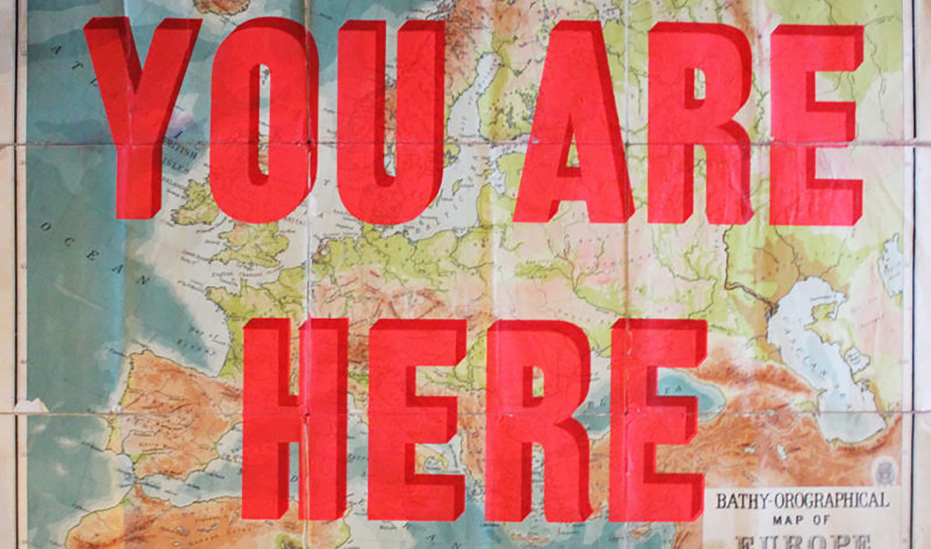
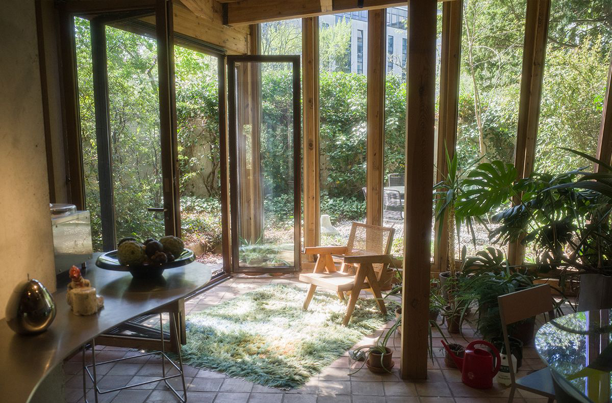
How often do you consult a map? For some of us it’s every day — arguably more often than before our lives went digital. And yet the allure of the analogue map has never disappeared, even — especially — once it’s ceased to serve a practical purpose. In fact older the map, the tighter its grip. Visit a museum, a historic building, even the offices of The Spaces in London… if there’s a map on the wall, it’ll attract the most attention for the longest, inviting pause in the search for familiarity and difference, similarity and change.
Cartography segued into an art form around the time collectors found themselves with discretionary cash to spend on it. When the first dealers emerged in the 1920s, they often deconstructed old atlases and sold off the pages as bits of nostalgia. ‘Vintage maps embodied the modern interest in pursuing progress,’ says Matthew Edney, a US-based professor of the history of cartography. When tastes began to change with the arrival of art deco and Bauhaus, he says, obsolete maps became items of fascination akin to Old Master paintings. ‘Modernist fashion and decor had changed. Art and personal skills were all being submerged by modernism and people started to see old maps as a craft.’
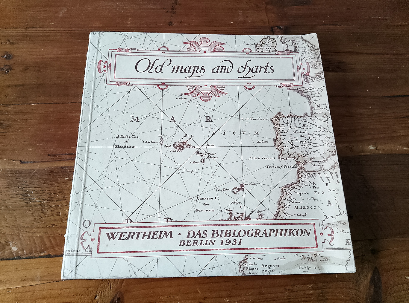
At the forefront of the trend was Berlin art dealer Hans Wertheim, who organised an exhibition of early maps in 1931. In his accompanying book ‘Old Maps and Charts’ he argued, ‘They reveal the open-eyed and open-eared vitality of the Renaissance men who made them, who conquered the world and depicted it then with all the childlike belief in fairy-tales… It is this which, perhaps more important and more attractive than their decorative quality, makes old maps… so extraordinarily fascinating. They, the last living witnesses of a past age, enable us to appreciate it and its landscape, which they show us as it appeared then and in process of development or discovery, better than many a picture or book could do.’
Even the UK’s oldest map publisher, Praed & Company, got into antiquarian maps as art. Established in 1907 as a printer and supplier — of Antarctica maps to Ernest Shackleton and of Far Eastern maps to Winston Churchill, among others — by the 1970s, Praed had moved to Knightsbridge and rebranded itself as the Map House, a dealer and a curiosity in itself. Its loyal patrons include the British Library and Library of Congress.
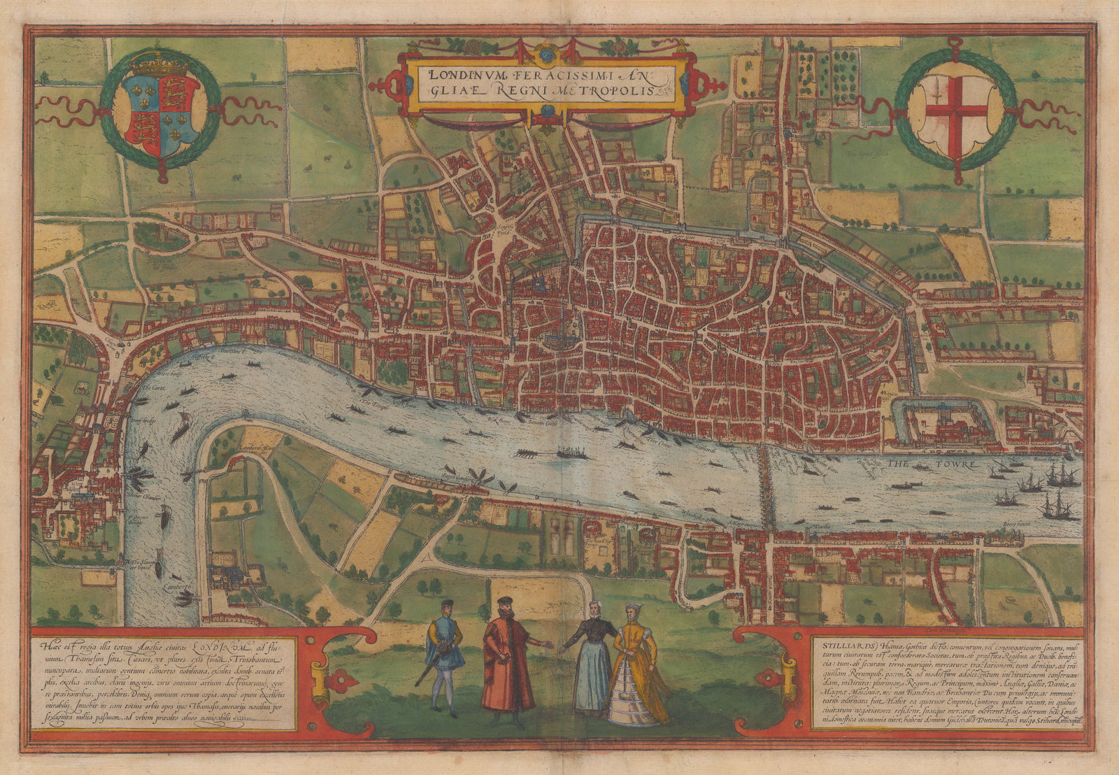
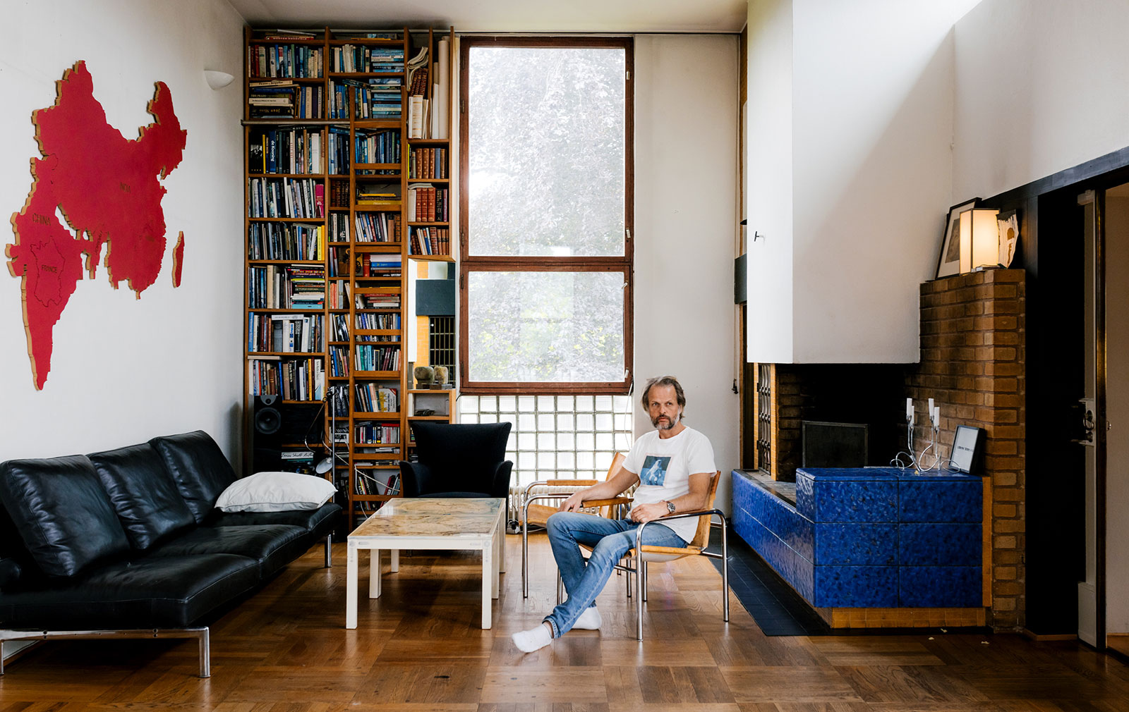
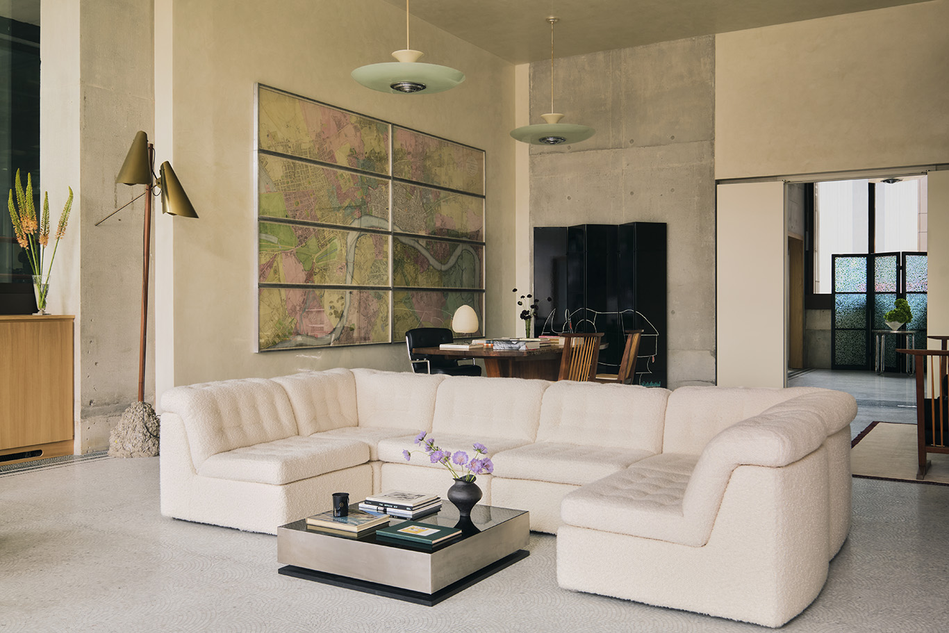
Interior designers gravitate to maps like they would a silk kimono or a vintage advertisement — as an expression of intellectual curiosity and discerning taste. Alex Eagle and Sophie Hodges of London practice Eagle + Hodges recently hung two maps of old London at their 180 Thames residential project — one by Richard Horwood in the 18th century, another by Radulphus Aggas in the 16th. ‘We like to make a space functional and utilitarian by decorating with practical things in an elegant way,’ says Eagle. ‘It gives a sense of space and time and exploration — it’s almost like an adventure to work out where you are. And they’re so decorative.’
Edney agrees. ‘Some mid-range dealers will say their largest clients are interior decorators who ask for a map with a particular colour palette.’
Photography: Thomas Ekström
Though the sepia tones of many historic maps will never go out of style, those printed in characteristic pinks and blues are no less ‘authentic’, for the most part. Early publishers pioneered colour printing with wood blocks and copper plates, though the register often went awry. In the 19th century, mapmakers would have their servants, often women and girls, apply watercolours through hand-cut stencils. Some 20th-century dealers were known to glamourise black and white artefacts by colourising them. ‘By and large they used watercolour,’ says Edney, ‘so it seems to lie below the black line and sinks into the page. Sometimes it’s applied precisely, sometimes carelessly.’
The carelessness is part of the allure. If you’re looking closely, you’ll see blotches in places from an overloaded brush, or strokes that overshoot the black boundary — a sign the plate or stencil was slightly off. And the soothing pastel tones are pleasingly neutral in their own way. ‘They’re gentle, elegant and sophisticated,’ says Eagle of the palette of her Richard Horwood. ‘And it’s hand-painted, so there’s something that feels beautifully crafted about it.’
Collectors can go as far back as the 16th-century when it comes to acquiring antique maps with a watercolour wash. But the beauty of maps-as-art is that even contemporary keepsakes are worth framing: a page out of a dog-eared atlas from a favourite road trip; a New Yorker cover featuring Saul Steinberg’s oft imitated ‘View of the World from 9th Avenue’; a snapshot from the Mapparium in Boston, the oversized stained-glass globe from 1935 that visitors can physically walk through. Framing becomes a big part of the look, if you’re grouping together related maps from a single source. The frame can draw out colour from the map itself, or add a contrasting hue. If a map comes pre-framed, it may obscure the markers of forgery, like improper cleaning, faulty lettering, bad shading or modern paper that’s been ‘antiqued’.
Heeding the dealer’s mantra to find a niche and stick to it, Edney says he’s has begun collecting maps that were printed in the 1920s and ’30s as publicity giveaways by radio shows like Amos & Andy. They’re fairly common, often off-colour (in more ways than one) and a challenge to frame, as most were printed front and back. But Edney doesn’t consider himself a true collector. ‘You know you’re a real collector,’ he says, ‘when you run out of wall space for your maps.’