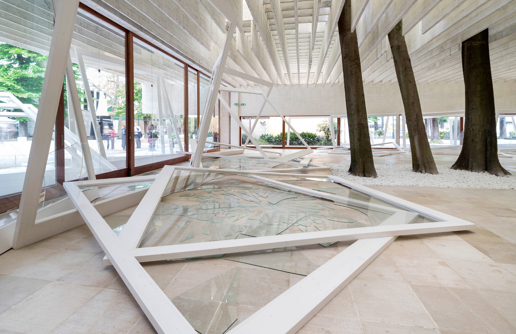
Wandering through the 56th Venice Biennale, you’d be forgiven for thinking you’ve skipped ahead to next year’s architecture show. From the Swiss pavilion’s transformation into a giant pool to the Norwegian pavilion’s ruptured glass facade, the buildings themselves are part of the artwork for many of the national exhibits. Exploring curator Okwui Enwenzor’s All the World’s Futures theme – probing global inequities and political stasis – they make for immersive environments.
Photography: Marc Asekhame
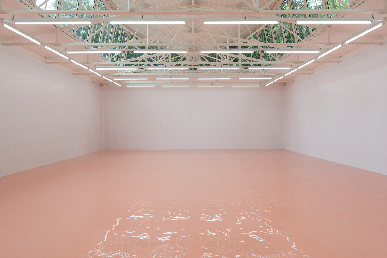
Perhaps the most enveloping is the multi-sensory Swiss pavilion. Pamela Rosenkranz turns the structure ‘into a body’ through her bio-medical pool of pink paint.
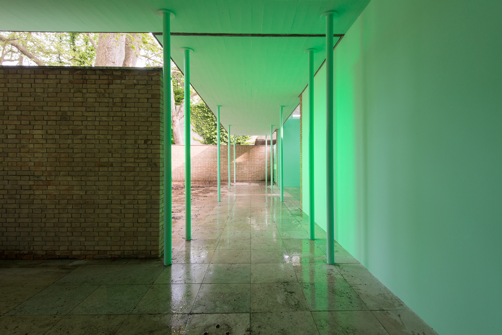
The artist has coated the building’s porous facade in a mint hue, intensified by green lights inside the courtyard. This ‘chromatic conditioning’ prepares us for what awaits at the end of a short tunnel: a deep and stirring pool of pink.
Photography: Marc Asekhame
Rosenkranz’s milky lake is the colour of Caucasian flesh, we learn – the exact opposite of the foregrounding green – and the average tint of the skin tones found in classic Venetian painting. The pool stretches out under skylights, and shores up against tarped walls. Its site-specificity becomes doubled, then, both a reality and a reference; a material and comment.
But best of all, Rosenkranz provides that all-too rare experience that makes your breath catch in your chest: the sublime.
Like the Swiss pavilion, many of the national offerings eschew the traditional gallery format of ‘objects in space’. The artworks play with the effects of wide-open or confined spaces on our senses, while controlling our journey through the buildings.
The group installation at the German pavilion is a case in point. Riffing on the curatorial theme of a factory, a narrow, even claustrophobic staircase has been designed, one that carries the visitor up to the roof, which has been transformed into a workshop, a ‘bel étage’.
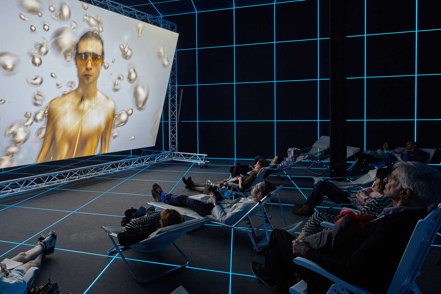
The artists have turned the building’s floors on their heads, accentuating its verticality. Hito Steyerl’s ‘motion capture studio’, for example – where a process-oriented video is screened before lounge chairs – is located in what feels like the basement, but is actually the pavilion’s main floor. Meanwhile, ‘rooftops 1 and 2’ are located on the ground floor, ensuring the classical Germania pavilion is properly disoriented, undone, and re-fabricated. How appropriate for an exhibition titled Fabrik.
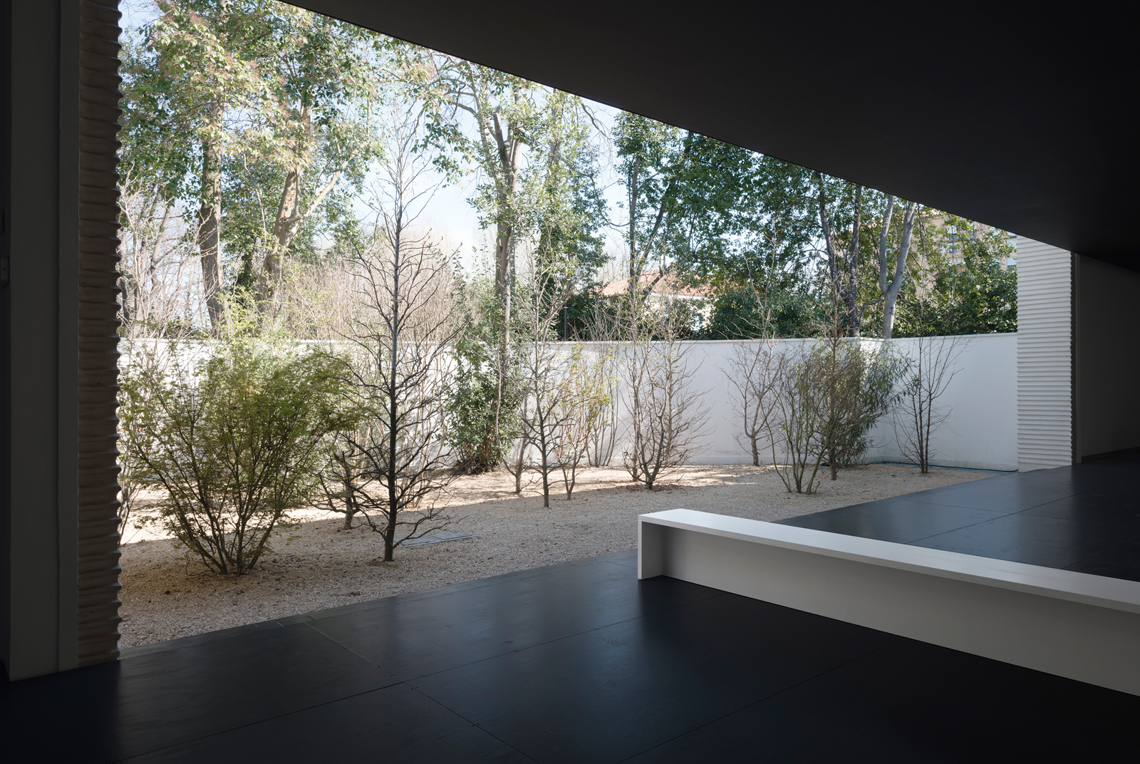
Elsewhere in the Giardini, Austria’s Heimo Zobernig enacts a similar intervention on his pavilion’s architecture, responding to the building’s ‘classical rounded arches and clear rational forms,’ and reducing everything to black.
Installing light-absorbing monoliths that appear to alternatively float on the ceiling, or consume the empty floors, the architecture is rid of its history. It is, all at once, something wiped clean, and renewed with directed potential.
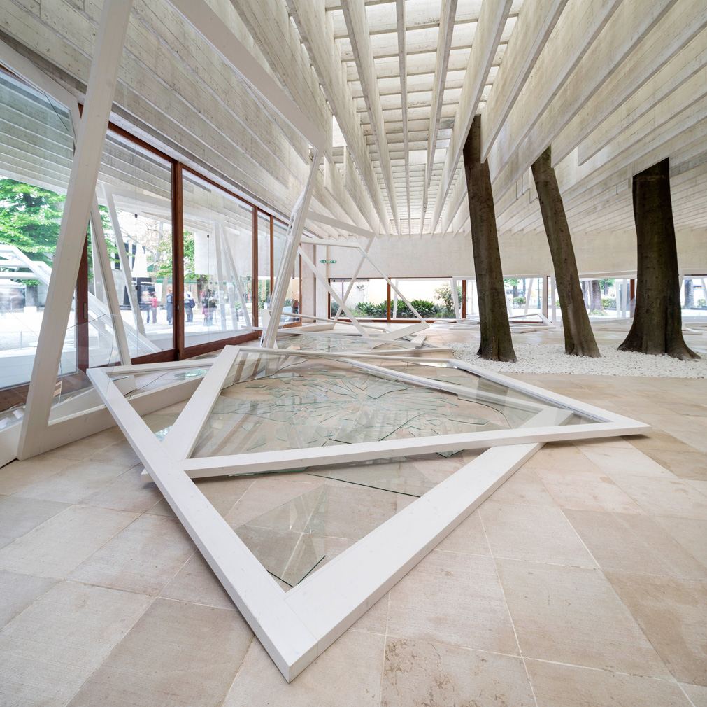
Like Zobernig, Norway’s Camille Norment works with a largely voided space, this time permeated by sound. Rapture includes a sculptural component – massive window frames lean precariously, their panes of glass splintered around the pavilion’s thresholds – as well as a ‘sonic intervention’. Conical speakers fanning from the modernist rafters play a hive-like instrument, bringing together sound and space.
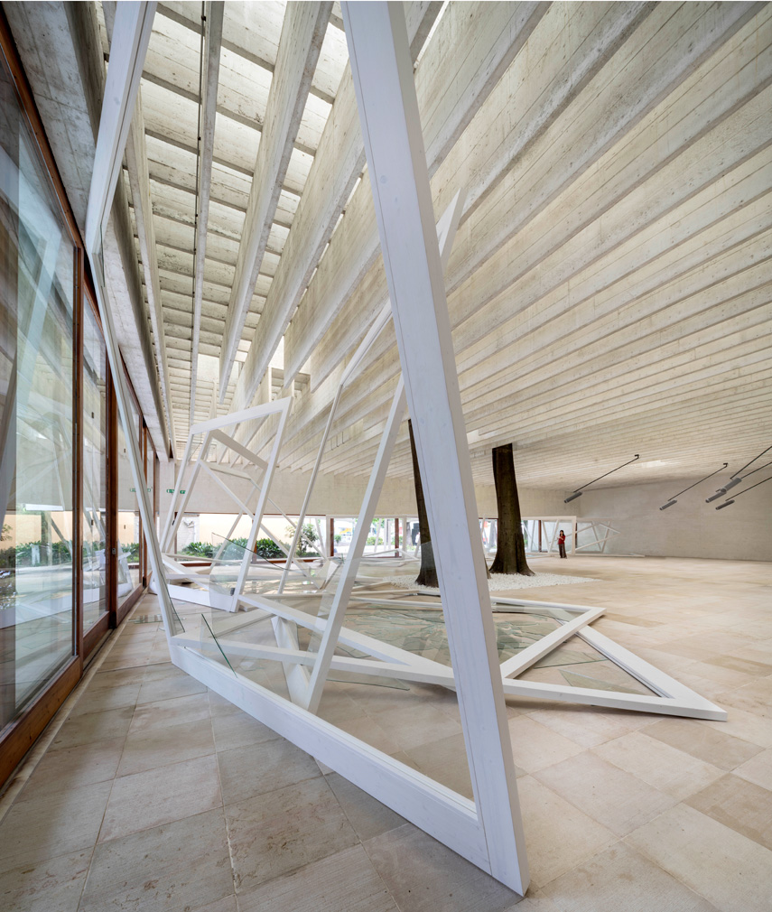
Everywhere you turn at the Venice Biennale, architecture is being used as subject or medium. Take a walk through the Canadian, French, Russian and Japanese pavilions and you’ll feel the spatial form being wielded to powerful effect.
This manages to make Sarah Lucas’ outrageous show in the British pavilion feel ‘traditional’, by contrast. Here, visitors pace around her bawdy sculptures – complete with giant yellow phalluses – looking on as an observer rather than a participator, the only nod to a more immersive environment coming in the form of bright yellow walls inside the building.
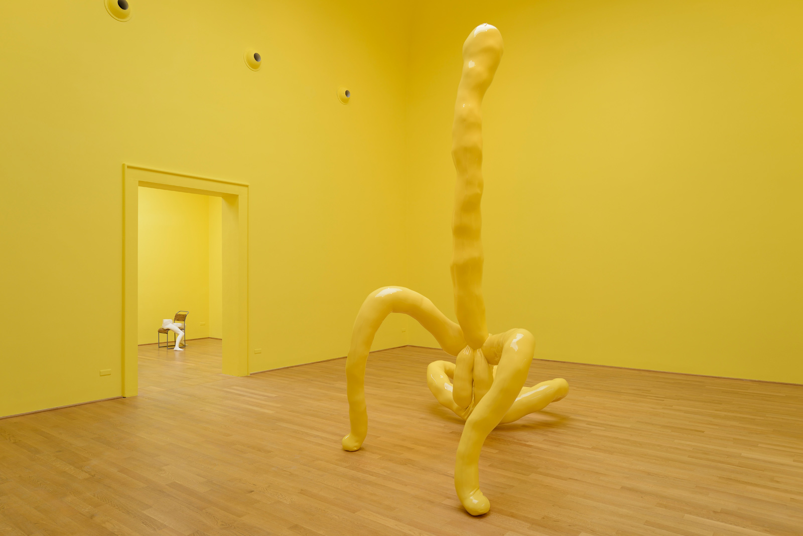
That’s not to say her work should be viewed in any other way. Her bombastic sculptures shouldn’t have to compete with their surrounds. But – as a tour of the Venice Biennale will attest – bricks, mortar and space are media firmly on the rise.
The Venice Biennale runs until 22 November 2015.


