During the pandemic, we were all forced to adapt new modes of living and working, especially office workers, whose kitchen tables were repurposed as desks and closets for private zoom calls. The adjustment to ‘WFH’ life was imprecise and scrambled for many – but not so for architect Jeremy Bull and his wife, marketing director Tess Glasson, of Sydney practice Alexander &CO.
In July 2020, before Sydney went into lockdown, the couple’s firm completed Alexander House – a purpose-built live/work space for the practice that adjoins their family home in the eastern suburb of Bondi Junction.
Constructed with rammed earth bricks formed from waste materials, the building was conceived as a prototype for Bull’s ideas around environmental sustainability and is flourished with a palette of concrete, steel, brass and stone.
And while it functions as an ‘office’, Alexander House is very much born from the residential neighbourhood where it’s located. From the get-go, it had to be a working showroom that could demonstrate the scale, volumes and treatments available to clients, while welcoming them with a dose of good old-fashioned hospitality. As an extension of Bull and Glasson’s realm – a geographically adjacent one to their home at that – it also had to flex to meet the demands of the couple and their children, and their growing studio staff, a second family in their own right.
In short, Alexander House had to challenge preconceptions about what a home or office should be.

But as laudable as this hybrid model is in theory, it was lockdown that really put Bull’s theories to the test.
‘We have ‘lived’ within Alexander House for close to one and a half years now,’ says Bull. ‘It has been quite uncanny timing given we were in lockdown for three months of that period, home schooled from within it and managed to close the lease of our old studio all in that time.’
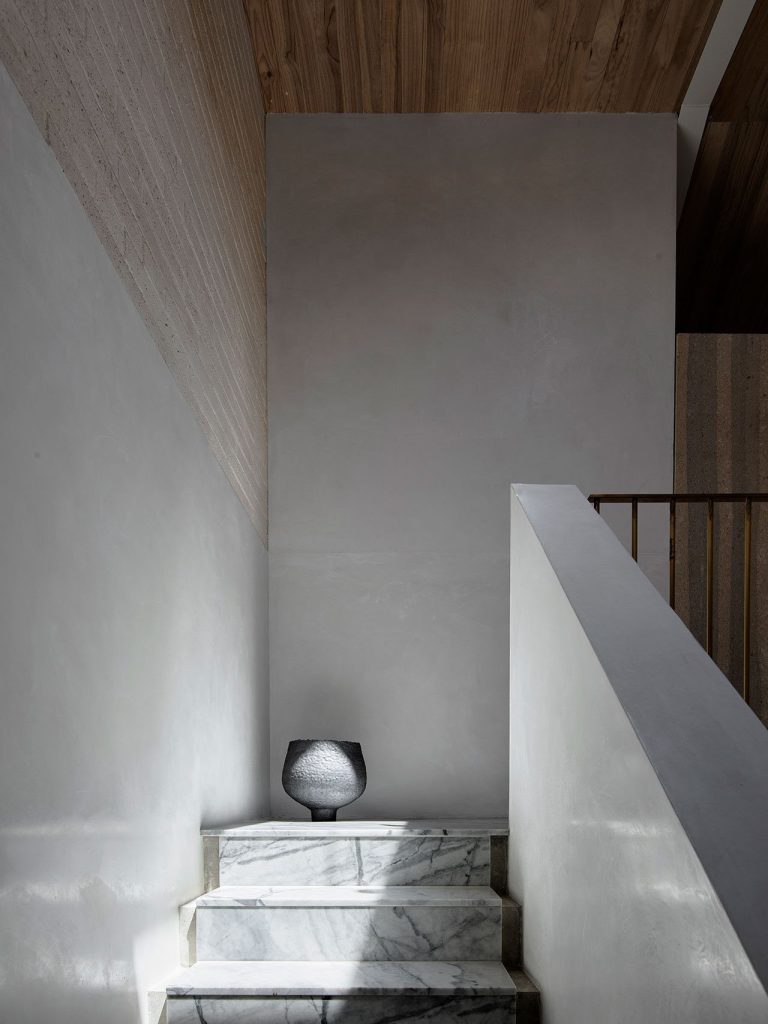
Though a new build, Alexander House feels like it’s decades-old thanks to its rich patina and ‘imperfect’ finishes. Reclaimed, sandblasted timber shows its age while buffed brass will blacken with time. Even plaster shows the hand that laid it, lending a sense of history and familiarity to its spaces, which are stacked across four levels within the tight constraints of a terraced plot.
But if there’s a standout ‘material’ within Alexander House, it is undoubtedly natural light.

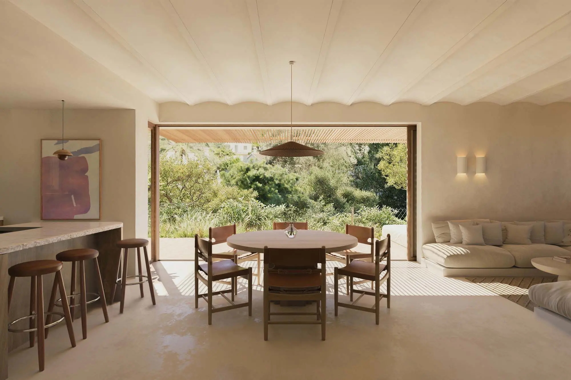
Crossing the threshold of the kitchen is akin to stepping into a cathedral of light, with double-height vaulted volumes and apertures to the sky bringing in views of the heavens. Sliding glass walls peel back to terraces, offering sight lines through the building and its recesses, while sunlight dances in reflective pools across the polished concrete floors.
The whole space feels warm and inviting and is bursting with textures and grains.
“I love the opportunity to turn pen lines and stories into spaces” – Jeremy Bull, principal of Alexander &Co
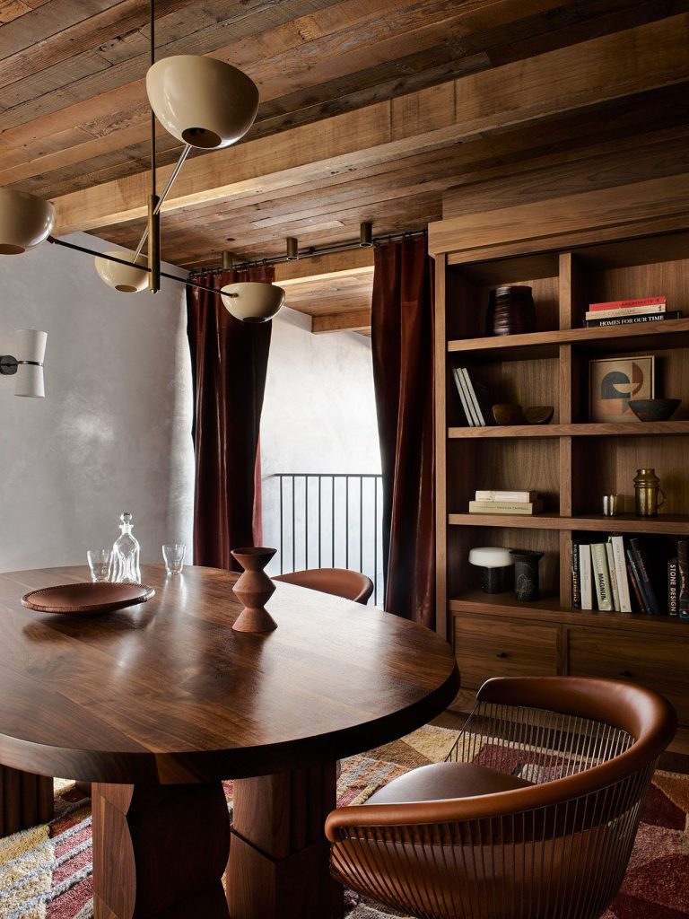
Adding to this tactility is a soft and understated minimalist aesthetic that sweeps through the height of the property. It’s a look that has come to typify the practice’s aesthetic where ‘imperfect’ finishes give way to tactile modernist and contemporary furniture made with natural materials, rich woods, chocolatey leather, and mossy boucle.
After nearly two years of working inside their experimental space, Bull and Glasson invited Kylie McDowell to see how their hybrid vision is working beyond lockdown.

Photography: Anson Smart

Photography: Anson Smart

Photography: Anson Smart

Photography: Anson Smart

Photography: Anson Smart

Photography: Anson Smart

Photography: Anson Smart

Photography: Anson Smart

Photography: Anson Smart

Photography: Anson Smart
Photography: Anson Smart

Photography: Anson Smart

Photography: Anson Smart

Photography: Anson Smart

Photography: Anson Smart

Photography: Anson Smart

Photography: Anson Smart

Photography: Anson Smart

Photography: Anson Smart

Photography: Anson Smart
Photography: Anson Smart

Photography: Anson Smart

Photography: Anson Smart

Photography: Anson Smart
Alexander House was designed as ‘a home for working in’ and while its design predates the pandemic, it’s an idea that has gained significance since. How has the pandemic shaped the way you use the space – and for your team and clients?
I think we have found a flow since returning to work, but like all things, the experience and the way we use the building feels almost seasonal, shifting and developing almost continuously. This both relates to the parts of Alexander House which have been added to (modified furniture, acoustic doors to some rooms) but also to the varying uses of the spaces and the way the team comes and goes.
The building is beautiful to be in and has provided our team and clients a ‘working prototype’ of various room sizes, materials, fixtures and lighting – as it was intended to.
But more so it has changed the experience of working and helped to further facilitate our exploration of hybrid work and what it means to our company. More so than anything, I think that it embodies the spirit of our work, both architectural and interior design. Soulful and I hope time enduring too.

Despite it being an ‘office’, the standout space isn’t a meeting room or studio, it’s the kitchen. What is the thinking behind that?
I think that the kitchen as the ‘heart of the home’ is a well-earned but accurate cliche.
It is a space in Alexander House which is subject to the most architecture, ceiling heights, volumes, material richness, lighting opportunities, and window and door types. I think this architectural diversity helps to facilitate a room with a very unfixed program. The room throbs, changes shape and function, changes population. We eat, present, meet, read. All helped by a wonderful coffee machine and a connection to the courtyard which is resplendent in pink and green and flooded with sunlight during the day, then atmospheric at night like caramel toffee.

Alexander House also has a distinct love affair with concrete, though it’s far from austere. Why did you gravitate towards this material, and how have you humanised it?
It was important to me that Alexander House walked the line between modern and ancient. We felt quite sure from the start that the home shouldn’t be a grey one. I wanted it to have a complexion, to feel like a woollen cardigan. The resolution of this was to expose the concrete slab and beam structures whilst allowing all other finishes to be warm, either plaster or timber or stone.
Even the concrete kitchen bench is pink, and there is brass all over. In this way the house is really not reductionist; it is rich and dense and not austere at all. The materials are very imperfect, details and junctions are crunchy and direct, and brass is browning in its own way without regard for aesthetic sensibility.

Furniture and art curation is also important to the success of the space. What do you look for in furniture and art?
Tess and I live next door with our four sons. Alexander House really provided the context to get all our favourite pieces into a home which we really could only dream of living in ourselves. It’s like a make-believe home for frustrated design-loving parents with young children!
Beyond that, we love the modernist and 20th-century classics. I have a personal love for the Brazilian modernists, the designs I am compelled by are more Fraggle Rock than furniture – like I’m sure with a ventriloquist behind them they would tell the best gags. We worked with our favourite team to design and manufacture various pieces and made sure to bring in some of our classics from venues designed over the years.

What’s your favourite detail?
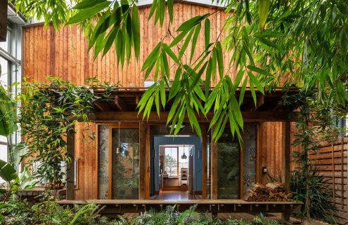
I have a little step which opens onto our tiny little tropical garden. We waited a long time to complete our garden (11 years), and I feel proud of it, maybe disproportionately so. It’s the work of Dangar Barin Smith and is a perfect reminder that sometimes all we need is a little green in our lives.
How does the ethos of your home and studio chime with your other projects?
I have only ever worked because I love to. This is not to say I don’t need a ‘job’ with many mouths to feed, but I just chose this work because I love it. I love the opportunity to turn pen lines and stories into spaces. I still pinch myself that my childhood love of drawing became a job. I guess this is a long way of saying that all our projects, our home included, are all connected absolutely.
They are connected by their curiosity and their storytelling. They are connected by the same hand that drew many of the first lines of their little sprouting ideas. And they are connected by their intent to make something purposefully enduring and simultaneously full of new ideas.

What’s the biggest design luxury in your own home?
Design luxury…. I think it’s all a bit of a luxury. To live in a home that came from my own imagination is a luxury. To be sheltered by creative ideas, wow, that is a gift for an architect.
If you could live in any building around the world besides your own, which would it be?
The Arabic Bedouin tents have always enchanted me. I’m middle eastern born and spent my childhood in the deserts of Saudi Arabia. How beautiful to be so close to the ground. I think I would take a tent as my number one.


