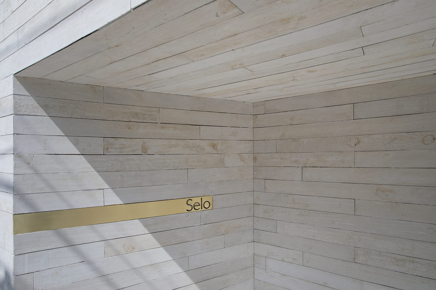
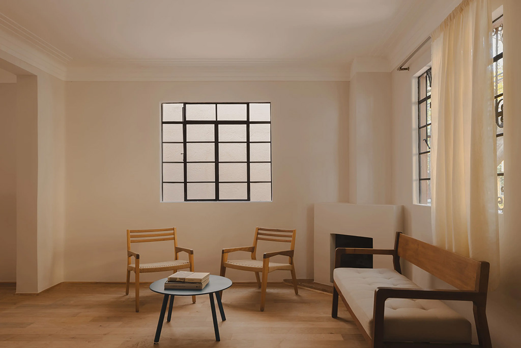
White cement and limestone interiors leave this São Paulo store feeling more like an art gallery than a shoe shop.
Brazilian studio MNMA oversaw interior design for handmade shoe company Selo, using liberal amounts of concrete and pale wood to give the retail space its ultra-minimal look.

Photography: MNMA

Photography: MNMA

Photography: MNMA

Photography: MNMA

Photography: MNMA
Photography: MNMA

Photography: MNMA

Photography: MNMA
They kept the building’s existing floor but repaired it using the Japanese technique of kintsugi, which traditionally involves mending cracks with lacquer mixed with gold powder. As a result, dark grey veins run across the shop’s floor.
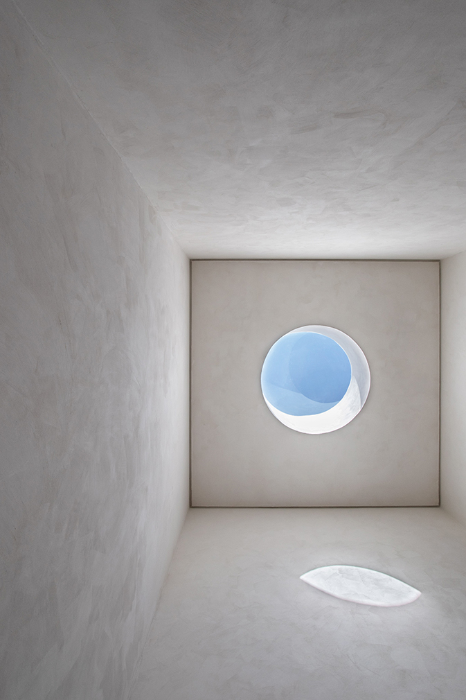
In addition to creating concrete furniture and display shelves, MNMA borrowed from the work of James Turrell, installing a circular window in the space that allows shoppers to peep out at the sky above.


