It’s official: 19-4502 Classic Blue is Pantone’s colour of the year with this peaceful shade set to quietly overtake its outlandish pink predecessor, Living Coral.
According to the colour experts, Classic Blue represents ‘protection, stability, peace, and confidence, as well as encouraging deep thinking, open mindfulness, and communication’. It’s also genderless, natural and evokes a connection with the sea and sky – fitting for the time current political climate.
View this post on Instagram
Blue shades have long been used in hospitals and care homes, with studies showing they have a positive and calming effect on the mentally ill, people living with dementia and even prison inmates.
But how do you stop your blue home from looking like a hospital ward? We’ve scoured Instagram for inspiration on how and where to use this subdued shade to best effect.
View this post on Instagram
1. Bedroom vibes
View this post on Instagram
‘Imprinted in our psyches as a restful colour, Classic Blue brings a sense of peace and tranquillity to the human spirit, offering refuge,’ says Pantone. These qualities make it ideal for a bedroom, where it evokes the feeling of an evening sky and promotes restful sleep.
Likewise, it works well in living rooms and areas of your home designated for R&R.
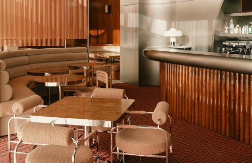
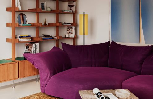
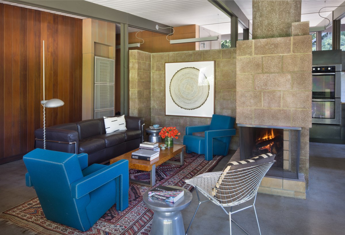
2. Statement furniture
View this post on Instagram
Classic Blue is described as a ‘resilient’ shade – and nowhere is this truer than when used in upholstery. As well as adding a moody twist to otherwise neutral rooms, a Classic Blue chair or sofa creates character without dominating the space.
Fabrics in this shade are also dark enough to hide stains – which let’s be honest, is the kind of ‘resilience’ we probably need.
View this post on Instagram
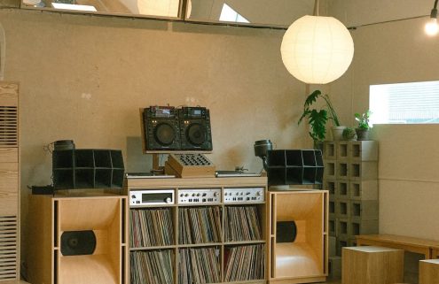
3. The shade for vinyl heads
View this post on Instagram
For the first time, Pantone commissioned creatives to give the colour of the year a ‘multi-sensory’ identity e.g. sound, texture, taste and scent. If you’re looking to give your listening room a refresh, then Classic Blue promotes relaxation and mindfulness and can stimulate the same parts of your brain as music.
Don’t have a listening room? Achieve the same effect with scent in your ‘relaxation space’ – wherever that may be.
View this post on Instagram
4. Team it up with plants
View this post on Instagram
Let’s be real. Everything looks better when paired with a bit of greenery, including this shade, which has a synergy with plantlife thanks to its natural undertones. Add a pop of colour via Classic Blue plant pots, or break up solid blocks of the colour with some hanging plants.
5. Wherever you need comfort
View this post on Instagram
Evoking stability and connection, Classic Blue embodies the fundamentals of comfort and has a tactile quality that can be incorporated into spaces in subtle ways. Think soft, plump cushions, welcoming front doors and hallways, warming lampshades or textured rugs.
View this post on Instagram
View this post on Instagram
View this post on Instagram