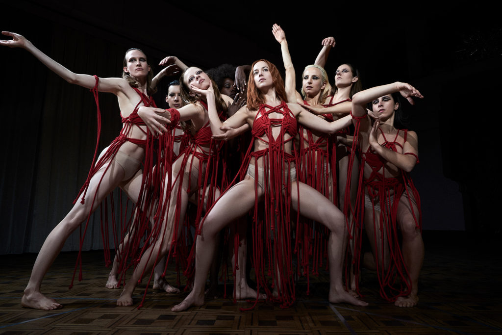
Much like Dario Argento’s seminal 1977 horror of the same name, Luca Guadagnino’s Suspiria is a dread-filled supernatural fable centred around a mysterious German ballet school. It is also, somewhat unexpectedly, rooted in a very dark reality.
Set in West Berlin in the mid 1970s, the film contains references to the Holocaust and Baader-Meinhof Gang, while the Berlin Wall casts a literal shadow on the fictional Markos Dance Academy where the main narrative unfolds.

In order to recreate the distinct look and feel of the city during this fraught period in its history, Guadagnino turned to production designer Inbal Weinberg, whose previous credits include Blue Valentine and Three Billboards Outside Ebbing, Missouri. She reveals her architectural inspirations and surprising personal connection to Suspiria…

Photography: Mikael Olsson

Photography: Mikael Olsson (c)

Photography: Mikael Olsson (c)

Photography: Mikael Olsson

Courtesy of Amazon Studios

Courtesy of Amazon Studios
Courtesy of Amazon Studios
What was Luca’s initial brief?
Inbal Weinberg: Well, the first thing to say is that I’m not really a fan of the horror genre, and I didn’t come into it with a huge knowledge of the original Suspiria. The first time I saw it was when I got the offer to interview for this job. Off the back of that, I created a lookbook which was basically my reaction to the script, which was very far from the original Suspiria, just because it wasn’t really in my lexicon.

Luca is a big fan of Berlin and that whole underground, new wave scene of 1970s German filmmakers like [Rainer Werner] Fassbinder, and that was also in my lookbook. But initially we mostly talked about my family and their experience – my grandmother was Austrian and went through the Holocaust and a lot of my family still live in Vienna. So I drew a lot from my own family history, and I’m also very familiar with Berlin. I think Luca liked that I had a personal connection to the history that is deep in the layers of this film.

What architectural references did you discuss?
IW: Our immediate references were early 20th-century Viennese architects like Adolf Loos and Josef Hoffmann. We were interested in exploring that period from Art Nouveau to those architects who completely divorced themselves from a more decorative style and decided to go with much straighter lines and a cleaner aesthetic. That fit our look, our feel for the place, which is an institution that is supposed to feel cold but also somewhat grand. And we looked at other spaces from the turn of the century, before Bauhaus but after Art Nouveau.

The Markos Dance Academy plays such an important role in the film. What was the process of designing that space?
IW: Luca found this old grand hotel on a mountaintop in the north of Italy near the Swiss border [in Varese, Lombardy]. It had been abandoned for probably 30 or 40 years – everything was in complete decay, there was no electricity or proper plumbing or any heating. So we had to do a lot just to make it habitable for everyone working on the film. In terms of the actual film spaces, there was a lot to do renovation wise because the hotel was built in the early 1900s and the popular style at that time was kind of like a bastardised version of Art Nouveau. It was very decorative, very typical of Italy of that time, but not really what we were imagining for the more German, more austere style we were going for.

IW (cont’d): We ended up changing the flooring, replastering everywhere, turned columns from round to square, did a lot of faux finishing of marble and granite surfaces, painted everything and restored certain elements that had become very dilapidated over time.

How collaborative was the production?
IW: Some visions are more cohesive than others, but in general, the best case scenario is when everyone is in tune with the story. I always find that the best way to achieve that is through clear communication – and that can come from anyone, not just the director. Luca is very collaborative in the sense of encouraging everyone to spend time together; I talked a lot with the costume designer [Giulia Piersanti] and the director of photography, [Sayombhu Mukdeeprom]. And I also got to know the editor [Walter Fasano] and title designer [Dan Perri] really well, which doesn’t happen very often because usually, their jobs start when I finish. I even helped Thom Yorke [who wrote the original score] with the album artwork. It was an intense shoot and we shot 80% of the film inside the hotel, so it was like we were living inside the set.

Is there a specific set you’re particularly happy with?
Probably the most satisfying thing for me was restoring the floor of the dance studio, which a number of professionals told us we would never be able to do. It was in really bad shape when we found it, and we fought to find the right people who would take on that project. We knew it was going to be a huge, very labour-intensive job, but Luca and my art director [Monica Sallustio] encouraged me to take it on and I’m so glad they did because all the hard work we did really shines through.
Read next: Explore the beguiling sets of Call me by your name
