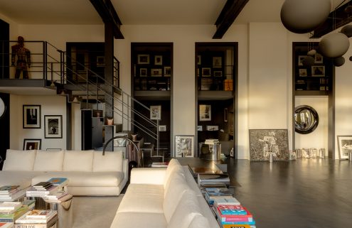
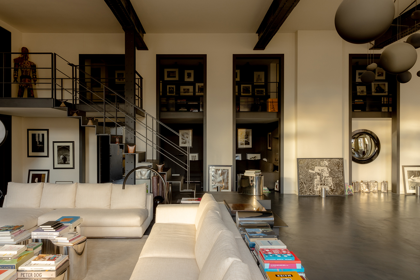
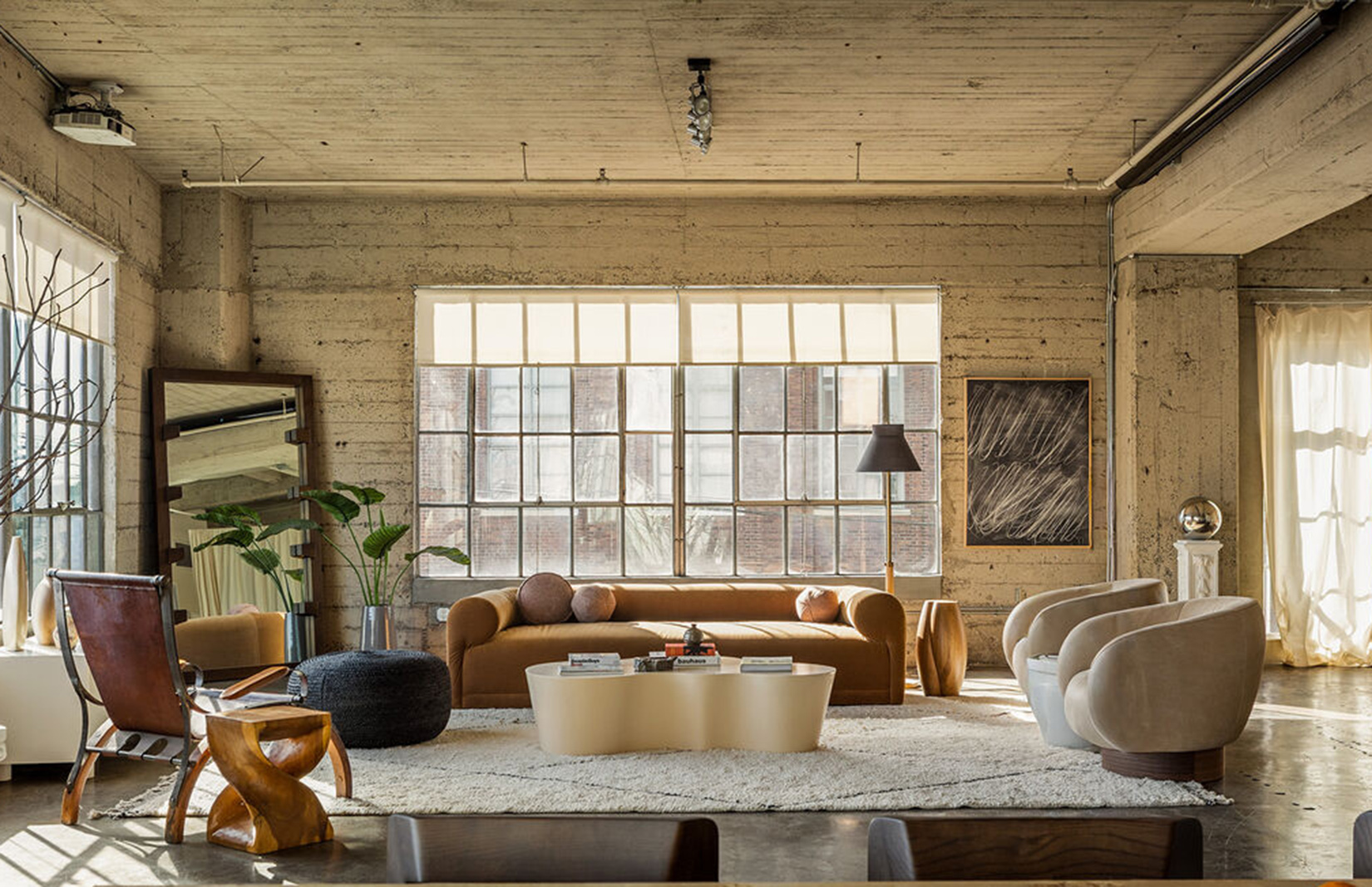
Many of us have seen glimpses of Veronica Ditting’s studio without even knowing it. The Vitsoe shelves, Kho Liang sofa and concrete floors have made cameos in a Talia Byre fashion shoot and spreads in The Gentlewoman, where Ditting was creative director and stayed for 12.5 years. One of only ten workspaces in London’s Barbican Estate, retrofitted into Chamberlin, Powell and Bon’s Brutalist landmark building after its completion in the 1970s, it forms a raw, industrial backdrop complementing her punk, directional style.
The image-maker says she had to view it after spotting the listing on Modernist Estates. Her former landlord in Clerkenwell had doubled her rent. And this trio of rooms, formerly used as rehearsal space for the Guildhall School of Music, had a historical allure and central location she couldn’t pass up. ‘It really feels like you’re in an architectural drawing,’ she says.

ddd Folio Folio Folio exhibition. Photography: Veronica Ditting.

ddd Folio Folio Folio exhibition. Photography: Veronica Ditting.

ddd Folio Folio Folio exhibition. Photography: Veronica Ditting.

ddd Folio Folio Folio exhibition. Photography: Veronica Ditting.

ddd Folio Folio Folio exhibition. Photography: Veronica Ditting.

Poster for Folio Folio Folio. Wet proofs of The Gentlewoman issue no.24. Photography by Qiu Yang.

Test prints for System magazine contribution. Photographed at the Barbican office. Photography: Matthieu Lavanchy.

Poster for Folio Folio Folio. Invitation for the launch of Rouge Hermès, Hermès Beauty. Photography by Qiu Yang.
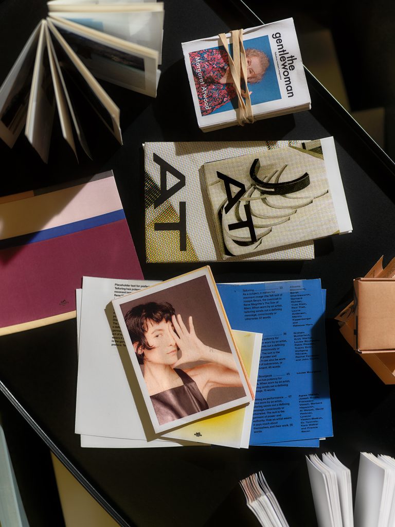
Poster for Folio Folio Folio. Miniature dummies and mockups. Photography by Qiu Yang.

Poster for Folio Folio Folio. Six-metre long blank leporello for Hermès womens-ready-to-wear. Photography by Qiu Yang.

Poster for Folio Folio Folio. Cover trials featuring Lightbreak by Nicolai Howalt, Hermès womens-ready-to-wear. Photography by Qiu Yang.

Barbican Estate. Photography: Matthieu Lavanchy.

View onto the office. Photography: Veronica Ditting.

View onto John Trundle Court, seen from the office. Photography: Studio Veronica Dititng.

The Gentlewoman issue no. 23, shown on a display stand hand-built for Folio Folio Folio. Taken in front of the office space. Photography: Studio Veronica Ditting.

Packaging design for AT ID by Alexander Taylor. Final boxes and mock-ups. Photography by Joyce Ng.

Talia Byre’s Spring Summer 2023 collection shot at the Barbican office. Photography by Matthieu Lavanchy.

Poster for Folio Folio Folio, exhibition at ddd gallery Kyoto at the Barbican office. Photography: Veronica Ditting.

Photography: Veronica Ditting.
Five years ago, Ditting moved into the 85 sqm office with an old rattan lounge chair and some Gispen seating from years living in Amsterdam. She displayed samples of past work for Hermès and John Lobb in her small archive room and brought in simple plywood desks on Egon Eiermann trestles for her co-workers – currently, she has four. USM cabinets hold equipment and office supplies. Spot-lighting comes from several Castiglioni lamps. Ditting has assumed the Dutch penchant for under-designing in order to maintain a functional, utilitarian look. ‘Maybe it’s a little eclectic, but it all works,’ she says. ‘I don’t like contrived design.’
Visiting clients get a detailed PDF with instructions for locating Studio Veronica Ditting through Barbican’s maze of landscaped walkways (‘I like that it’s a bit obscure – it always fascinates people’). But the Argentine-born, German-raised creative spends a great deal of time on location in Europe, for shoots, or in Japan, where a survey of her work recently launched at ddd gallery in Kyoto. On show until 28 July, Folio Folio Folio celebrates her successful fashion campaigns, branding projects, books and editorial spreads, and features new photography taken right here in her workspace. She recently returned from the opening, via meetings in Milan, so the London office is more a place where Ditting keeps her head down. ‘I work in the most focused way here,’ she says. ‘I can go into tunnel vision.’

In the meantime, her Vitsoe shelving system tracks her international lifestyle, displaying vintage miniature books from South America, interesting packaging, and even 1970s pharmaceutical brochures kept for their design and authenticity. ‘When I’m here, I’m so focused on deadlines and work,’ says Ditting. ‘When I’m travelling I have more head space to be looking around. Wherever I travel I always ask where’s the best vintage bookshop.’ She’s also a supply-closet zealot: passionate and fiercely loyal when it comes to brands she likes. She’ll order cutting knives from Japan, a particular spec tape and bookbinding glue for assembling dummy publications. ‘It’s a pet peeve of mine – I hate dysfunctional office supplies.’ Since Brexit has made ordering equipment more complicated, she’ll haul back pens and cutters in her suitcase from, say, Modulor, a four-storey art supplier in Berlin.

Balancing the hard, cool surfaces are sheepskins, a kilim pillow, a hand-sewn felt cushion by Dutch artist Yeb Wiersma and rugs purchased abroad. A blanket by artist Ella Kruglyanskaya x Studio Voltaire on the sofa is one of many warming up the space. Various bits are picked up from commercial work, though Ditting still relishes the experimentation and exploration that editorial work affords. Currently, she’s directing shoots for a book with makeup artist Lucy Bridge. ‘She’s such a voice of her generation,’ says Ditting, ‘so particular when it comes to colour usage, and so versatile. It’s a nice long-term collaboration that feeds into my creativity and experimentation.’
Ditting has even tried her hand at designing her own furniture. Her proofing cabinet – a station for reviewing printed work ahead of publication – came out of a collaboration with her friend, German designer Max Frommeld. ‘It’s quite a specific piece. It had to have a specific angle and lights above.’ They decided on grey Formica for the countertop, combined with walnut drawers and custom powder-coated detailing. It’s eclectic personality complements the mis en scène. Yet, says Ditting, ‘For the most functional equipment, it’s the most designed one in the space.’


