Pantone has announced its top colour prediction for the next 12 months is Viva Magenta, but we look across the spectrum at the colours going head to head for dominance in 2023.
Pantone – Viva Magenta

Pantone’s Colour of the Year announcement has become a staple in the calendar. The company’s forecasters reference everything from popular culture and fashion trends to technology and socio-economic shifts to make their decision.
This year’s dominant shade is Viva Magenta, an intense crimson colour that Pantone describes as ‘audacious, full of wit and inclusive of all’. It’s a markedly more confident shade than previous years, which have focused on softer tones such as Very Peri – a lavender-tinted blue – and Classic Blue.

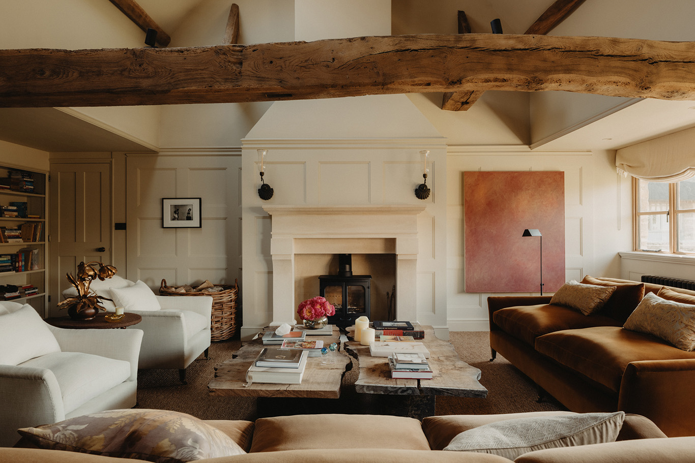
When it comes to incorporating it into interiors, Pantone suggests harnessing its full power with a velvet couch or lacquered wall or, for the more cautious, adding a flash of colour with a Murano light or floral arrangement. As the brand points out: ‘Viva Magenta packs a lot of drama in a small dose’.
Dulux – Wild Wonder

Dulux has opted for a more muted choice this year, with Wild Wonder – a ‘positive, glowing tone, inspired by the natural world.’ The paint company chooses its colour of the year in partnership with a panel of international design experts, who discuss ‘where the world is heading’ and what colour matches the mood of the moment.
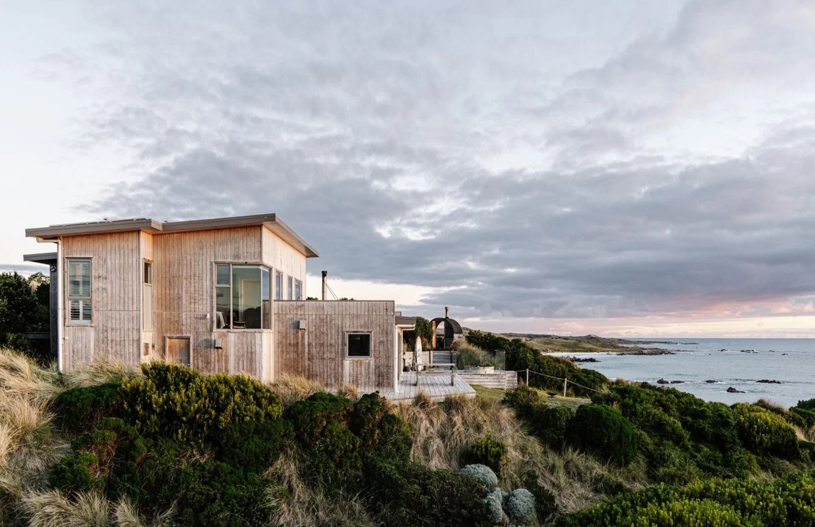
While both Pantone and Benjamin Moore have opted for vibrant shades, Dulux has instead chosen a colour that connects with nature. Wild Wonder evokes sandy dunes, afternoon light and beach pebbles and pairs well with other neutral shades and brighter jewel tones.
Dulux suggests combining Wild Wonder with olive greens, mushroom browns, bubblegum pinks and baby blues.
WGSN – Digital Lavender

The always fashion-forward WGSN looked to the digital world and a growing trend for wellness to predict this soothing shade of lavender. ‘Research suggests that colours with a shorter wavelength, such as Digital Lavender, evoke calmness and serenity,’ says the trend forecaster. ‘Already embedded in digital culture, we expect this imaginative colour to converge across virtual and physical worlds.’
According to WGSN, the colour is going from strength to strength, already embedded in the youth market and well on its way into the fashion and wellness world. They predict we can expect to see it in electronics, lighting and homewares over the next 12 months.

The trend forecaster is also a step ahead of the others, having also predicted the colour that could dominate 2024 – a rusty, vitamin C colour it’s calling Apricot Crush.
Benjamin Moore – Raspberry Blush

Paint company Benjamin Moore is pinning its hopes on Raspberry Blush, which it describes as a ‘vivacious shade of coral tinged with pink’. It’s a big change from 2022, when the brand announced a more neutral sage colour, poetically named October Mist 1945.
Much like Pantone, Benjamin Moore is hoping for an energetic year ahead. ‘Raspberry Blush is the definition of charismatic colour,’ says the paint company. ‘This unapologetic shade of red orange had us thinking: bold, bolder, boldest.’
Suggestions for using the shade range from creating an accent arch to dousing walls and wall panels in the colour. Benjamin Moore has put together a palette of colours to pair with Raspberry Blush, which includes contrasting shades such as Starry Night Blue and North Sea Green.
Farrow & Ball – Wine Dark

Annual shade? Farrow & Ball hadn’t announced a new paint colour in four years until 29 September 2022 when it revealed 11 new additions to its very carefully curated palette of 132 colours.
‘Our relationship with our home has changed so much over the last few years, it felt like the perfect time to introduce these new colours,’ said the brand’s colour curator Joa Studholme. ‘We all feel ready to show off our spaces and personal style.’ Joining the club are colours Stirabout, Eddy, Tailor Tack, Templeton Pink, Bamboozle, Hoper Head, Selvedge, Kittiwake, Wine Dark, Whirlybird and Beverly – encompassing recent year trends of natural greens, soft pinks and inky blues. Bamboozle is a rich rust colour that pairs well with the forest green of Beverly, but our favourite is Wine Dark – a dark blue tone with a hint of violet that works particularly well in bedrooms.
Sherwin-Williams – Redend Point

Blush meets beige with Sherwin Williams’s 2023 colour of the year, Redend Point. The subtle but versatile shade embraces earthy and organic vibes with a subtle pink undertone that is both warming and adventurous. Pink is famed for its calming effect and Redend Point picks up this mantle. Muted but impactful, it works from the living room to the bedroom and office.
Behr – Blank Canvas

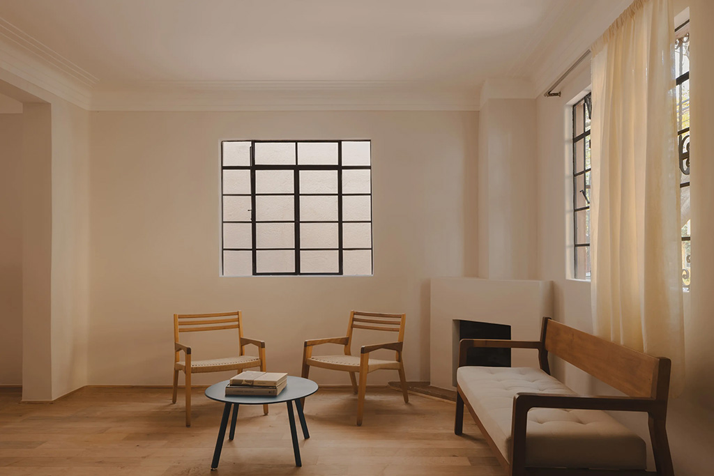
New Year means a fresh start and a clean slate. That’s the thinking behind Behr’s 2023 colour of the year, Blank Canvas. The ‘hopeful and welcoming warm white ‘ has a woody undertone that adds heat and a sense of cosiness. It’s particularly effective in entrances and hallways, setting the tone for all that follows, but fans of minimalism will find it versatile and robust enough to hold its own in living rooms and bedrooms too.


