Experts at the Pantone Color Institute have finally revealed its ‘Colour of the Year’ for 2024, Peach Fuzz. The warm and cosy shade is light, fruity, playful and evokes a sense of peace.
Forecasting colour trends is very research-based: brands pull on sales data to track what consumers are buying and use this data to identify shifts in colours and more subtle shifts in hues and undertones.
Researchers also look to the fashion industry, see what colours are popping on the runway, and film and television. They dig into geographical shifts, demographics, and material markets to predict what could trend in the year ahead.
The result is a closely guarded secret, and Pantone is the last to publicly reveal its 2024 shade, with other brands announcing their top picks earlier this autumn. Now we have the full palette; we look at all the shades you can expect to see through 2024.
Pantone – 13-1023 Peach Fuzz

Wellness is the order of the day for Pantone’s 25th annual Colour of the Year selection, 13-1023 Peach Fuzz, which encompasses our ‘desire to nature ourselves and others.’ The velvety peach tone is a cheerful but serene mix of pink and orange designed to enrich the body and mind.
‘In seeking a hue that echoes our innate yearning for closeness and connection, we chose a color radiant with warmth and modern elegance,’ says Leatrice Eiseman, Executive Director of the Pantone Colour Institute. ‘A shade that resonates with compassion, offers a tactile embrace, and effortlessly bridges the youthful with the timeless.’
Given everything going on in the world right now, it’s an optimistic shade that embodies a desire for gentleness, kindness – and peace.
It’s a very different vibe from last year’s selection, Viva Magenta – 18-1750, a crimson shade encompassing experimentation and ‘self-expression without restraint’.
Pantone’s Colour of the Year is decided annually by a group of the institute’s members from various industries, backgrounds and locations, who look to fashion, interior design, film and the red carpet to see what’s popping. Gucci and Fendi’s summer collections, JLo’s Oscars gown and Kelly Wearstler’s recent projects such as cocktail bar, Dahlia (above) all pioneered the shade.
Use it in bedrooms and dining rooms – and spaces for rest, nourishment and emotional rejuvenation.
Pair it with natural wood tones, reddish oranges, pinks, burgundies and red-tinted purples.
Behr – Cracked Pepper PPU18-01

Behr’s Cracked Pepper – PPU18-01 is at the opposite end of the spectrum, a deep peppery black designed to stimulate the senses. It’s ‘a versatile soft black that accentuates the spaces you create life moments in,’ says the company, and it works well applied monochromely to spaces or as an an accent.
While using black or deep navy shades in the home was once considered a daring move, it’s become increasingly popular in recent years and is a moody inversion of the classic ‘all white’ minimalist look.
Use it in bedrooms, dining rooms and living rooms.
Pair it with soft white tones, natural woods, rattan and tan leather. It can also pair well with olive greens and burnt orange shades.
Benjamin Moore: Blue Nova CC-860

It could be the title of a Woody Allen movie, but Benjamin Moore’s 2024 shade Blue Nova CC-860 is inspired by space exploration and the cosmos. The brand teamed up with aerospace company Blue Origin to announce the colour, a blue-violet hue that is said to spark adventure, optimism and new horizons. Says Benjamin Moore: ‘Depth and intrigue are balanced by an undercurrent of reassurance. This alluring mid-tone features an enchanting duality, capturing the spotlight with endlessly classic appeal.’
Use it in living rooms, offices and ‘through’ spaces such as hallways.
Pair it with the tangerine-tinged shade, Topaz.
Sherwin Williams – Upward SW 6239

It’s onwards and upwards for Sherwin Williams, who picked this whimsical, soft blue shade as its 2024 Colour of the Year.
Upwards SW 6239 is a breezy, celestial hue that evokes a sense of freedom and lightness – with a ‘hint of a silver lining’. Blues are typically known to be calming, relaxing colours that promote stability and reliability. This lighter denim tone heightens that sense of positivity, contentment and creative thinking.
Use it in kitchens, bathrooms, wet rooms etc – especially those with natural stones. It also has quite an impact when used on exteriors.
Pair it with cool pastel tones.
Dulux – Sweet Embrace

Barbie was undeniably the breakout cinematic hit of the summer; its blockbuster marketing campaign doused cities across the globe in vivacious bubblegum pink and encouraged us to all be a bit more Barbie. Dulux has opted for a soft, plaster-like pink shade for its 2024 CoTY, Sweet Embrace, a calming, soft hue that works like a neutral while adding texture and warmth. This versatile colour adapts to light orientation, adding warmth to north-facing rooms and balancing tones in east and west-facing spaces.
The plaster pink shade is also an excellent base for darker, more decadent accents and rich textiles (like velvet and heavy fabrics) or brightly coloured cabinetry and furniture.
Use it in larger rooms, living rooms and bedrooms.
Pair it with warm greens and rich, contrasting colours where it can act as a neutral.
HGTV Home by Sherwin Williams: Persimmon

Pantone isn’t the only one plugging for a peach in 2024: HGTV Home by Sherwin Williams has picked Persimmon as its 2024 CotY, a fruity orange shade with mid-pink tones. The refreshing colour is lighter than earthy terracotta and adds a sense of youthful vitality and energy to a space.
Use it confidently in shared spaces (dining rooms and entertainment spaces) or as an accent in more neutral spaces.
Pair it with more neutral window dressings and upholstery.
Valspar – Renew Blue (8003-37D)

Valspar is also leaning into the theme of rejuvenation for its 2024 CoTY – its 15th annual pick. Dubbed Renewal Blue 8003-37D, the colour is inspired by ‘fleeting elements like fog, mist, clouds and glacier lakes,’ says Sue Kim, Valspar’s director of colour marketing. ‘Renew Blue elevates everyday mood, encourages self-expression, and evokes a feeling of balance and calm’.
With a slight green undertone, Renewal Blue is brighter than Sherwin Williams’ whimsical Upward Shade and is a robust and versatile tone that acts like a neutral shade and works well in ‘through spaces’. Valspar also suggests using Renew Blue for colour drenching – i.e. dousing the entire room in the cheerful shade.
Use it in entryways, dining areas and the kitchen.
Pair it with more of the same.
Dunn-Edwards – Skipping Stones (DET567)

US paint brand Dunn-Ewards is celebrating 99 years in the business with its 2024 collection, New Dawn. Among the collection of nature-inspired hues is Skipping Stones – an introspective colour inspired by the peaceful feeling of skipping stones across a lake.
The colour is a steely blue shade with undertones of green and grey. Its serene quality evokes a connection to the sea.
Use it in bedrooms, studies, and rooms earmarked for quietude.
Pair it with neutral tones and dark accents.
Graham & Brown: Viridis (121592)

Nature inspires many of this year’s top colours, but while many have looked to the sky and sea, Graham & Brown has looked to the earth for Viridis – an understated green shade that promotes new beginnings, peace and wellbeing. The muted hue makes a big impact when used singularly in the living room or spaces for entertaining and is versatile enough to work in entranceways and passages.
Maryanne Cartwright, Graham & Brown head of design, says, ‘[Virdis] creates such a calming effect with tones of new beginnings, perfect for entertaining’ while conjuring a sense of stability we seek in the home.
Use it in ‘entertaining spaces’ – i.e. living rooms, media rooms, bars and backyard areas.
Pair it with natural finishes and materials, neutral tones or, conversely, black.
Dutch Boy Paint: Ironside 422-7DB

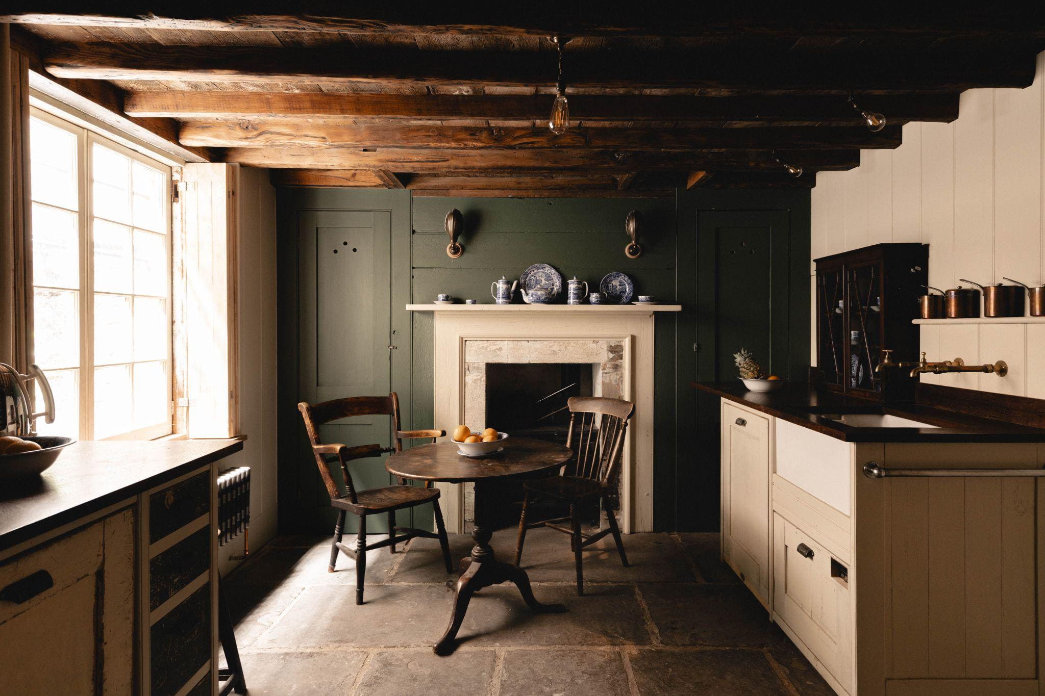
Deep, moody green is the order of the day for Dutch Boy Paint, which picked the playfully titled Ironside as its 2024 CoTY. The comforting colour ‘soothes and reassures’, explains Dutch Boy’s colour marketing manager Ashley Banbury of the tone, which has a clay undertone.
The collection is part of the brand’s 2024 palette – Heritage Brown, Antique White, the steely Whale’s Tail and Ironiside – and encourages mental relaxation and bodily rejuvenation through rest. But it also works fantastically as a grounding counterpoint to brighter shades, like wild orange or grouted sand, strawberry shade, and pineapple flan.
Use it in more formal living rooms and entryways or for trims, doors and alcoves in brighter spaces.
Pair it with heritage brown and antique white.


