Tiles might reign supreme in the bathroom and the kitchen, but there’s a host of other interior spaces and objects we don’t traditionally associate them that are crying out for a tile-driven revamp.
Some designers are ditching wallpaper and paint and finding entirely new ways that porcelain and ceramic tiles can add rhythm, colour, pattern and scale to spaces – both public and private.
Bedrooms

At first thought, the bedroom can seem at odds with tiled elements – but think again. The tactility and colour pigments (especially the rouge hues of terracotta) inject warmth into this private and cosy domain.
Handmade mosaic tiling runs throughout Arles hotel L’Arlatan, including in the bedrooms. Cuban-American artist Jorge Pardo oversaw the interiors, using 6,000 sq m of handmade tiles in different colours and shapes to create a kaleidoscopic effect underfoot. It’s a far cry from the building’s former life as a car park.
View this post on Instagram
Tiled flooring is a no-brainer in countries that regularly hit the 30-degree mark, but for colder climes, there are other surfaces where tiling can be installed with dramatic effect.
Fiandre Architectural Surfaces’ Roc Ancien line is used to create a patterned, wall-sized headboard. Or you could follow Casa Ceramica’s example and pair huge, patterned floor tiles with textured, tiled wall panelling for a more maximalist effect.
View this post on Instagram
Living rooms

Courtesy Ceramiche Refin
Courtesy Ceramiche Refin
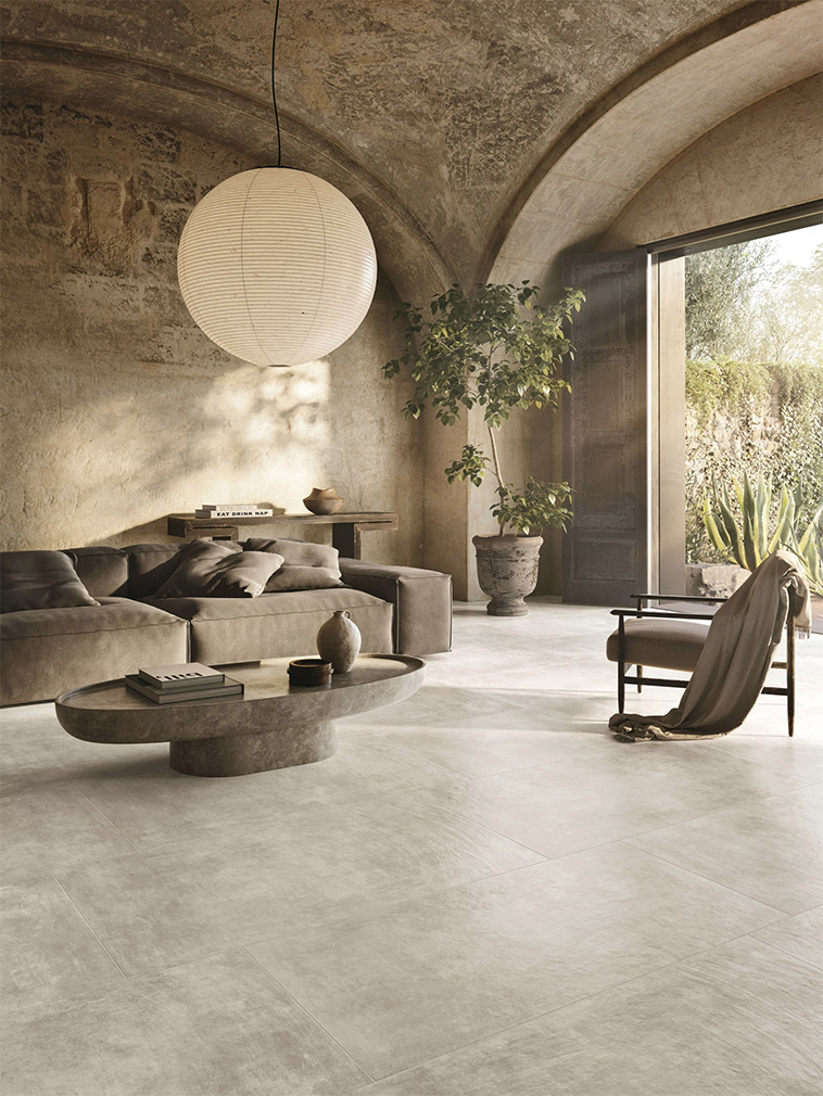
Tiling can form a backdrop in living areas, contrasting the typically ‘softer’ feeling of these spaces. Italian brand Ceramiche Refin‘s Affrescati range uses traditional pigments to create porcelain tiles resembling painted surfaces, which can be used on floors as well as walls.

Floor tiles can also complement a minimal interior design approach, as in this Puglia villa. Villa Ostuni uses a neutral colour palette alongside a stone mosaic floor that connects the living space to the rest of the property.

And at this London pie and mash shop turned home, tiles are the statement piece, wrapping the ground floor of the building from floor to ceiling. Victorian green-and-white wall tiles and clay-coloured floor tiles date from the building’s commercial use. They’ve been softened for a domestic space with the addition of built-in cabinetry. Glossy ceilings also evoke this lattice framework, while evoking the milky translucency of a Japanese shoji screen.
Dining rooms and restaurant interiors
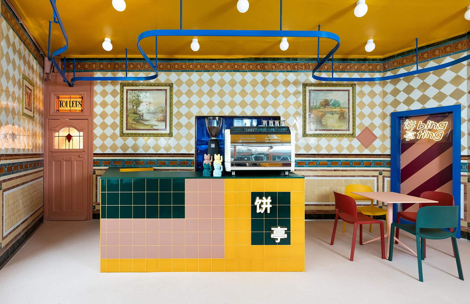
Bing Ting Cafe, in England’s Hull, showed what is possible when restaurants go beyond the classic black-and-white bistro floor. The former butcher’s shop was already covered in ornate wall and floor tiles (heritage listed ones, no less). They’re echoed in new expanses of tiling that pick up on the original colours. Studio Sam Buckley completed the look with brightly coloured furniture and neon lighting.
View this post on Instagram
Oversized tiles can also change up the aesthetic, as shown in Palma hotel Concepció by Nobis, which uses green and white tiles to contrast the stone arches of its restaurant.

In India’s Chandigarh, Renesā Architecture took a more radical approach to tiling. The Tin Tin restaurant is covered in a ‘mosaic matrix’ made of hand-laid stone and terrazzo, wrapping around counters, dining nooks and floors. The end result is an eye-bending collage of grids.

Madrid pastry store Cara Mela used tiling to mark the transition from store to dining space. While the counter and lobby are decked out in crisp white tiles, they ‘spill’ over into a sea-green tiled area at the back of the bakery – filled with metal stools and tables for guests to perch and enjoy chocolate tarts and toffee apples. This ‘zonal’ use of styling can also be translated into domestic spaces.
Furniture
View this post on Instagram
Tiles can make an impact off the wall as well, as seen in furniture designer Max Lamb’s Working Tile series of seating with Japanese brand TAJIMI.

You could also take inspiration from this Masquespacio-designed restaurant in Valencia, which took the maximalist tiled walls onto the furniture, covering tables in a checkerboard pattern. Plinths, side tables, armchairs and alcoves are also good ceramic covers.
View this post on Instagram


