Shifting attitudes to fast food are nudging some restaurants into changing their tune. No longer is it just about a quick in-and-out service and leaving napkins and straws by the exit. Today’s dining experience requires not only quality – preferably healthy – grub, but also an atmosphere that will draw people in off the street and make them linger a little longer.
Chains and one-off food joints are cottoning on to the power of interior design. Gone are the quirky pictures of Ronald McDonald and the statuettes of Colonel Sanders, these new-age ‘fast casual’ joints have gone upmarket in their look.
The 6 pitstops here are proof that the fast food scene is evolving…

After a series of flashy experiments in Amsterdam and Sydney, the revamped McDonald’s at Hong Kong’s Admiralty Station is a deliberately sober affair, described by its designers as ‘an exercise in non-design’. Landini Associates have swapped the typical gaudy McDonald’s colours for a pared back palette of grey, white and taupe. ‘The intention is to hero the food, the service and the people who come to enjoy it, and to create a “recognisable neutrality” that allows this to happen,’ they explain.
Concrete tables and atmospheric lighting abound, but perhaps the biggest change is the open kitchen, which allows visitors to see their burgers being whipped up. McDonald’s Corporation CEO Steve Easterbrook recently told investors that the chain had put too much focus on the ‘transactional, less emotional aspects of our brand’, which explains this moody new direction. Said Landini Associates: ‘This calmer, more intimate solution delivers a relaxed nighttime experience for the diners and a sharper quicker one for the day.’
Photography: Ross Honeysett

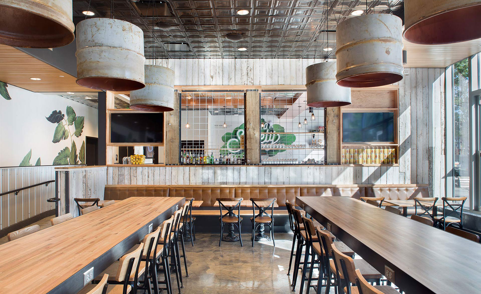
Denver practice Rowland+Broughton Architecture crafted a ‘barn meets loft’ concept for the interior of new rustic roots eatery Honor Society, near Denver’s Union Station. The practice deliberately selected ‘finishes and materials that would have been used while building a farm structure’, says R+B’s senior interior designer Jayna Kline.
Dining room walls are clad with reclaimed wood from Kentucky horse farms, while the floor is polished concrete and the ceiling geometric-stamped tin. Furniture has been made from waxed steel and reclaimed oak, and a wire screen set within barn beams – modelled after the fencing used for pig enclosures – separates the main hall from an elevated bar space, clad in in metal wainscot. The menu, as you might expect, tackles traditional American favourites, such as short ribs, grilled and fried chicken.
Photography: Honor Society

Colonel Sanders has been banished, along with KFC’s traditional red-and-white colour palette, in the fried chicken brand’s UK restaurants. Its in-house design and marketing team, as well as its I-AM agency, collaborated with consultants R&R and Finch Interiors on a new design concept, which is gradually being rolled out across its British stores.
‘The overall intention was to create a relaxed, informal and contemporary interior that challenged the perception of “fast food” restaurant environments,’ says R&R. It adds that the use of natural materials ‘enhance the overall ambience’ and specially commissioned illustrations and artwork of ingredients ‘create a more personal touch’. Red is now only used sparingly as an accent colour.
Photography: Cloud 9 Photography

London’s fledgling restaurant chain Bird – a fresh spin on the classic chicken shop – has put design at its centre from the word go. It has enlisted a stellar team of Brinkworth and furniture designer Michael Marriott to craft its trio of spaces. At the Islington outpost in a former pub, the designers have celebrated the building’s 1930s history, stripping back the exterior to reveal glazed bricks and old signage, while exposing the brickwork inside the building. Neon signage provides a nod to the new.
‘The patchy, mismatched brick wall to the rear of the space, was a perfectly contrasting backdrop to the bright white neon BIRD logo,’ says Marriott. ‘The brick adds a rich layer of texture and life to the venue.’ Rough finishes offset the signature orange perforated steel fittings and blue tabletops. Since opening the Islington space in October, they have opened a smaller space in Camden and have plans to expand beyond London.
Photography: Louise Melchior

Architects CORE dished up this Baja-inspired interior for new ‘fast-casual’ taco joint, Buena Onda in Philadelphia. Evoking the atmosphere of Mexican beach towns, the 2,300 sq ft restaurant’s colour-blocked tiling and upholstery also echoes the work of Mexican architect Luis Barragán.
White wooden slatting – which takes cues from Mexican grass-thatched beach huts, called palapas – helps divide the restaurant, while tactile Acapulco chairs complete the look. In the kitchen, chef Jose Garces plates up tacos, quesadillas and other traditional Mexican ‘fast’ dishes that use locally and sustainably sourced ingredients. Buen provecho.
Photography: Michael Moran

Create London, a specialist in reviving some of the capital’s disused buildings, has opened a ‘healthy’ chicken shop inside a Victorian fire station in London’s Tottenham. It serves local school kids during the day while at night it operates as a restaurant and bar.
Newly-crowned Turner Prize winners Assemble were tasked with designing Chicken Town and settled on a aesthetic bursting with primary colours. Exposed pipes and doorframes have been painted in red while chairs are bright yellow. Shades of blue and green cover the banquette seating and lower half of walls. Natural wooden table tops add a warming touch to the space along with the brass counter tops by the bar. It’s not your average chicken shop.
Photography: Emil Charlaff


