Small homes are now the norm but living with less square footage doesn’t have to be cramped or impractical.
Designers are creating custom furniture solutions that challenge the perception that bigger is better and draw on a myriad of inspiration, from jigsaw games to renaissance art.

Jonathan Tuckey Design recently completed a conversion project situated in a Georgian townhouse in Marylebone, that used furniture to divide up a large internal volume in a multifunctional way. ‘We created rooms within rooms in order to reorder, utilise and retain its grand proportions,’ the practice said.
Their inspiration? Louis Khan’s castle plans, which show great central halls with auxiliary spaces set into thick walls, and Antonello da Messina’s St. Jerome In His Study painting, showing a wooden workspace within the grand proportions of a church.
We’ve compiled six useful tips on maximising space – and squeezing the most out of every corner of your own home.
Built-ins that blend in

Fitted storage walls provide a neat solution to the issue of a poorly configured layout while giving ample space to keep belongings hidden away, without taking up lots of floor space.
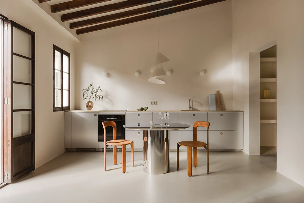
Custom cabinetry is also useful for hiding odd shapes such as those created by alcoves and chimney breasts and turning uneven spaces into square or regular shapes. Minimalist cupboards with flush finishes (edge pulls, monotone colours) streamline everything and work in both period and contemporary homes.
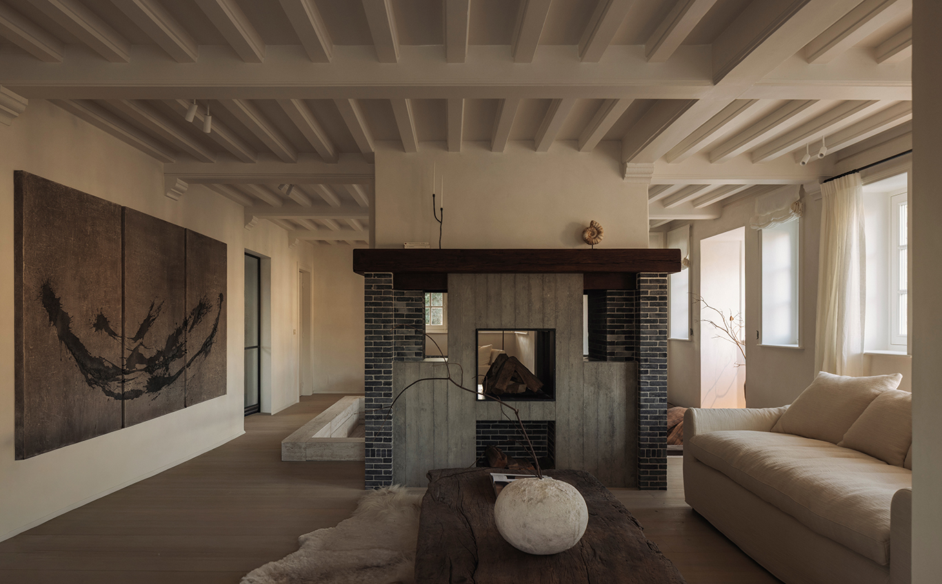
Need to subdivide a large room into several spaces? Architectural joinery can be used to form rooms within rooms, such as Jonathan Tuckey’s Marylebone design, as well as rooms between rooms, or antechambers. Installing tall cabinetry connects with the vertical proportions in an interior space, which often gets overlooked.
Moving panels instead of walls

Walls don’t have to be static. Pivots or sliding ceiling tracks turn them into room dividers as well as cupboard frontage. Moveable room-sized doors take their design cues from shoji screens in Japanese interiors, which are traditionally made with a wooden frame and translucent paper, though solid wood is a good option, too.
Even better for small or awkward living spaces are pocket doors that slide back into the wall rather than swing open. This Victorian innovation is making a comeback, and is bespoke, requiring a wall is either constructed to suit the door, or a pocket is created specifically for it. Look for a design with neat lines to accentuate that uncluttered look.
Open tread staircases

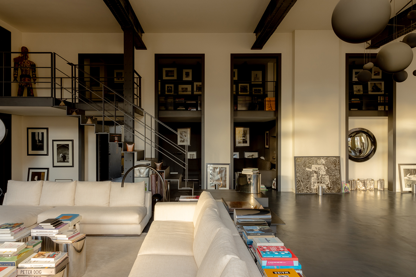
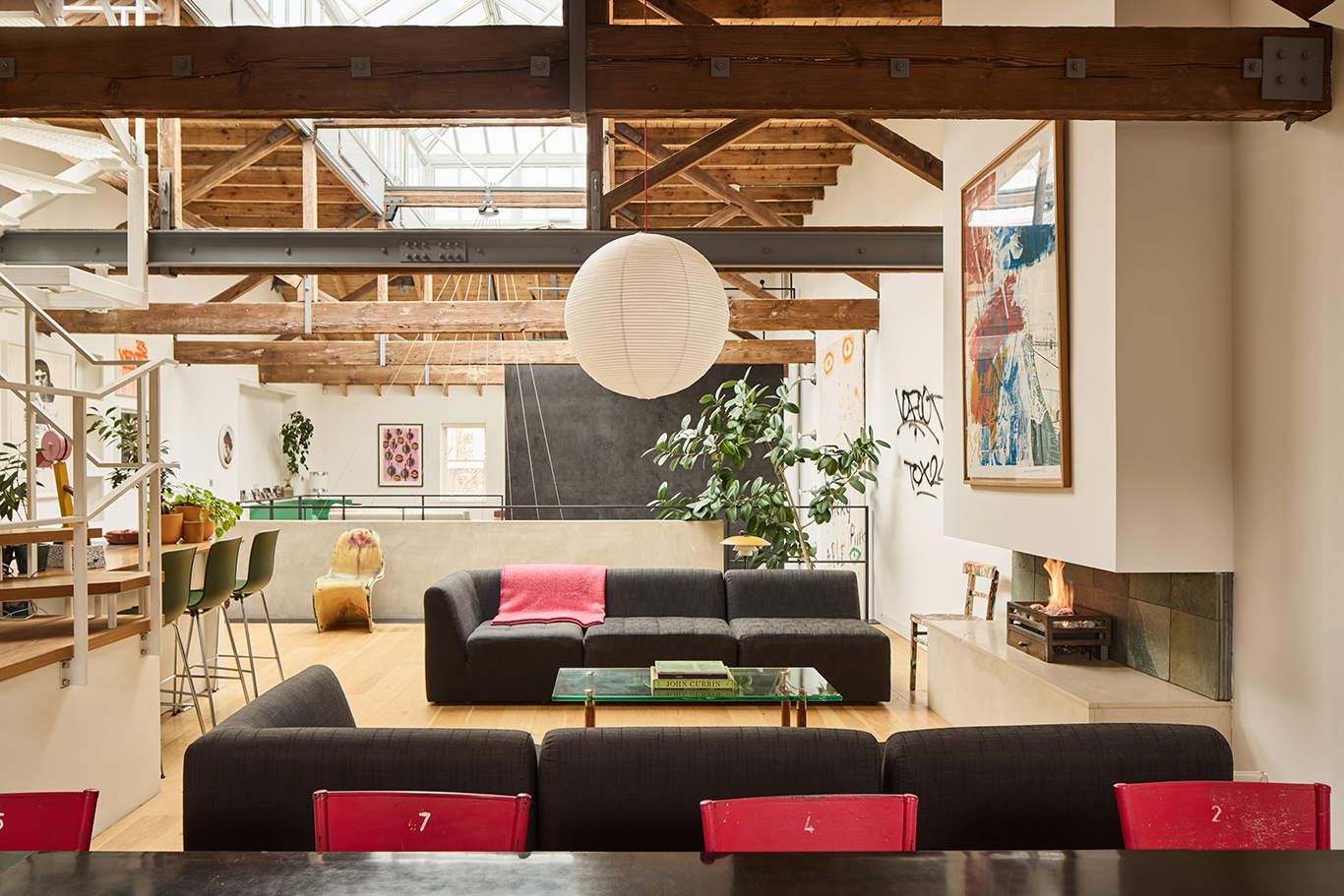
Open tread, floating or cantilevered staircases, have a lightweight appearance and take up less physical space than standard boxed-in designs. They allow for natural light to pass through and provide sightlines into other parts of the home and beyond. Open treads increase the useability of under the stair space due to higher light levels.
Skylights and picture windows
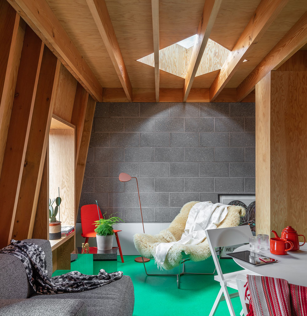
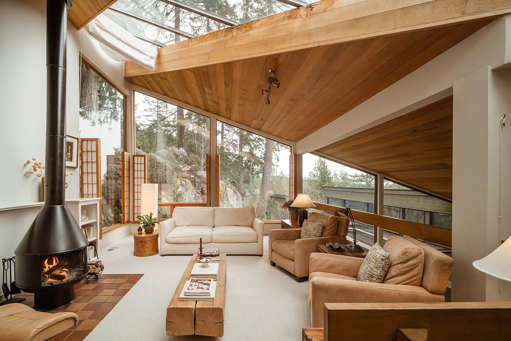
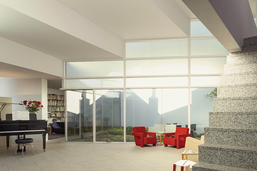
Strategically placed picture windows and skylights can have many space-increasing advantages. Both draw the eye outside while bringing in glimpses of nature and amplifying light, especially in dark corners like stairwells.
Rethink lateral levels

Need more rooms than your home’s footprint will allow? Consider an interlocking jigsaw configuration like Bradley Van Der Straeten’s award-winning extension, Two and a Half Storey House. Here it was possible to merge the layouts of two adjoining storeys in order to create additional rooms.
Bed areas could be put on a raised platform as it requires less head height, giving the room below a higher ceiling, or a sunken floor would allow for a higher ceiling overhead. Meanwhile, space-saving innovations such as vacuum insulation panels can be used in limited floor and roof depths.
Studio living design

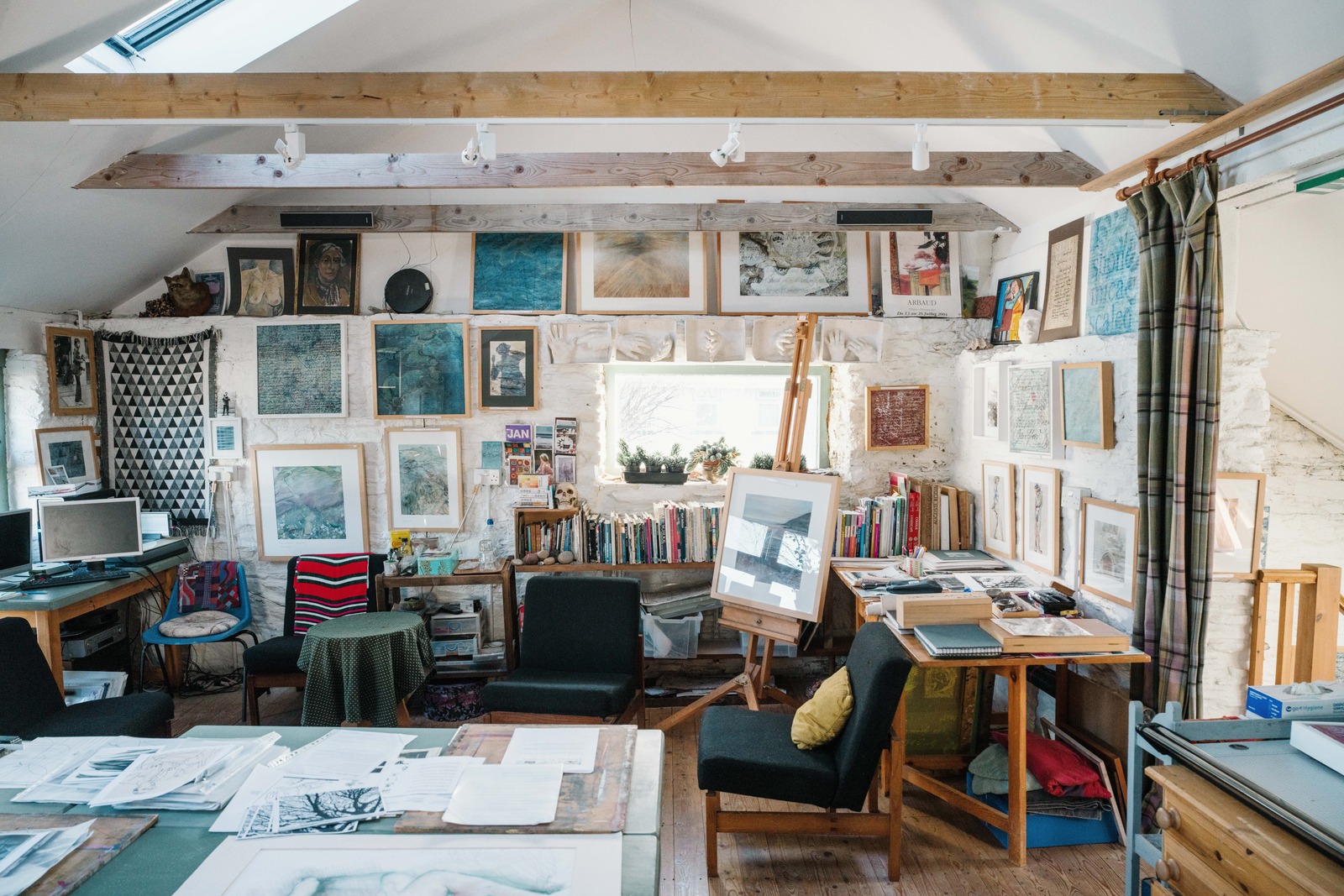
Take design cues from studio flat living, in which the sleeping, eating and living areas are all contained in one room. Invest in a central, multi-dimensional piece of custom joinery that could form reading, dining and living areas, while allowing for easy access via a circular walkway. An all-wood structure creates a warm feel while a sense of space is added through the continuity of materials, while skylights pour light into corners where traditional windows can’t reach.


