Creating natural, earthen interiors all starts with the right colour palette. And few tones evoke a sense of grounded, sustainable style more than terracotta.
From deep, burnt reds to subtler pink clays, this versatile spectrum of hues is earmarked as a major trend for 2025.
Whether you are after an intense drench of colour or a punctuation of contrasting shades and materials, there are plenty of ways to paint, weave, tile and plaster terracotta into your life and space.
We spoke to five interior designers who have done just that.
Natural Beauty

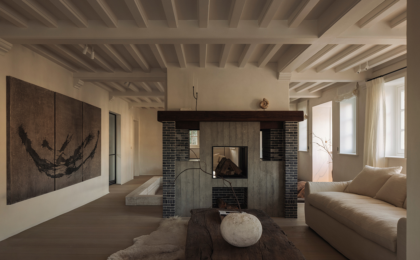
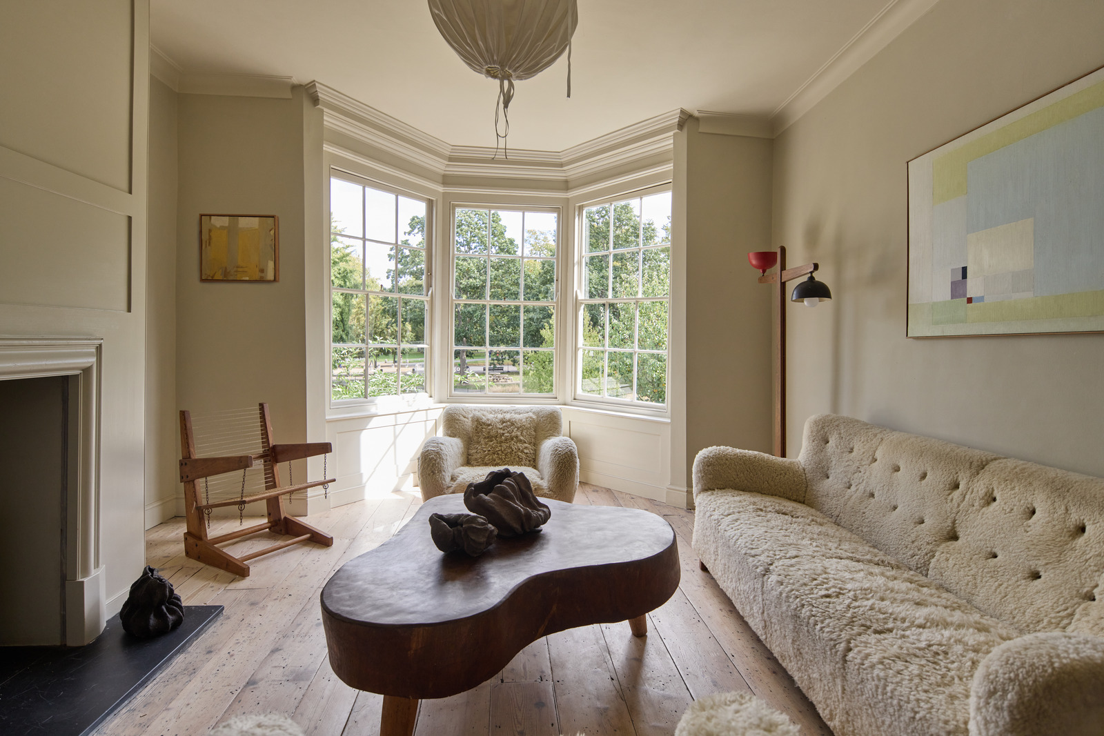
The beauty of working with an intrinsically natural colour palette like terracotta is that the desired finish can often be achieved using raw materials. Interior designer and director of K&H Design Katie Glaister discovered this when plastering her own living room. ‘The finish is just the regular Gypsum Finish Coat plaster,’ she says.
‘As the decorators were about to slap on a coat of primer I decided to simply seal the raw plaster with a matt sealant. I never expected the result to be so effective. Raw plaster creates a stunning terracotta hue and adds warmth and depth with its earthy, natural tones. The subtle variations in texture and colour give walls a handcrafted, organic feel that pairs beautifully with both old and new furniture pieces and matte finish softens light which creates a cosy and inviting feel. It’s the perfect backdrop for an inviting living room. Welcoming, cosy and chic.’
www.kandhdesign.co.uk
The Terracotta Touch

From colour washes to the power of punctuation, terracotta and deep, earthy tones are ideal for injecting a splash of contrast into a room. Especially given how well the palette works alongside an array of other colours and materials. In a South Kensington townhouse, interior designer Kate Guinness of Kate Guinness Design has used terracotta touches to draw people into the home from the second they walk through the front door. A deep, earthen red console table in the hallway and a terracotta stair runner create magnetic, welcoming pops of colour against the dark blue walls.
‘The blue colour in the hallway flows not only through this area but on throughout the whole staircase compartment of the 5-storey building,’ says Guinness.

‘We knew it would need a lift on account of it being such a big expanse of a single colour, so we opted for a complex stair runner to add contrast and warmth to the space.’ The splash of terracotta is repeated in the drawing room, where sofa seat cushions create eye-catching points of interest. ‘The room is flooded with natural light,’ says Guinness. ‘So, we went with terracotta on the main furnishings as we needed something that would work well with the hot summer sun as well as with the cooler winter light and a roaring fire — for us, terracotta struck the perfect balance.’
www.kateguinness.co.uk
Build it up

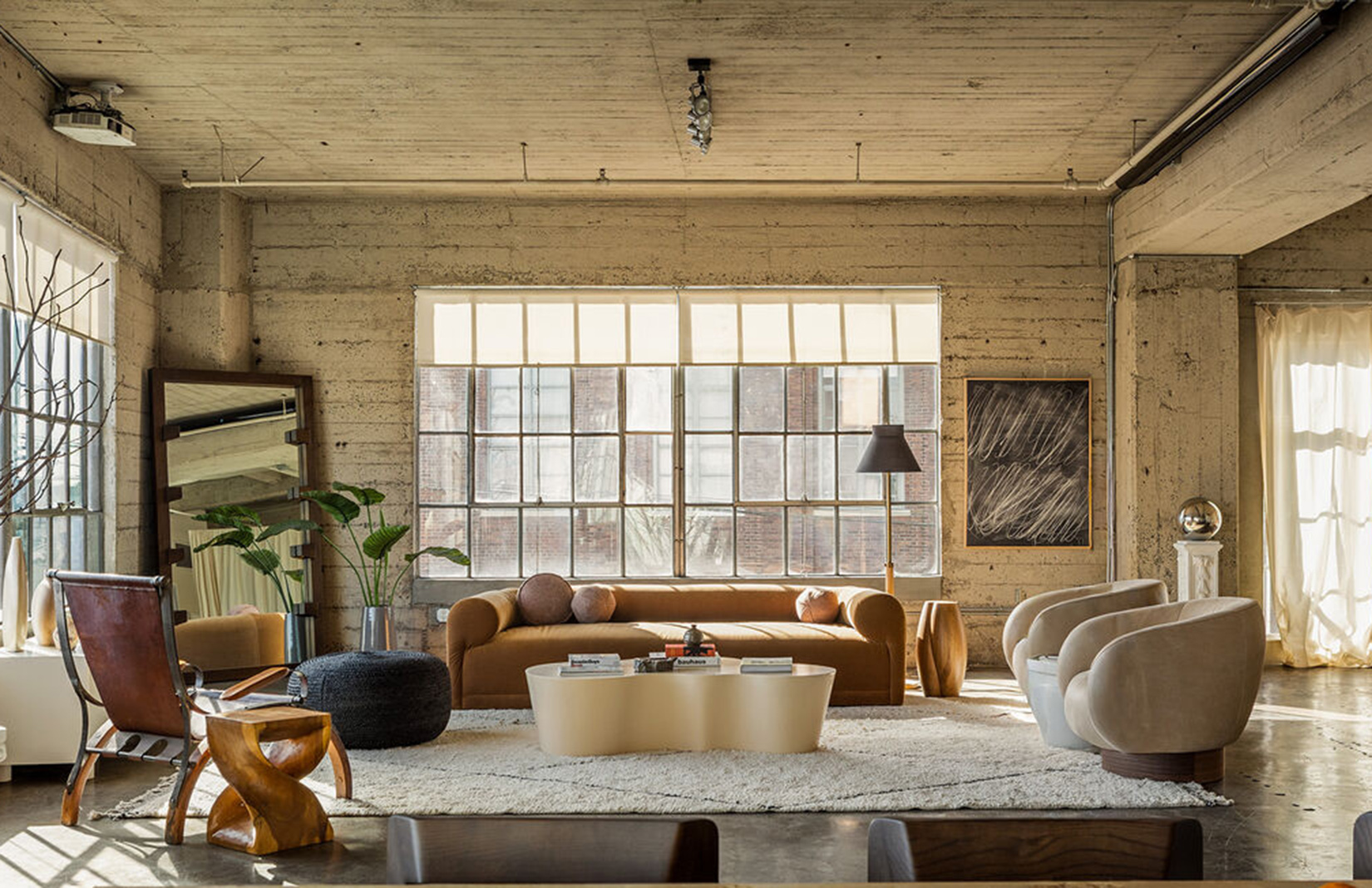
Don’t be afraid to layer terracotta on terracotta on terracotta. It blends well into its surroundings – particularly when paired with other natural materials – no matter how much you build on the palette. Jacu Strauss, creative director at Lore Group and founder of Lore Studio, has done just that throughout One Hundred Shoreditch.
An east London hotel, the property’s light-bathed lounge area overlooking the City of London is anchored by a large terracotta-toned leather seating area. This is then used as the base for a collection of clay-pink lamps and, added to that, terracotta planters. ‘Unlike the overt femininity of traditional pinks, muted, clay-like shades feel grounded and sophisticated, effortlessly blending with natural materials like wood, linen, and ceramics,’ says Strauss. ‘Earthy pink tones bring warmth, subtlety, and a sense of organic elegance. These tones have an inherent softness. When combined with deep browns or rust tones, they become warm and inviting, evoking desert landscapes and sunbaked clay. When set against cooler greys or charcoals, they take on a modern, understated edge.’
www.loregroup.com
Down to Earth

Terracotta translates as baked earth and, as such, is right at home as both a floor material and colour choice. From boot rooms and hallways to kitchens and pantries, it evokes a relaxed, homely style when used in its natural state. It can also be deployed as an injection of colour using a different material entirely – as demonstrated in this bathroom design by Vaughan Design and Development, where marble tiles take centre stage. ‘The brief from our client was for a timeless design, but with enough interest and warmth that it felt like an inviting space that you would want to spend time in,’ says director Holly Vaughan.
‘The slightly richer terracotta tones of this Rosso marble were perfect to ground the pale pink on the walls and the other neutral colours of the zellige tiles in the shower. In a space where there are so many ‘hard’ elements and materials, a warm, pinky tone can really soften the overall look.’
www.vaughandesignanddevelopment.com
Lighten Up

Going down the terracotta route doesn’t mean you have to go for a strong, burnt tone. Especially if your space calls for something with a little less intensity. Looking to the lighter end of the spectrum can result in an equally arresting look, says Sophie Pringle, creative director of Surrey-based interior design practice Pringle & Pringle. ‘We used a paint called Jonquil by Edward Bulmer in one of our projects and it’s a colour we love because so many other colours sit well with it,’ she says. ‘It also feels different under different lighting, which keeps things interesting; light and bright during the day, with a much cosier, warmer tone when under lamp light or candlelight. We painted the joinery in with the wall colour to avoid breaking up what was quite a small space. By drenching the room, it feels much bigger and more cohesive.’
www.pringleandpringle.co.uk