Photography: Pantling Studio

Photography: Pantling Studio

Photography: Pantling Studio
Photography: Pantling Studio
Photography: Pantling Studio
Photography: Pantling Studio
Photography: Pantling Studio

Photography: Pantling Studio
Photography: Pantling Studio
How do you bring an online retailer into the physical world?
That was the challenge facing UK design practice Studiofibre, tasked with creating workspaces in London, New York, Hong Kong and Shanghai for digital fashion platform Farfetch.
‘What we do is create a 3D bricks and mortar version of a brand,’ explains Studiofibre co-founder Fiona Livingston. ‘A huge part of Farfetch’s DNA is curation – they essentially curate fashion [from 400 brands across the world]. So we approached the project like a curation project too… We wanted the experience to be like visiting a gallery.’
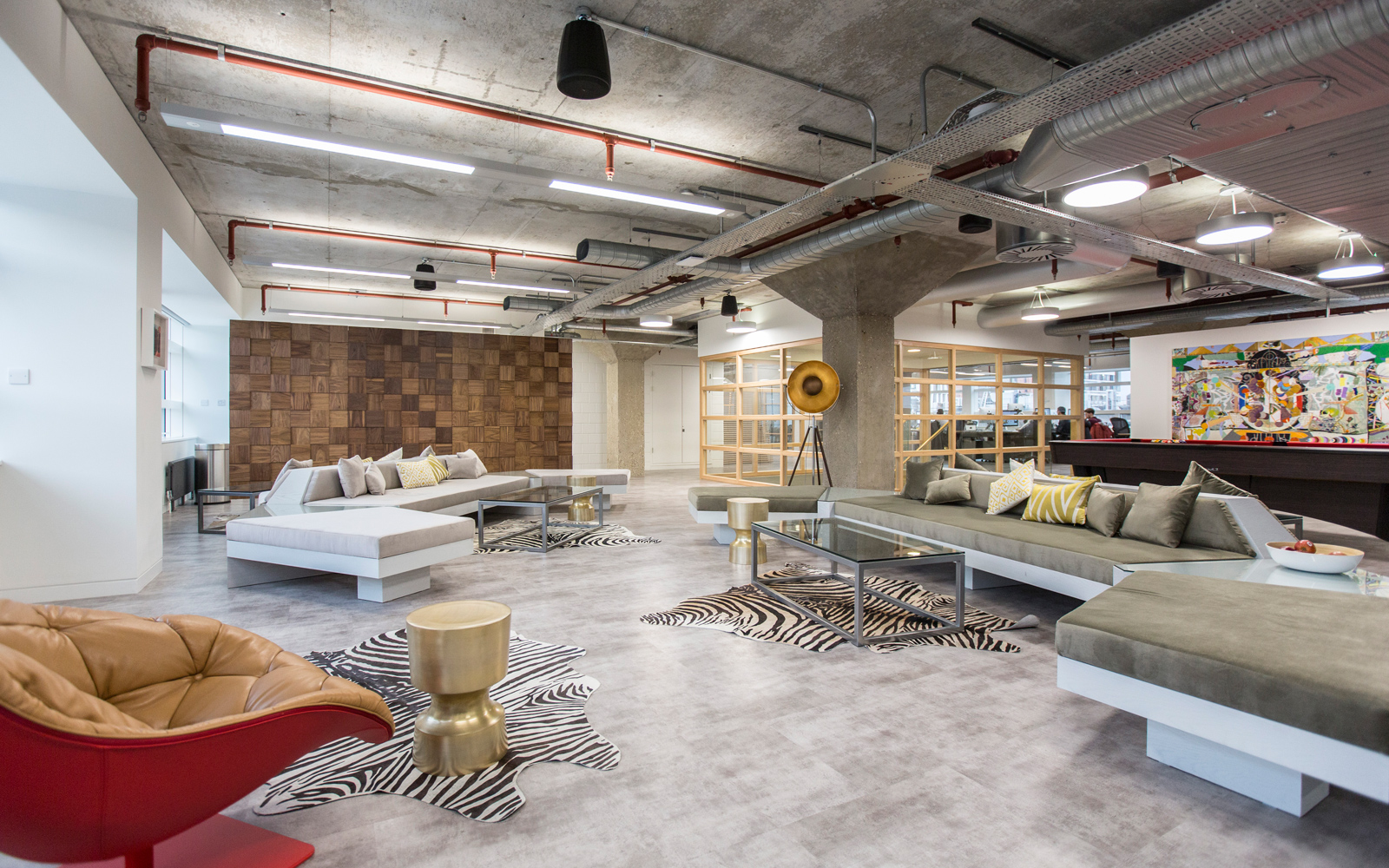
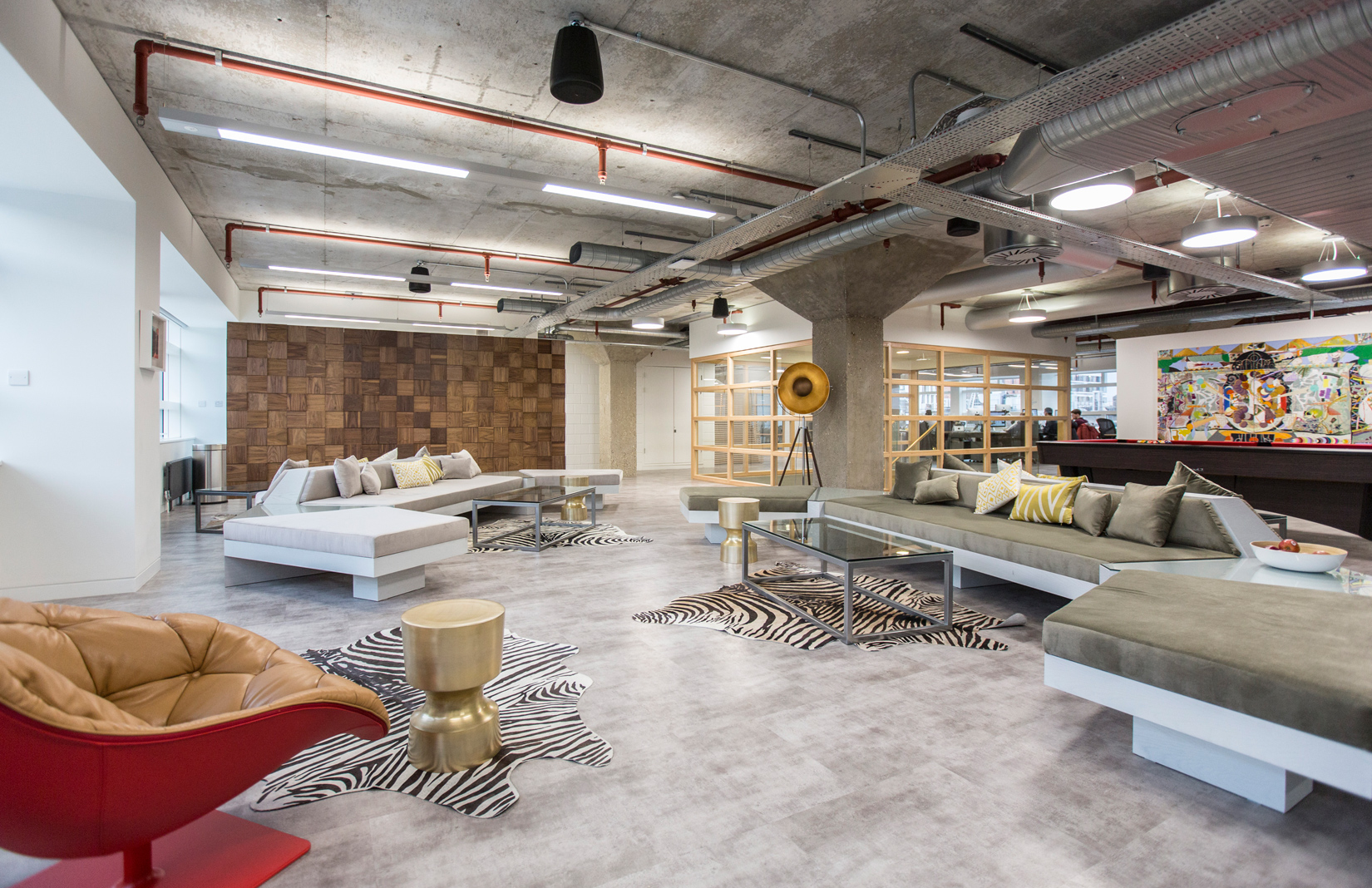
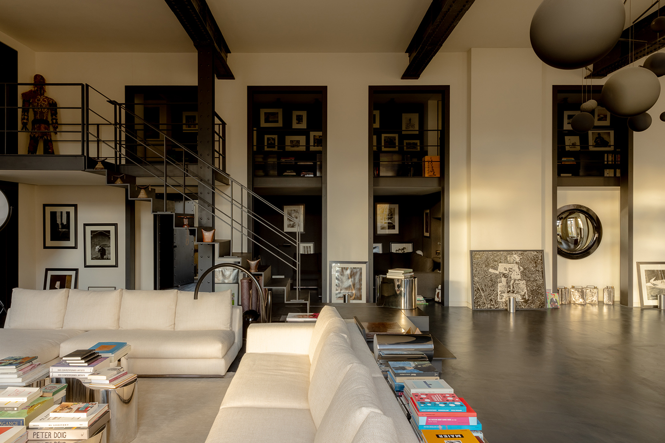
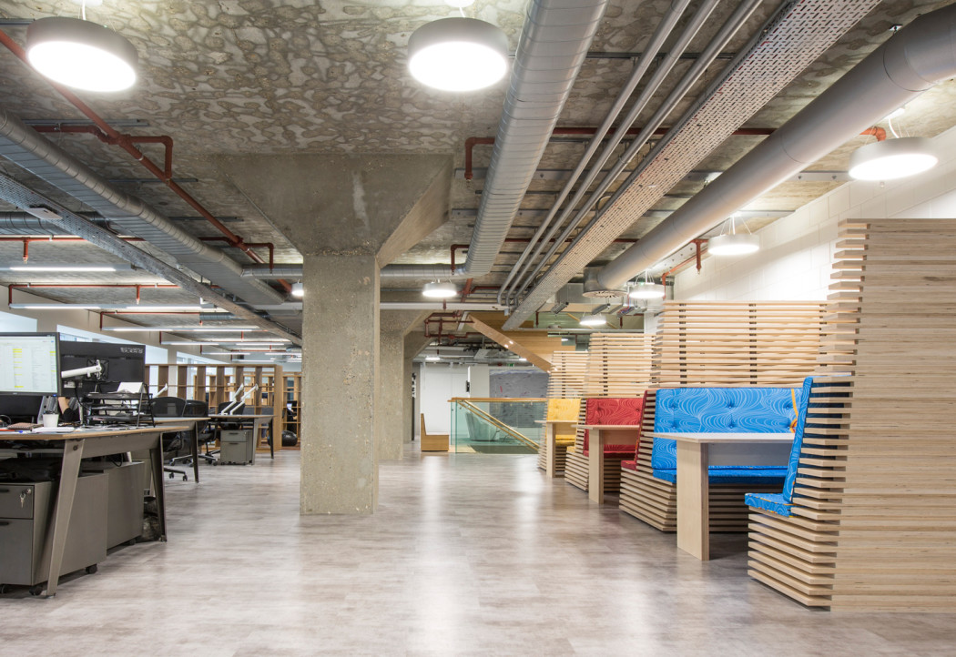
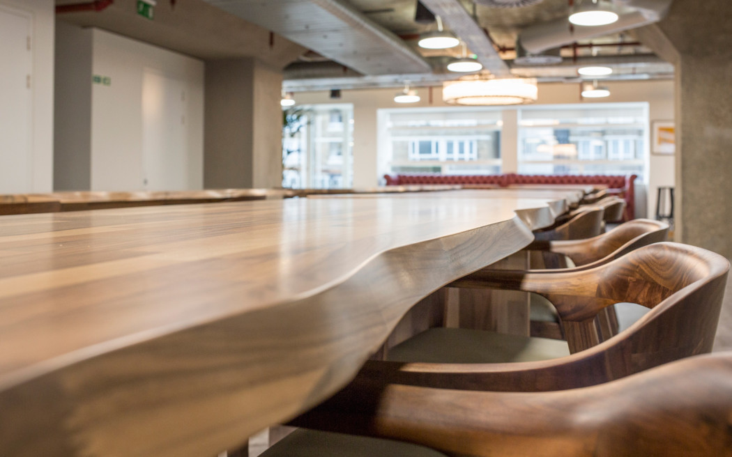
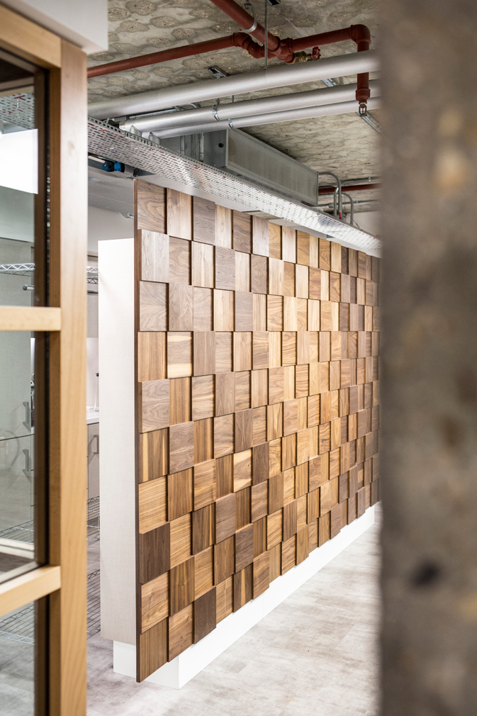
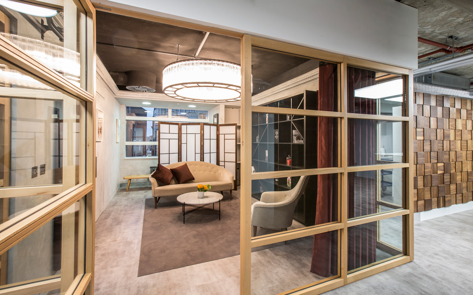
Each of the large, industrial-style HQs is filled with furniture designed by Studiofibre or custom-made by an eclectic group of suppliers. A variety of textures and finishes also give the spaces a tailored feel. In the 38,000 sq ft London HQ, for example, concrete floors and ceilings are offset with slatted wooden booths, bamboo tables and a marble reception desk.
‘We’ve rolled out a global language to those four locations,’ adds Livingston. ‘In Shanghai, you’ll see the same partitioning, same furniture, and lots of the same elements – there’s marble reception desk in all of them. If you walk out of the London space and into the New York one, you know you’re still in the Farfetch world.’
The brand’s new HQs include open-plan meeting spaces, restaurant/bar areas that doubles as a public events spaces – a facility Farfetch lacked before – as well as project rooms and bespoke ‘breakout’ booths made from slatted plywood.
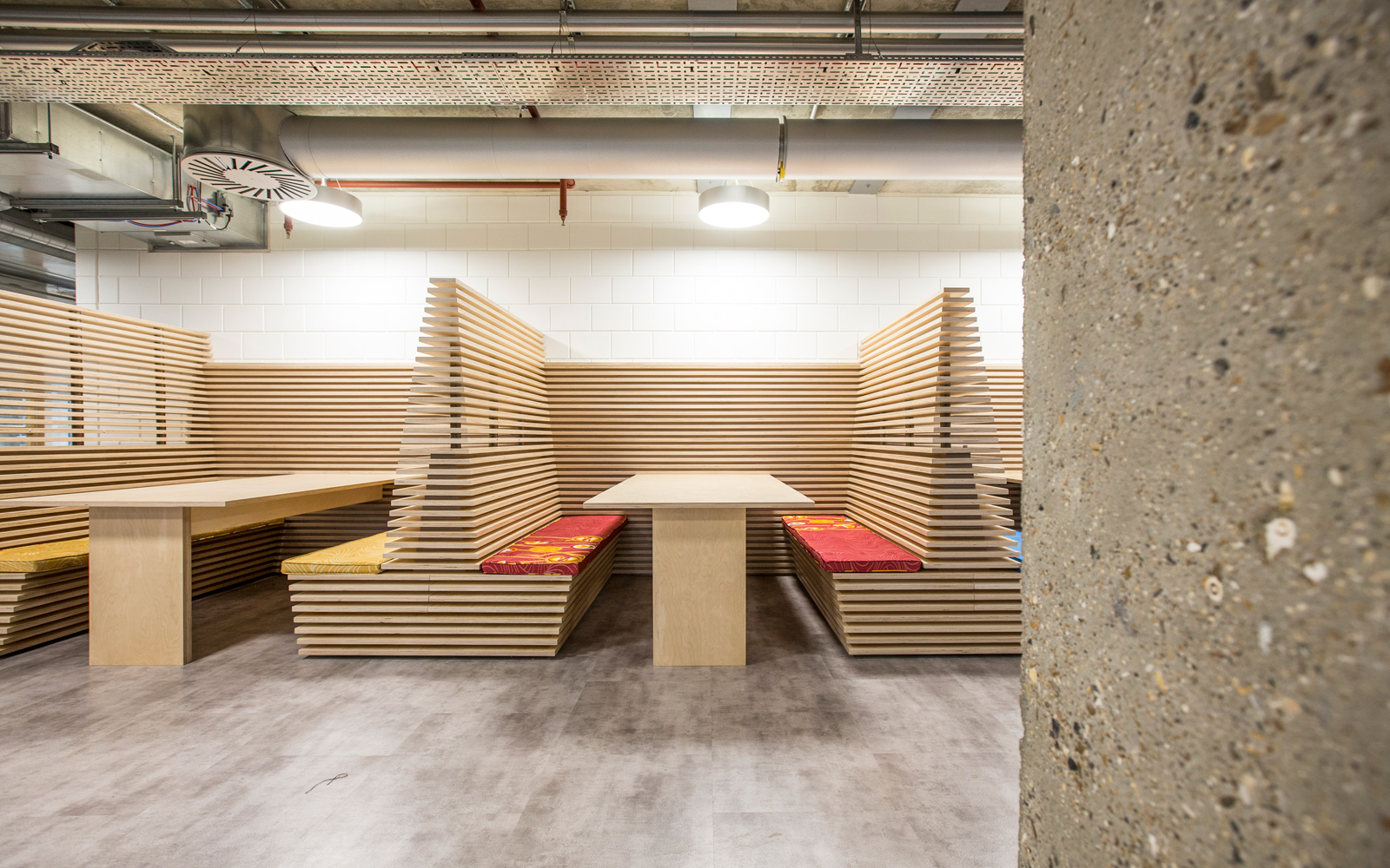
‘We created fluid work environments so you don’t need to be chained to your desk the entire time – you can work in the restaurant and have a coffee, or you can hang out in a breakout booth.’
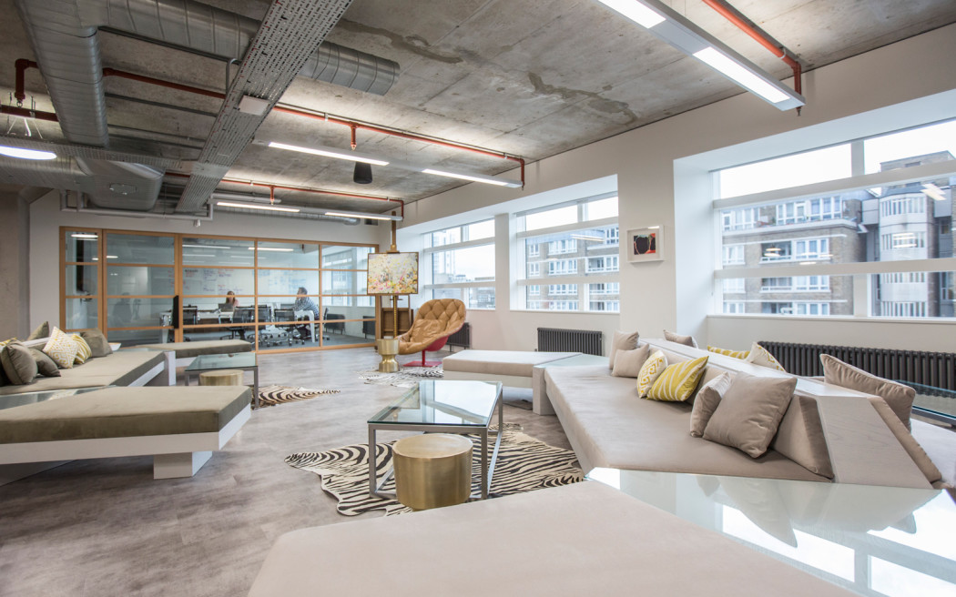
A lounge furnished with ‘Lautner’ sofas and soft furnishings also accommodates VIP clients visiting for personal shopping sessions – as well as shoots for the company’s website and social media channels.
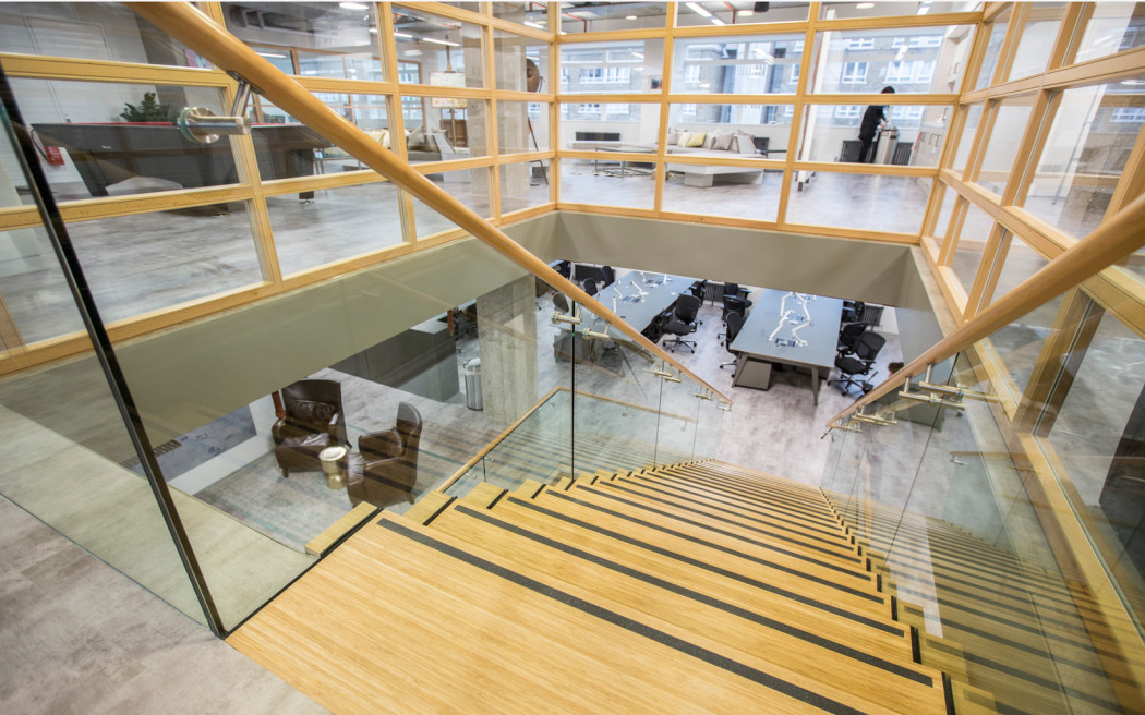
Livingston continues: ‘There are lots of elements we designed specifically for them that came from the fact that Farfetch don’t do “off the shelf”’. These include a partitioning system that resembles glass-and-timber-framed Japanese shojis, which divide the floorplates into private spaces (for meetings and training areas), and a bespoke staircase made from glass, steel and wood.
Closer inspection also reveals ‘sliced’ chamfered details on Studiofibre-designed furniture and door handles – a nod to Farfetch’s graphic typeface.
Studiofibre has previously created offices for Net-a-Porter and Notonthehighstreet.com, establishing itself as a go-to for digital brands wanting to move into real-life digs.
