Photography: Alexandra Bové

Photography: Alexandra Bové
Photography: Alexandra Bové
Photography: Alexandra Bové

Photography: Alexandra Bové

Photography: Alexandra Bové
Sushi is served in floating steel and wood booths at this minimalist Mexico City sushi bar, which blends Japanese and Hispanic elements.
Escala Arquitectos and Michan Architecture designed the Mexico City restaurant, which is the second Oku outpost in the capital. The practices have laid out the space so the downstairs sushi bar is the ‘storefront’ of Oku. Concrete floors sweep up and into counters, while steel-framed glass panels mark out the downstairs dining space.

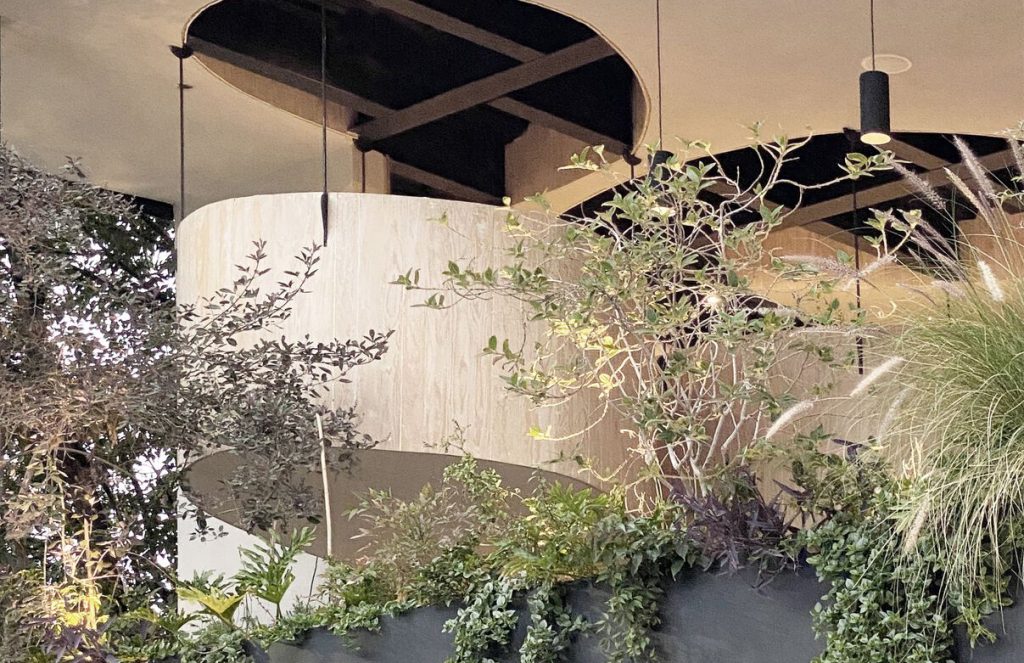
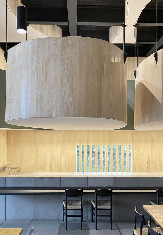
A spiral staircase leads up to the main feature of the restaurant – a trio of suspended, petal-shaped dining booths that are welded to the building’s steel structure and hang over the main bar. They create a cocoon for diners, who share an oval table and wraparound bench.
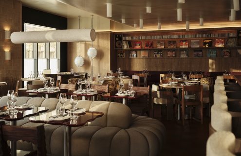
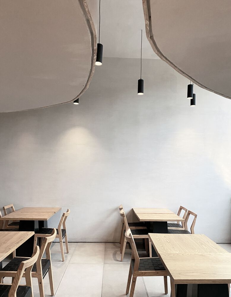
The end result is a space that, as the architects describe it, ‘plays with polished and raw finishes’. Industrial vibes, created by the steel and concrete is set off by sprays of greenery glimpsed through the windows, and pale wood panelling and furniture.
Prado Sur 125, Lomas – Virreyes, Lomas de Chapultepec V Secc., Miguel Hidalgo, 11000 Ciudad de México, CDMX, Mexico


