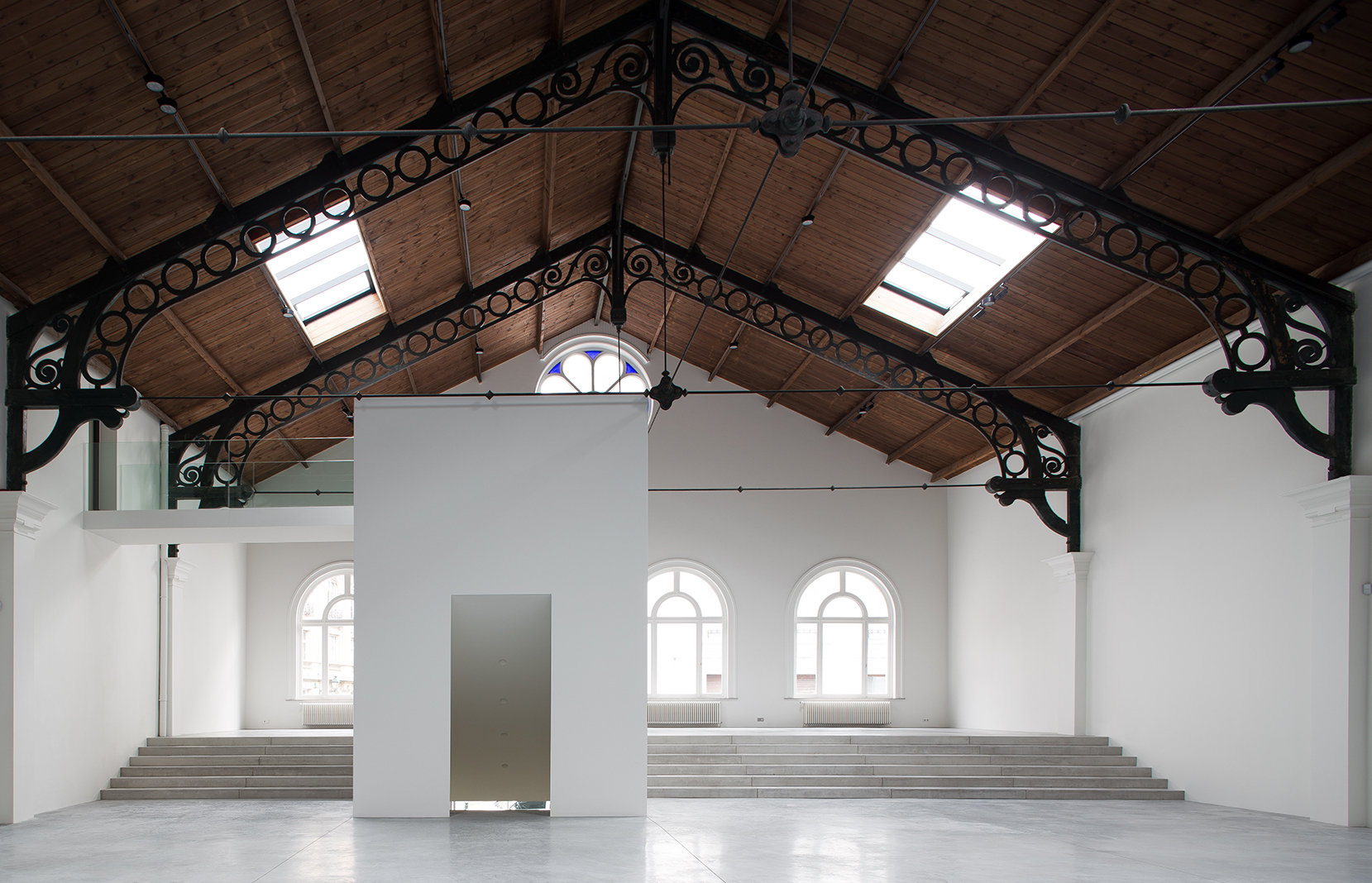
There’s no evidence that the young romantics rolling around Le Royal Skating in the 1880s were suitably impressed with the rosette windows, the ornate iron roof trusses that were revolutionary for their time, or even the sheer enormity of the space. By 1900, Le Skating was converted into a Bugatti garage, then a war-weapons depot, and then an exhibition space for classic cars before being abandoned for decades.
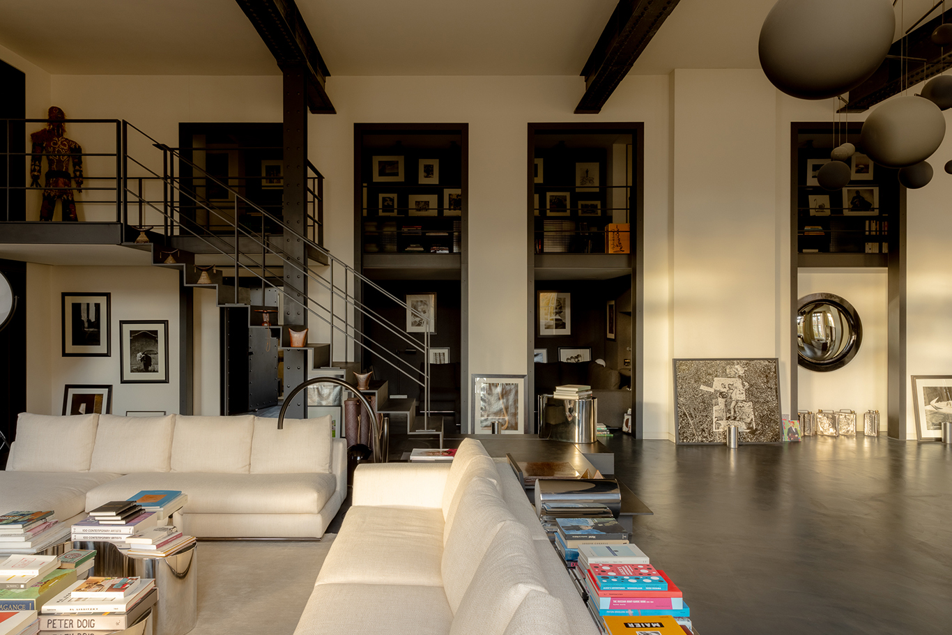
Better late than never, their great-great-great-grandchildren will pay reverence when the building – in Brussels’ elegant Saint-Gilles district – reopens as La Patinoire Royale, a showcase for contemporary art and design of the past 60 years. For most of the original masterwork remains much as it was, not least the 3,000 sq m floor, now a glossy polished concrete.
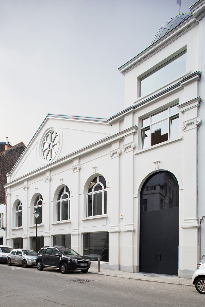
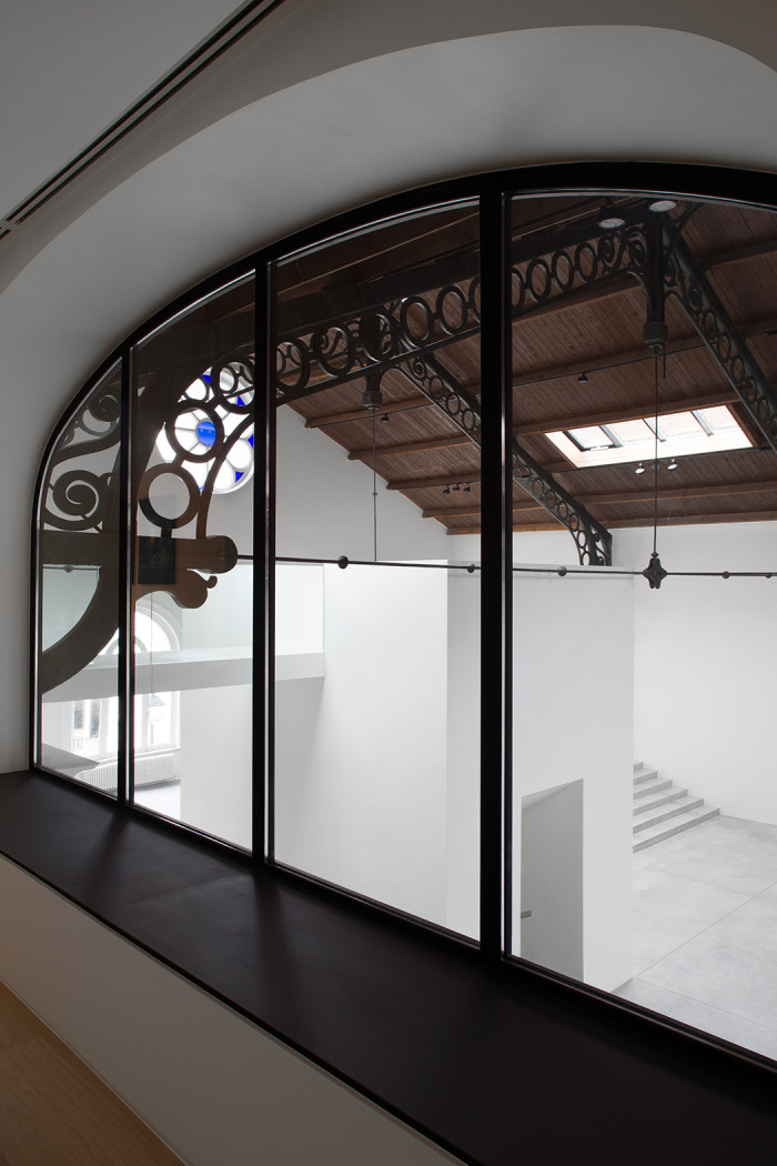
The difference is in the delicate hand of Parisian interior designer Pierre Yovanovitch. After John-Paul Hermant Architects restored the ionic facade, timber roof and metal buttresses by Eiffel collaborator Camille Polonceau, the Parisian interior designer was enlisted to mastermind its adaptive re-use, bringing a human scale to the hangar-like interior.
Photography: Jean-François Jaussaud; Luxproductions for La Patinoire Royale

Photography: Jean-François Jaussaud; Luxproductions for La Patinoire Royale
Photography: Jean-François Jaussaud; Luxproductions for La Patinoire Royale

Photography: Jean-François Jaussaud; Luxproductions for La Patinoire Royale
Photography: Jean-François Jaussaud; Luxproductions for La Patinoire Royale
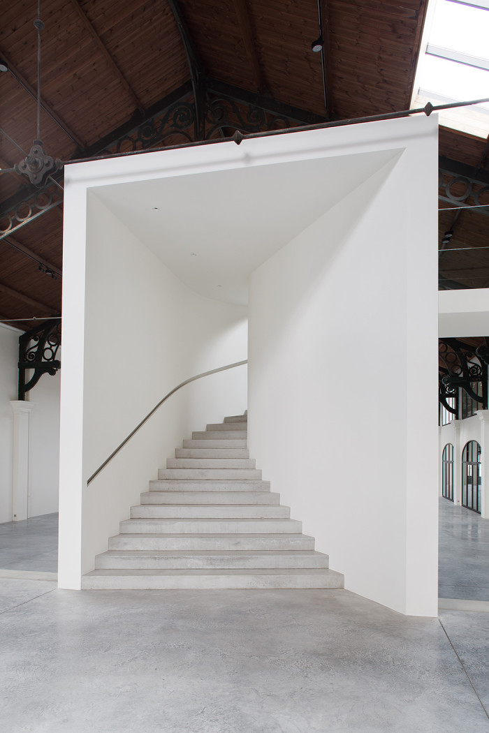
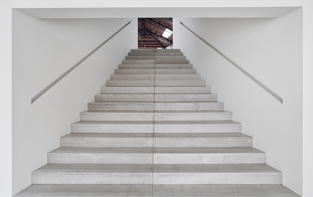
His minimalist intervention leaves the building to its essential role, exhibiting art, yet takes on another vital one: welcoming the public. A series of staircases act as a guide, inviting visitors in and around to explore it completely.
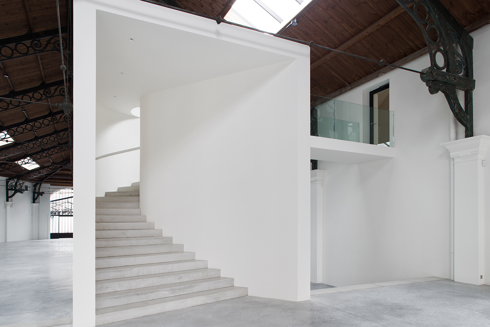
‘They asked me, “Are you crazy? You’re going to ruin the space,”’ says Yovanovitch of the owners when he proposed the internal staircase. ‘But I insisted. The space was complicated because of its size. The staircase volume is very dynamic, because it’s not in the centre but to the left.’
Less monolith than modern beacon, the staircase whisks upward to a glass balustrade that overlooks the neo-classical bones and leads into the next gallery.
Yovanovitch widened the existing windows and roof lights, channeling sunlight into the far corners of the space. He overhauled the arched entrance with a monumental, 8m glazed door, framed in black-painted steel. On the floor above, a rotunda showered with light from the original glass dome serves as the new library, furnished with a streamlined desk and custom lighting.
There was nothing stopping Yovanovitch from gutting the space and starting anew; when the bricks and mortar were finally listed 20 years ago, the dilapidated interior was passed over. ‘But I chose to leave the roof as it was,’ says the designer. ‘There’s a balance between the contemporary and minimal and the feeling that the building has history.’
Indeed, if you felt compelled to strap on your skates and go for a whirl on that floor, nobody could blame you.
