Remember Steve Martin roller-skating through the galleries of LACMA in LA Stories? Or Anna Karina racing through the Louvre in Jean Luc Godard’s Bande à part? These delicious moments of cinematic fantasy endure in part because they subvert the reverence these buildings are designed to evoke.
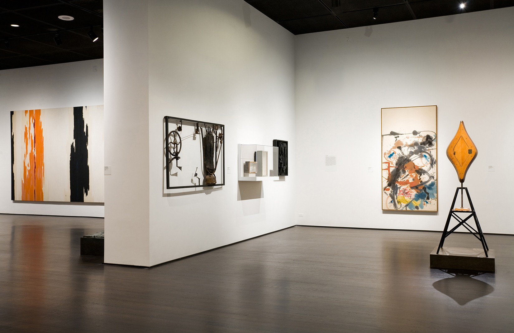
Exuberant behaviour is not encouraged, either by the grandiose art temples of the late 19th century, or by the clinical white cubes that have been de rigueur since MoMA’s midtown Manhattan building opened in 1939.
It’s no bad thing security-wise – YouTube is full of hapless visitors inadvertently walloping exhibits when they ignore gallery protocol – but hushed reverence can have a stultifying effect on art and its audience.
‘The big mistake of so many contemporary galleries is that they’re designed so that one space looks like the next, which puts your brain to sleep,’ says Ralph Rugoff, curator of London’s Hayward Gallery.
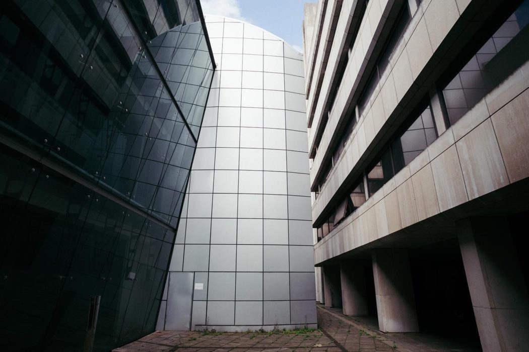
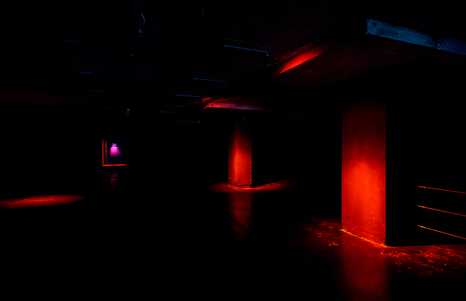
The institution’s recently opened off-site show – an exhibition of recent video art titled The Infinite Mix – occupies a Brutalist former office block on The Strand. ‘Artworks are so sensitive to their surroundings and all of these spaces bring an extra dimension to the work,’ says Rugoff. ‘Suddenly you feel you’re in a new kind of 21st-century museum that doesn’t have the formality of a conventional gallery.’
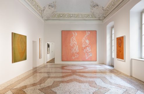
When artist Francis Upritchard was invited to represent New Zealand at the 2009 Venice Biennale, she recalls encountering the ornate – and untouchable – rooms of the Palazzo Mangili-Valmarana exhibition space with some alarm.
After making custom furnishings for her work to counterbalance the Palazzo’s huge foxed mirrors, Upritchard ended up appreciating the interplay between the contrasting elements. Showing the same pieces afterwards at the Museum of New Zealand, she noticed how the setting changed her reading of the work. ‘I felt weirdly that in a room that was coloured they had more room to breathe.’
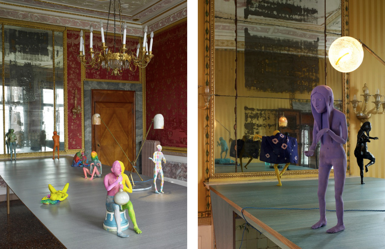
Tomorrow the artist will discuss how to integrate art into living space at the first Frieze Art and Architecture conference. She also has a solo display with the Kate MacGarry gallery at Frieze London. In preparation for the fair she has painted her studio walls a ‘weird peachy orange and lilac’ and says that she now craves non white-cube spaces. ‘A white space is kind of boring for the viewer: it’s bland and it doesn’t often help the work.’
But while white cubes can be deadening, the trend for integrating biennials into a city’s built environment comes with its own pitfalls. A site’s intrinsic aura can be a distracting force, so the match-making of artwork to site requires a skilled curator.
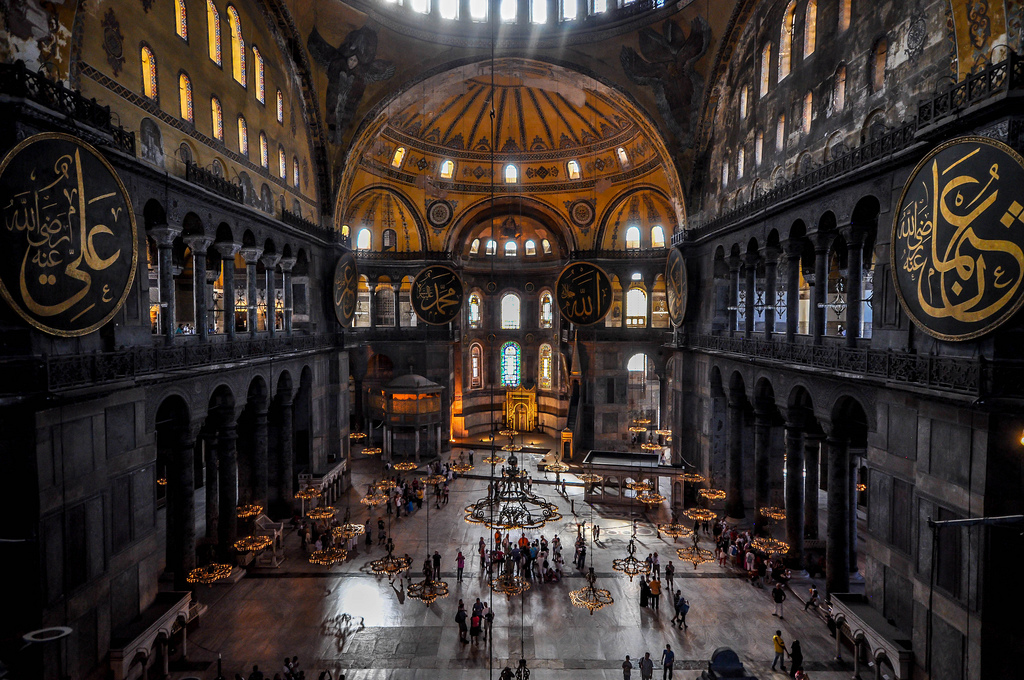
At the 2003 Istanbul Biennale, works were shown at the Hagia Sophia, causing a battle for attention that the 6th-century building was always going to win.
Earlier this year, the Moscow International Biennale for Young Art used the labyrinthine and rubble-strewn Trekhgornaya Manufaktura as its main location. Alongside the human cost of stubbed toes and glass cuts, the art was variously hard to see, hard to find and hard to hear.
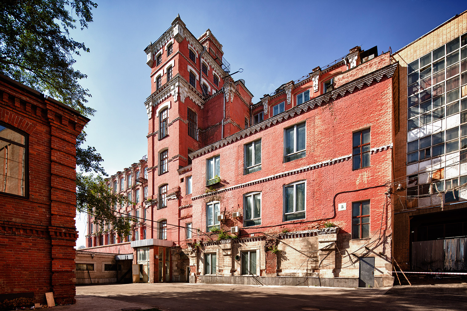
Its satellite locations – notably the Moscow Museum of Art – might have been bland by comparison, but at least you could concentrate. Trekhgornaya, however, had advantages: artists were at liberty to knock holes in the plasterwork, and play about with the windows and piping.
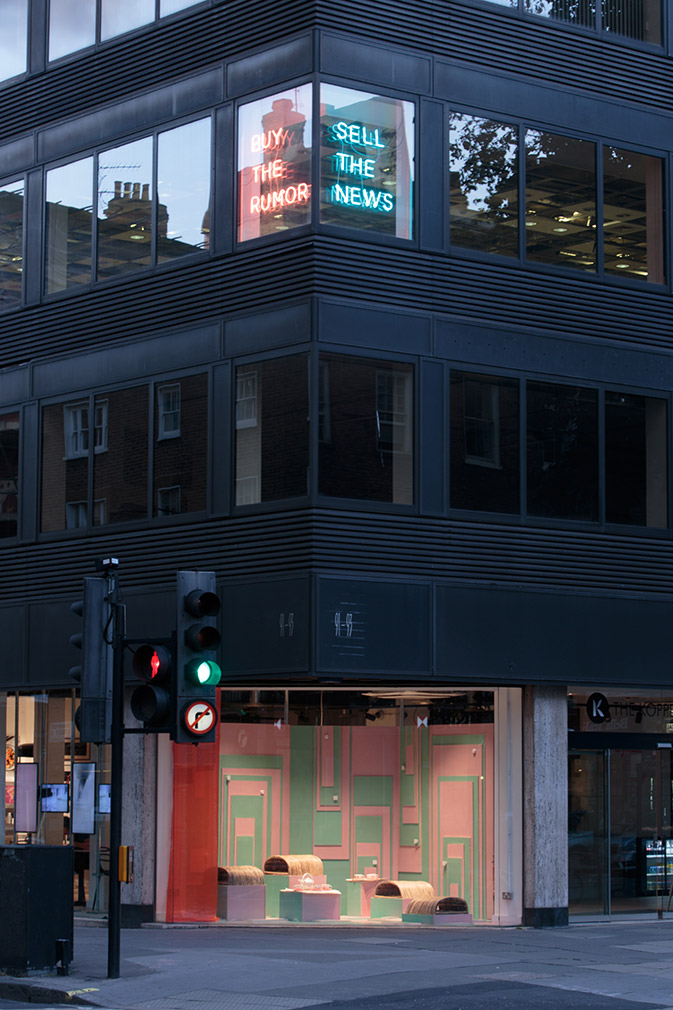
Installation view of Speculations on Disappearance (Cooking Sections, 2016) at The Empire Remains Shop. Photography: Tim Bowditch
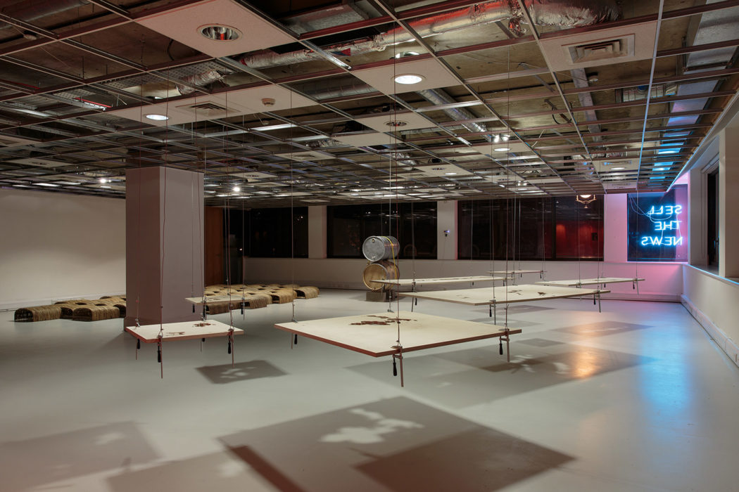
Installation view of Speculations on Disappearance (Cooking Sections, 2016) at The Empire Remains Shop. Photography: Tim Bowditch
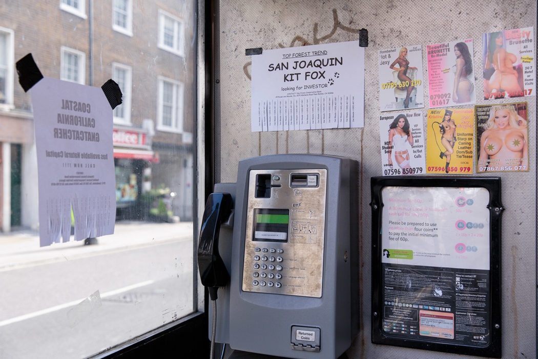
Installation view of Speculations on Disappearance (Cooking Sections, 2016) at The Empire Remains Shop. Photography: Tim Bowditch
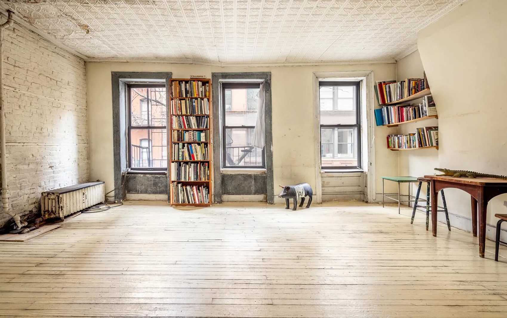
The advantage of non-art sites are not just material: in moving beyond gallery spaces artists can reach new audiences and engage in acts and behaviours that would have less impact within a formal institution. The Empire Remains Shop, which currently occupies a shop window and first-floor office space on a busy corner of London’s Baker Street, has been insinuating itself in various ways in the neighbourhood. The artists involved in the project have posed as estate agents, given out free ice cream (flavoured with Japanese Knotweed) and taped phoney adverts to the local phone boxes.
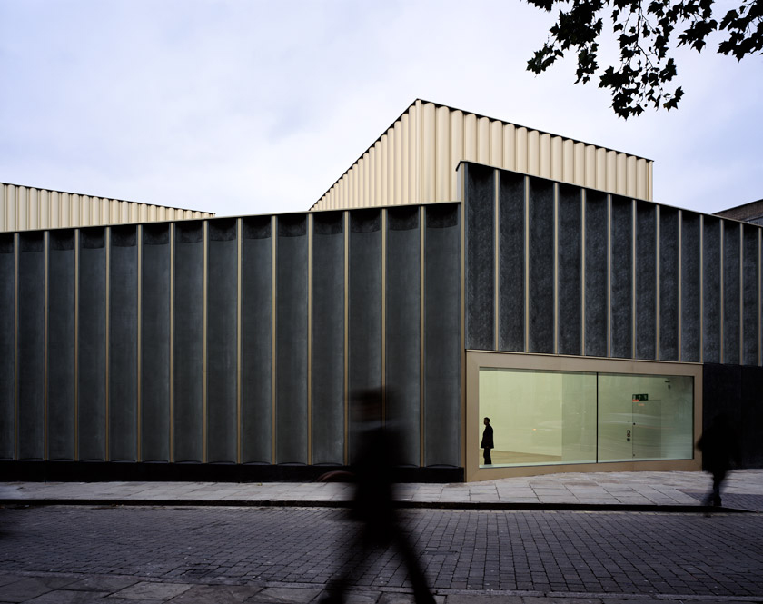
‘I wouldn’t want to hold the classic white cube space in opposition to the “non-traditional”’,’ says Sam Thorne, director of Nottingham Contemporary, which occupies a building designed by architects Caruso St John. ‘One of the dominant museum models of the last couple of decades has been the repurposed post-industrial space: Tate Modern, the former power station; or Dia:Beacon, an old printing factory. And non-traditional spaces have, in turn, influenced the design of new institutions.’
Nottingham Contemporary also works in close relation to the city’s project spaces. Earlier this year, artist Simon Starling showed both at the Contemporary and at Backlit, an artist-run studio and exhibition space sited in an old textile mill.
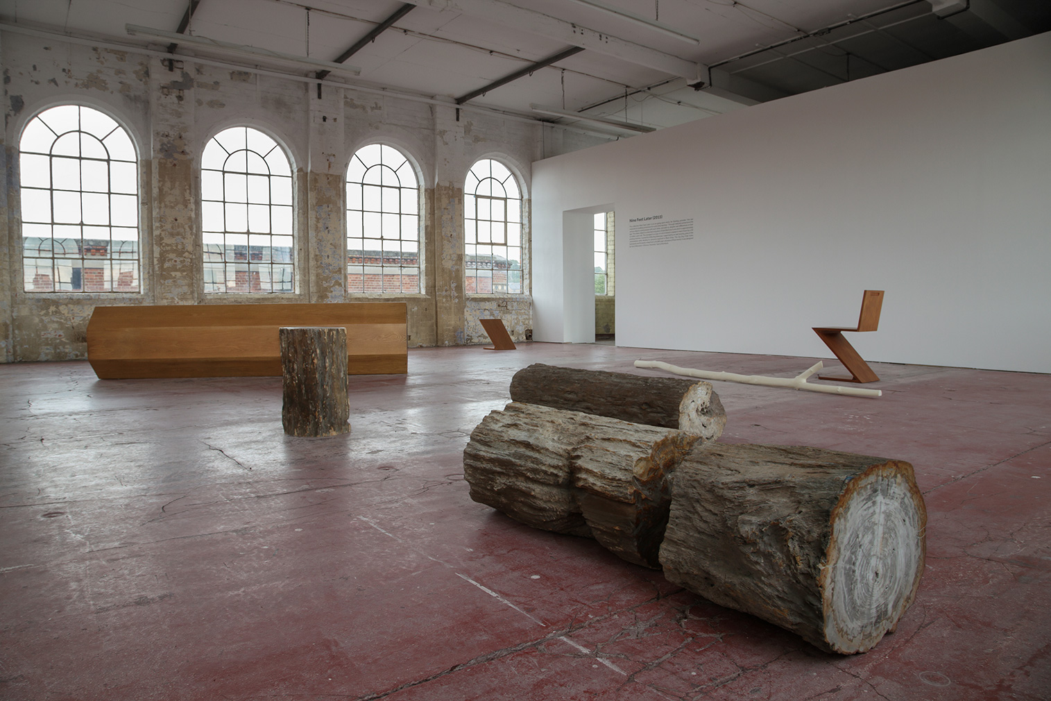
While the two sites play complementary roles, Thorne points out that the difference between such venues is not simply atmospheric: ‘What a purpose-built space such as ours brings is, in part, the ability to exhibit and view works from museum collections. The environmental conditions are controlled, as are the light levels, so we can show works that wouldn’t be permitted to be exhibited elsewhere.’ The white cube space, then, looks unlikely to die out anytime soon.
In 2008 Martin Creed paid homage to Bande à part with a work that saw a relay of sprinters crossing Tate Britain’s Duveen Gallery. If anything the stunt looked more out of place in our increasingly art-reverential culture than it did in the 1964 movie: it was a striking reminder that our museum and gallery culture seems to be getting more formalised and uptight than otherwise. And how important alternative sites for art are as a result.
