Wes Anderson releases his 10th film, The French Dispatch, this month, and it promises to be more Wes Andersony than ever before. Centring around the foreign bureau of a fictional American newspaper, the film has been dubbed ‘a love letter to journalism’ inspired by The New Yorker and stocked with his familiar ensemble of A-list actors, including Bill Murray, Elisabeth Moss, Timothée Chalamet, Frances McDormand and Léa Seydoux.
As with predecessors, The Grand Budapest Hotel and Moonrise Kingdom, much of The French Dispatch was shot on location. The petite French town of Angoulême served as a stand-in for Anderson’s fictional Ennui-sur-Blasé. However, many of its interiors were built as sets by a team of art directors, set designers and decorators.
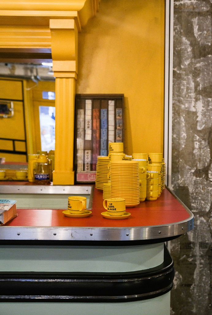
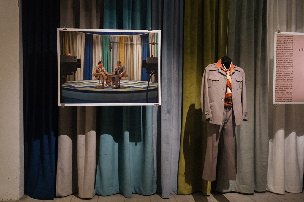
But Angoulême isn’t the only real-life location Anderson fans can visit – the film’s Le Sans Blague café has been recreated inside 180 The Strand, where for the rest of the month, it will serve up French classics from the film as part of an exhibition of its sets and props.

Photography: Rosella Degori

Photography: Rosella Degori

Photography: Rosella Degori

Photography: Rosella Degori

Photography: Rosella Degori

Photography: Rosella Degori

Photography: Rosella Degori

Photography: Rosella Degori

Photography: Rosella Degori

Photography: Rosella Degori

Photography: Rosella Degori

Photography: Rosella Degori
Photography: Rosella Degori

Photography: Rosella Degori

Photography: Rosella Degori

Photography: Rosella Degori

Photography: Rosella Degori

Photography: Rosella Degori

Photography: Rosella Degori

Photography: Rosella Degori

Photography: Rosella Degori

Photography: Rosella Degori

Photography: Rosella Degori

Photography: Rosella Degori

Photography: Rosella Degori
Photography: Rosella Degori

Photography: Rosella Degori

Photography: Rosella Degori
‘We had a fantastic piece of real estate right on that corner of 180 The Strand and right from the brief wanted to wrap the corner and give it that French café feel that you get when watching the film,’ says The French Dispatch‘s art director Kevin Timon Hill.
Hill explains how they’ve restaged Wes Anderson’s fictional world inside the London building.

How have you translated the visual language of Anderson’s fictional world into the real one without breaking the spell?
KTH: I think there are features in any space that you either pick up on, consciously or subconsciously and recognising those elements (and designing them into a space) was something that I have done a lot of in my career before working in film designing branded commercial spaces. There are a few [visual cues] in Le Sans Blague. The colours and the black lines; the chequerboard tiles and the custom lino floor. Once you incorporate those, you already have [Wes’] recognisable language, so you can start to adapt it to work with the area you have. I was keen to keep the spiral staircase in there, which was from the original set. For me, it is a key element to hang the interior design on, as it’s so recognisable in the film.

What were some of the challenges in building the pop-up?
KTH: The film set is noticeably tightly spaced; no Covid 2-metre-clearances in there!
We had to give plenty of circulation space and also retain the open, adaptable volume for evening events while also keeping the narrow feel of the film set. We increased the size of the lino border around the edge of the room to visually squeeze the space a bit, so retaining some of that film narrowness but ultimately keeping the function of a working cafe.
Onto the film itself: you previously worked with Wes Anderson on his animated film, Isle of Dogs. How different was your role as an art director on The French Dispatch?
KTH: The speed, time scale and level of detail that you have to draw on stop-frame animation movies are very different from live-action filming.
In the Isle of Dogs, we had to draw and model every single piece of dressing. From the fruit on the plates or shapes of sake cups on the counter of the sake bar, for example, all the way up the engineering of the frame that would hold the set together, allowing pieces to be removed for access and elements to be locked off for animation.

KTH (cont’d): Working in live-action, you tend to have more of an aesthetic involvement in those things. The art director concentrates on the surfaces you see in filming, but not so much the scaffolding or engineering of standing up the set (if you don’t see it in-camera). Working on The French Dispatch, however, was incredibly interesting following on from Isle of Dogs with Wes, as we were attempting to achieve the same level of attention to detail from stop-motion across a live-action film. It was really quite amazing.

How much of the set design for The French Dispatch was built versus location-based?
KTH: We had a high number of set pieces, but many of the sets used the geography and features of the town of Angoulême incorporated into the design.
Take, for example, the prison in The French Dispatch. It was decided fairly on by Adam Stockhausen (production designer) and Wes that we would film the prison scenes in these large unused warehouses and ex-factory buildings and that we would fold all that inherited detail into the design of the sets. Rather than fight the space or cover over details, we would build the sets almost freestanding from the walls and unapologetically build architectural elements into the design of the prison that may not have ordinarily been there.

Much of the joy derived from Anderson’s work is the unique visual language; from colour to props, everything is considered down to the finest detail. Each scene brims with Easter eggs for the audience to discover. What are some of your favourites from this movie?
KTH: The names of the crew in the many posters and shop front names throughout the film. Across the city, you can see them. I recognise them right away, but you’d have to be armed with the pause button and a list from IMDB to catch them all as a viewer that doesn’t know the names of the various teams or crews that make up the film!

Which set, in particular, are you most proud of?
KTH: The Roebuck-Wright dolly that takes him through the Police Station at the start of his story was one of the most challenging sets.
There was a moment where we realised that the location we had selected just wasn’t going to deliver the look of the set that Wes was after. We had committed to the space and started work, but we had to make the call to pivot and change direction to make it an entire set build. A huge, long dolly shot was filmed in one go, changing direction through seven rooms all in one long set.
We concepted, drew and built that set in less than a month. Something we couldn’t have achieved without having such a wonderful and supportive construction team, and we were all proud to have pulled it off when the camera rolled.
‘The French Dispatch Exhibition’ runs until 14 November 2021 at 180 The Strand and is a ticketed event, while the film is in cinemas from October 22.


