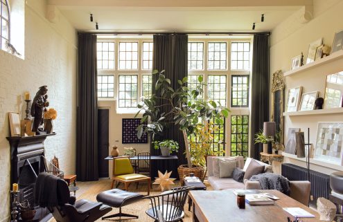
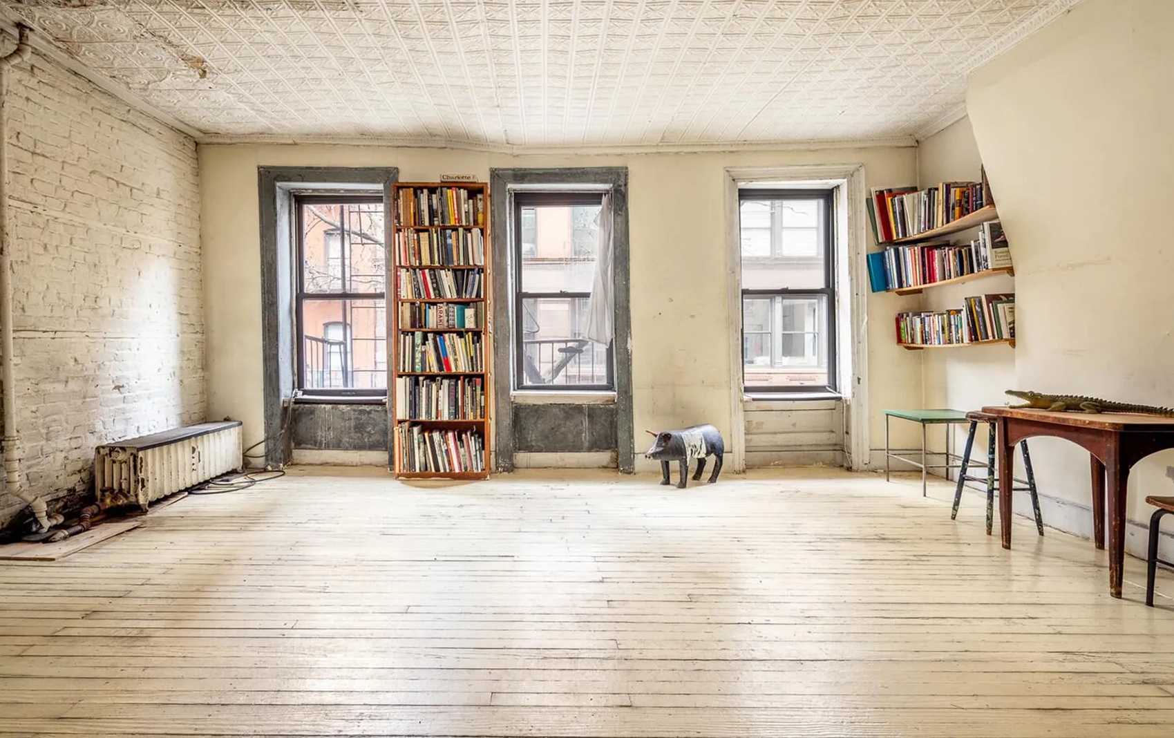
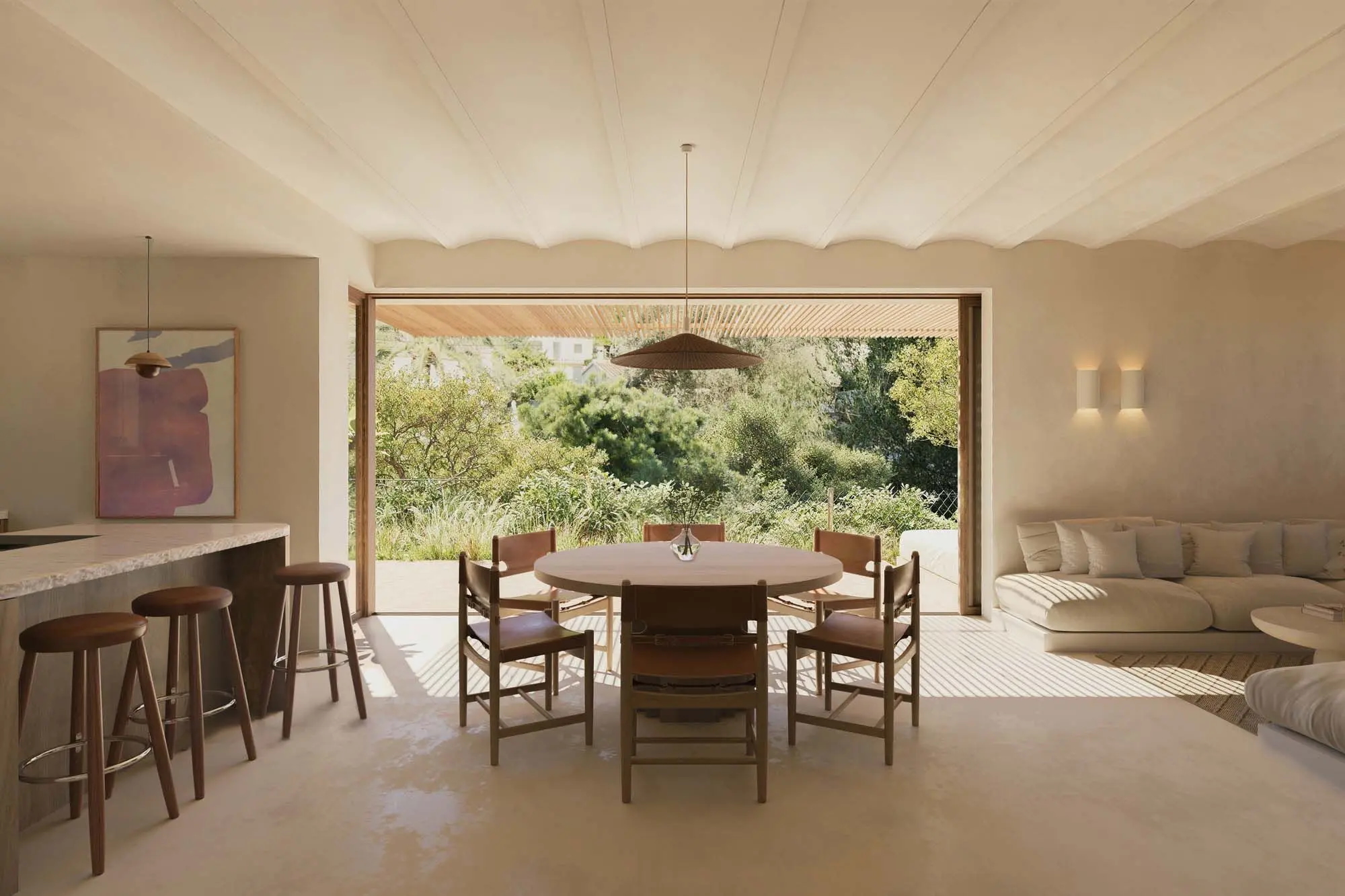
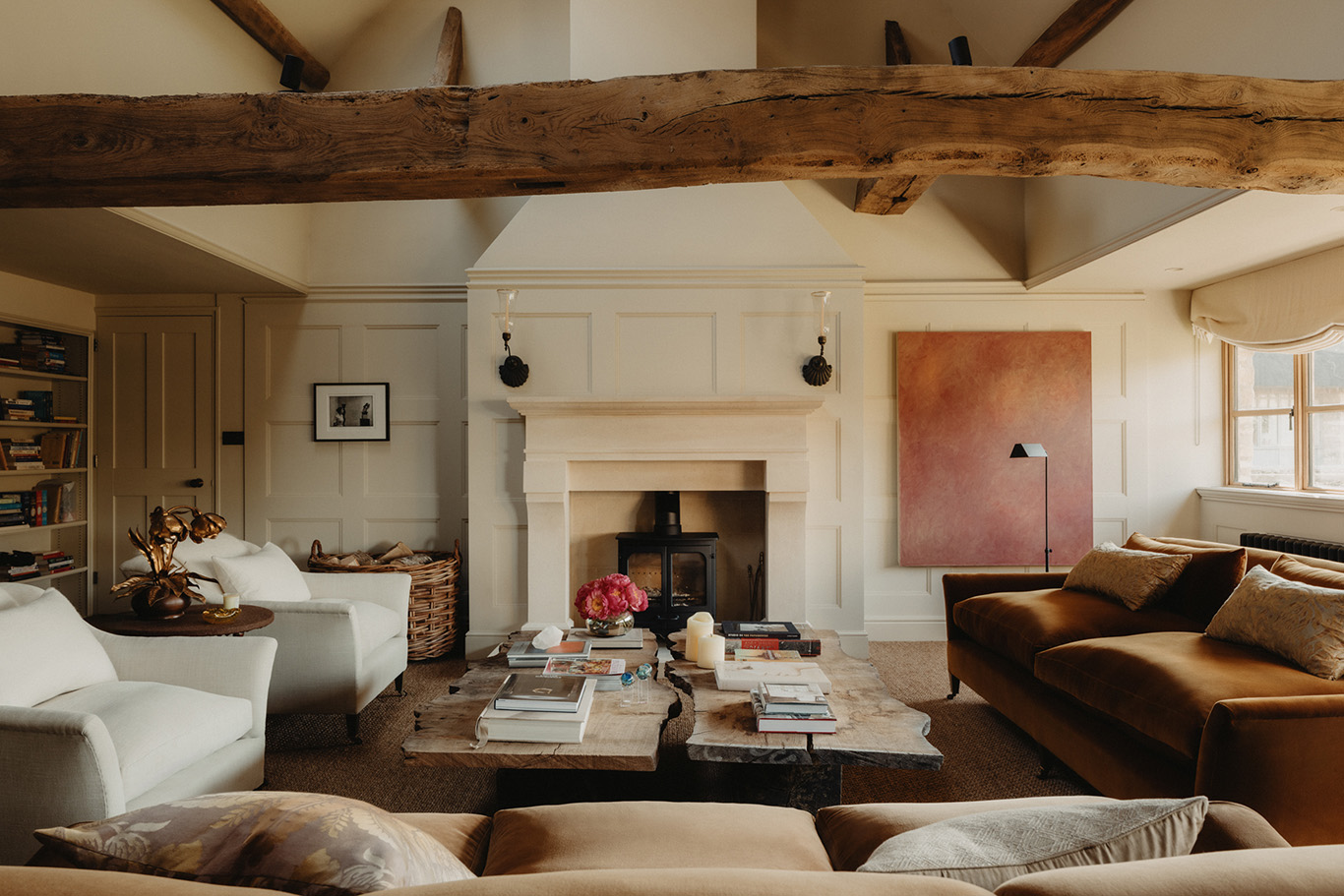
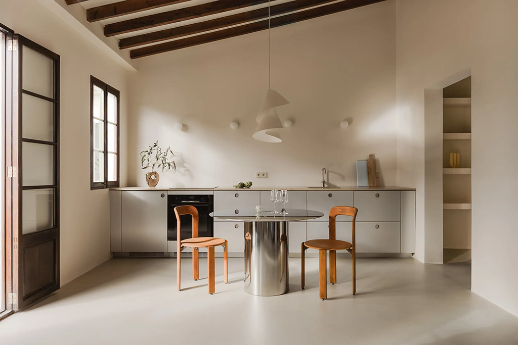
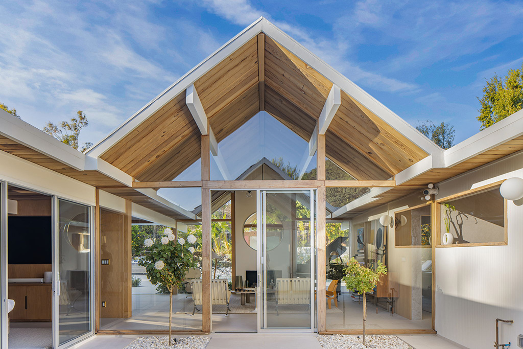
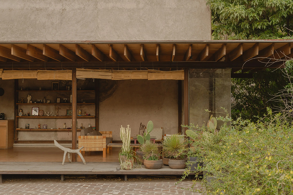
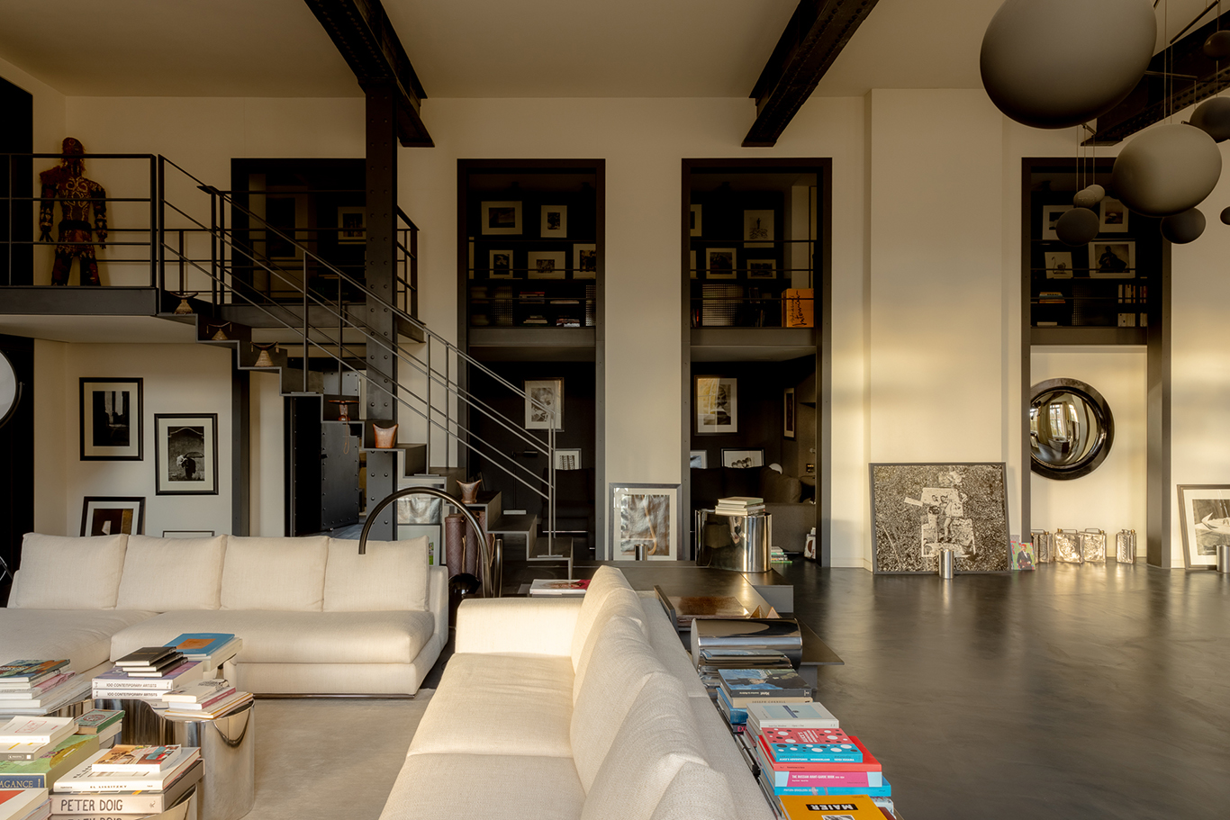
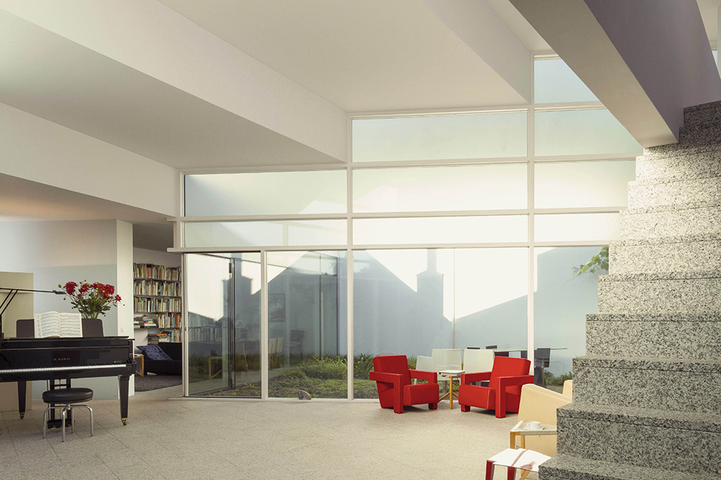
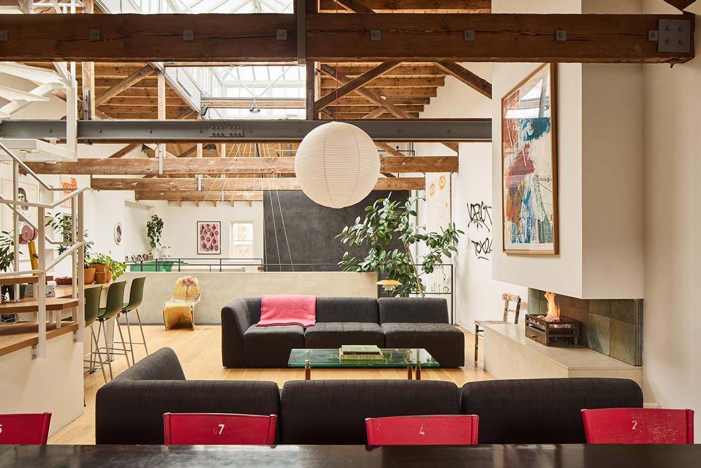
A decade or so ago, warehouse loft living was so aspirational that ordinary homes wanted to get a piece of the open plan action. Hence the craze for ‘knocking through’ and rear extensions to create one big kitchen-living-dining area and new-builds with a single big room on the ground floor. As a result, formerly dark and poky terraced houses were filled with light and a sense of space, and parents could easily keep an eye on small children.
But the joys of open-plan are starting to wane for some, and designers have been noticing a backlash. They can be noisy, and as children grow, so does the need for separation.

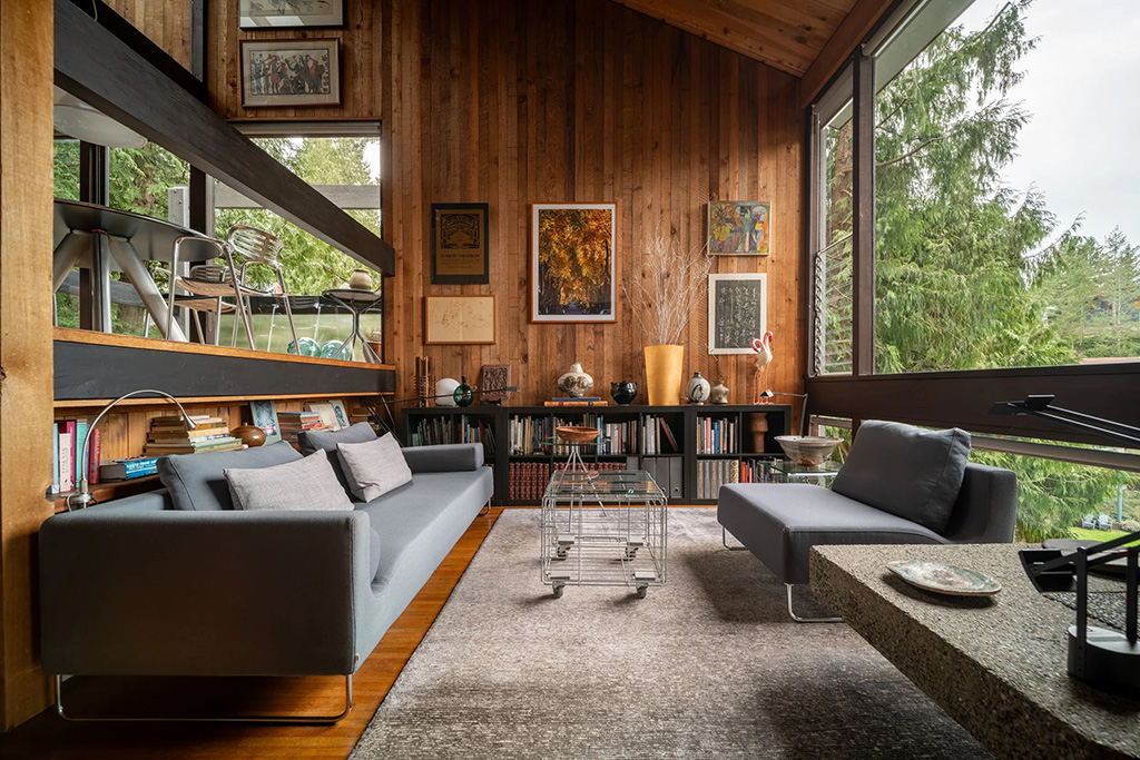
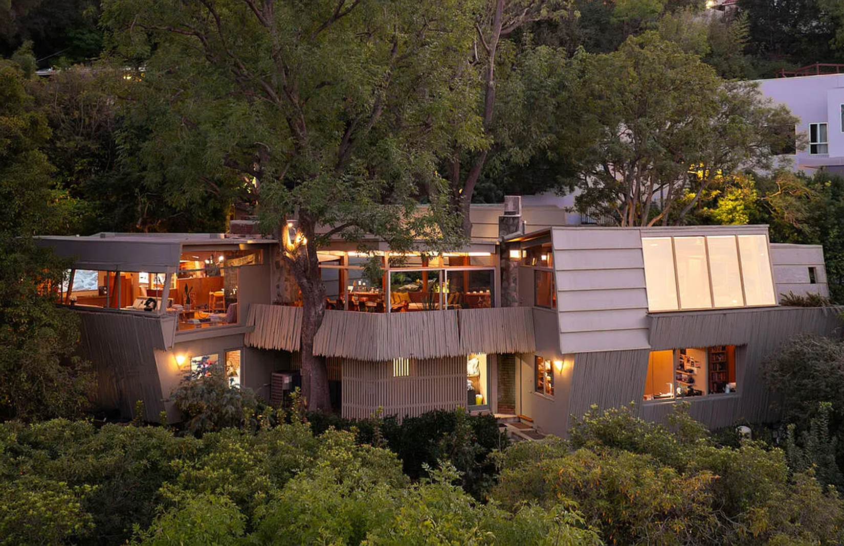
Liverpool Road project by Cousins & Cousins. Photography: Jack Hobhouse

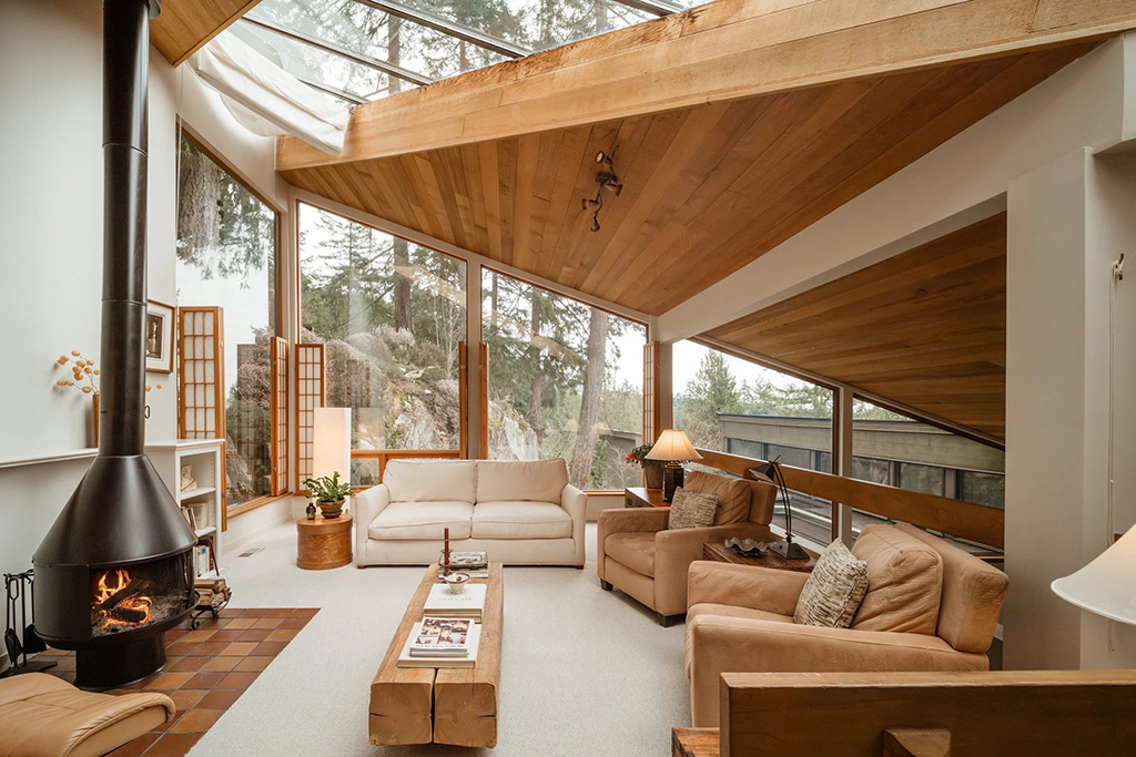
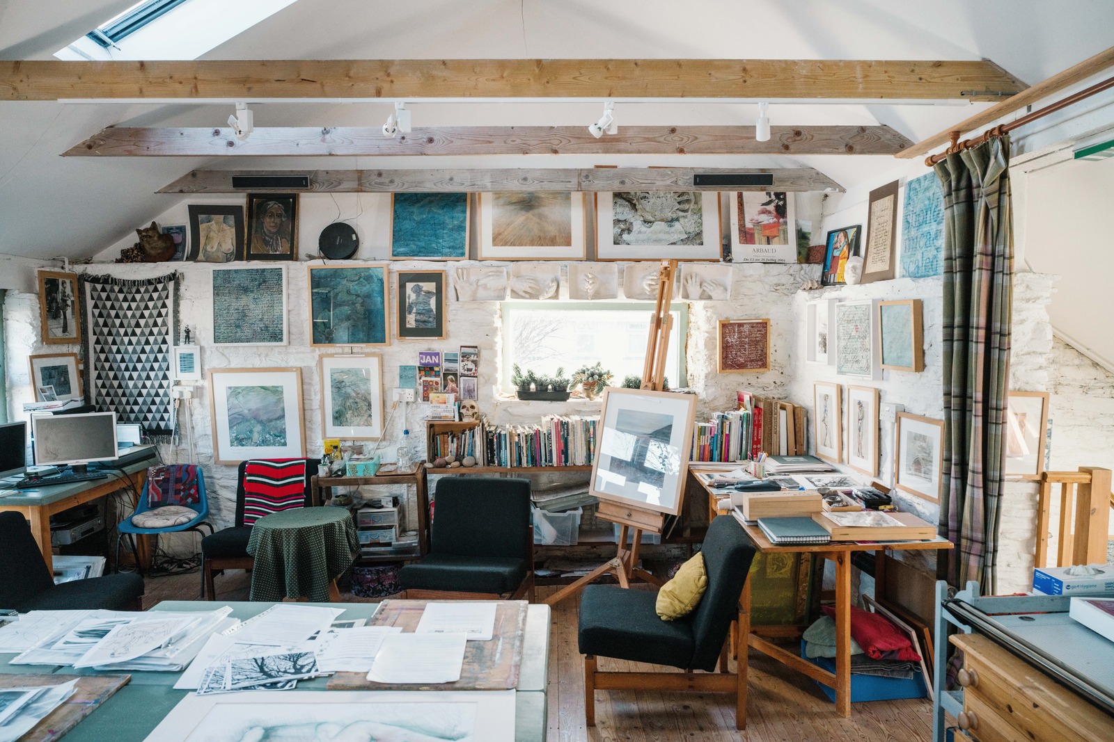
DeBeauvoir house by Cousins & Cousins. Photography: Jack Hobhouse
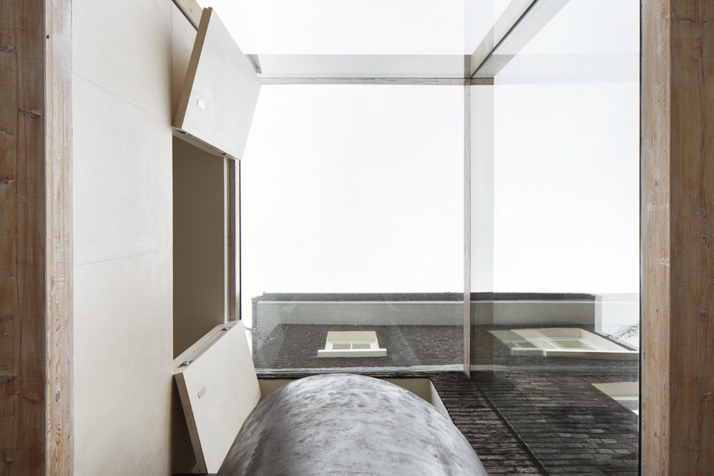
DeBeauvoir house by Cousins & Cousins. Photography: Jack Hobhouse

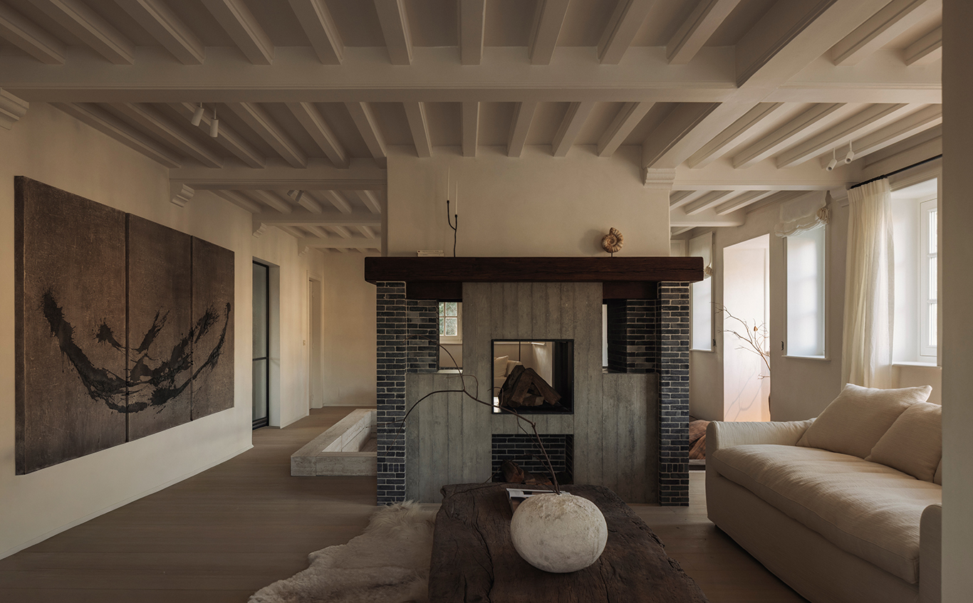
Chetwynd Road by Cousins & Cousins

Vegetarian Cottage by Cousins & Cousins. Photography: Jack Hobhouse

81-87 Weston Street for SOLIDSPACE. Photography: Rory Gardiner

81-87 Weston Street for SOLIDSPACE. Photography: Rory Gardiner

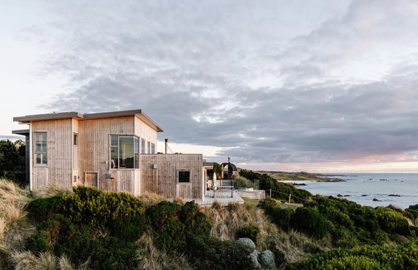
The Pump House. photography: The Modern House
What’s more, our rising use of social media and the culture of digital surveillance via devices like Alexa ‘has made many of us feel increasingly “on display”, and moments of true privacy feel few and far between’, says Albert Hill of Inigo and The Modern House. ‘This makes us feel, albeit subconsciously, increasingly exposed and as a result increasingly seeking respite from this exposure.’
And the last year of lockdowns hasn’t helped the case for open plan. ‘We’ve been staring at the same “four walls” for months,’ says architect Jelena Cousins of Cousins & Cousins. An open-plan space ‘can feel rather limiting and actually becomes claustrophobic, which interestingly is the last thing one thinks of in such a layout”.
Or as Kate Watson-Smyth, author of Mad About The House, puts it: ‘everyone’s working from home, and people are thinking “wall! what a clever idea, now I get it.”‘

Will Burges of 31/44 Architects has never been fooled by the notion that a big open space creates flexibility. ‘From experience, I think it’s probably the opposite is more flexible – to be able to shut a door between two spaces offers much more versatility to the use of those two spaces.’
In the houses 31/44 designs – including Burges’s own and that of fellow partner Stephen Davies (pictured) – the firm aims for a flexible set of rooms with varying levels of connection that can be adjusted.

This move from open-plan to ‘broken plan rarely involves simply dividing a big room to create two smaller ones – though Cousins & Cousins pulled this off recently by splitting a large child’s bedroom to create a small TV room. ‘The child that now has a smaller bedroom as a consequence of this change has an equal size bedroom to her siblings, but they all benefit from their TV room, which at 2m wide is tiny but very functional,’ she explains.
Often, putting up a stud wall is a hassle and impractical because both rooms need their own natural light and fresh air source. Instead, designers have a box of tricks, including concealed doors, oversized sliding doors, and changes in floor levels. ‘Whenever we have a room with a step change in floor level between, for instance, the dining and kitchen area, it’s always really well-received by buyers,’ says Hill. He cites The Pump House, one of The Modern House’s most liked images on Instagram ever.

Developer Solidspace is known for its use of the split section to disrupt open plan and create connected spaces. Allford Hall Monaghan Morris did this for their Weston Street development.
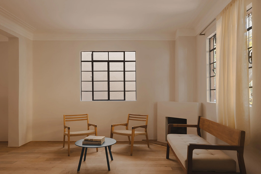
But it’s possible to create the impression of a room without architectural interventions. Watson-Smyth suggests a library system with books or plants on open shelves, a low wall, the strategic placing of furniture, internal curtaining, and even a different paint effect in one zone. However, a return of those foldable (and easily breakable) screens seems unlikely.
The expectation is that new and renovated properties will feature more varied spaces. This could be a combination of big, bright areas for everyday living and entertaining, ‘but also a darker, more den-like space in which to retreat from the pressures of modern life’, says Hill, who predicts that ‘large, uniform spaces of the type that we tend to associate with the minimalist aesthetic will ebb away’.


