Photography: Leon Chew
Over 100,000 people pass through Frieze London’s iconic white tents every year in Regent’s Park. While the artworks on display change annually, the booth layout has largely remained the same—until now. To celebrate Frieze London’s 21st edition, design practice A Studio Between has reimagined the visitor experience, delivering the biggest shake-up to the tent to date.
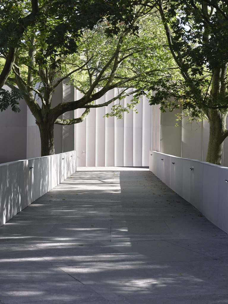
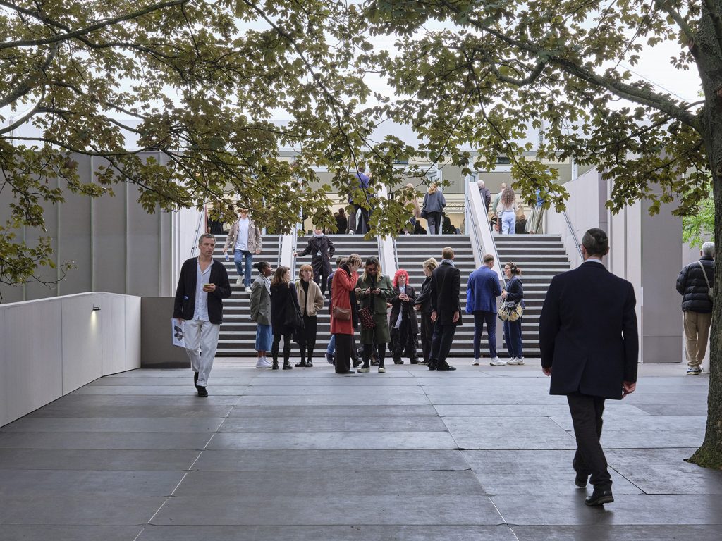
A grand new staircase now whisks visitors into the venue, offering a sense of arrival while softening the boundary between the park and the tent. The addition of windows framing the park’s leafy views further amplifies the light and creates a more open atmosphere inside.

Photography: Leon Chew

Photography: Leon Chew

Photography: Leon Chew

Photography: Leon Chew
Photography: Leon Chew
Photography: Leon Chew

Photography: Leon Chew

Photography: Leon Chew

Photography: Leon Chew

Photography: Leon Chew

Photography: Leon Chew
The studio’s redesign also includes a thorough rethink of the venue’s traffic flow. The movement of visitors in previous years has been studied to improve navigation. Galleries are arranged in a grid around a central loop, with clear sight lines and enhanced signage ensuring a smoother experience for visitors as they make their way through the tent.
In keeping with this focus on accessibility, the hierarchy of presentation has been democratised. In previous years, big-name and legacy galleries held centre stage, while emerging galleries and curated sections were relegated to the fringes. This year, the curatorial approach has shifted to put artists at the heart of the experience, giving equal prominence to a wider range of exhibitors.
Meanwhile, Frieze Masters has also undergone a redesign courtesy of legendary architect, Annabelle Selldorf to elevate the overall visitor experience.


