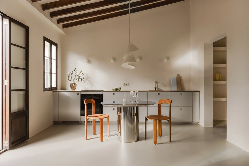
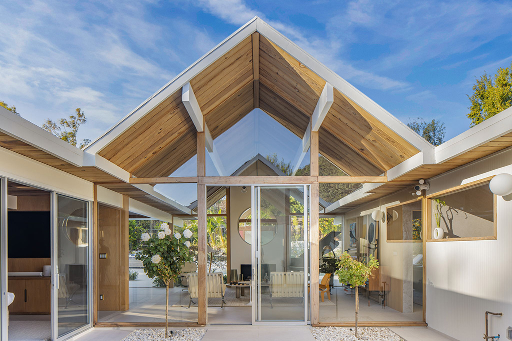
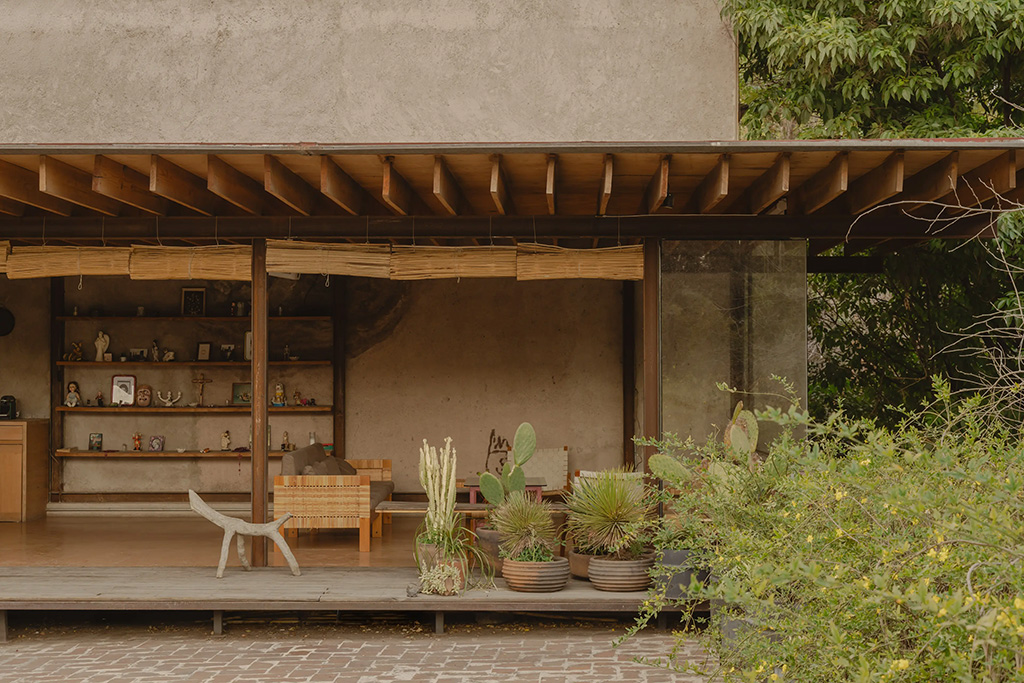
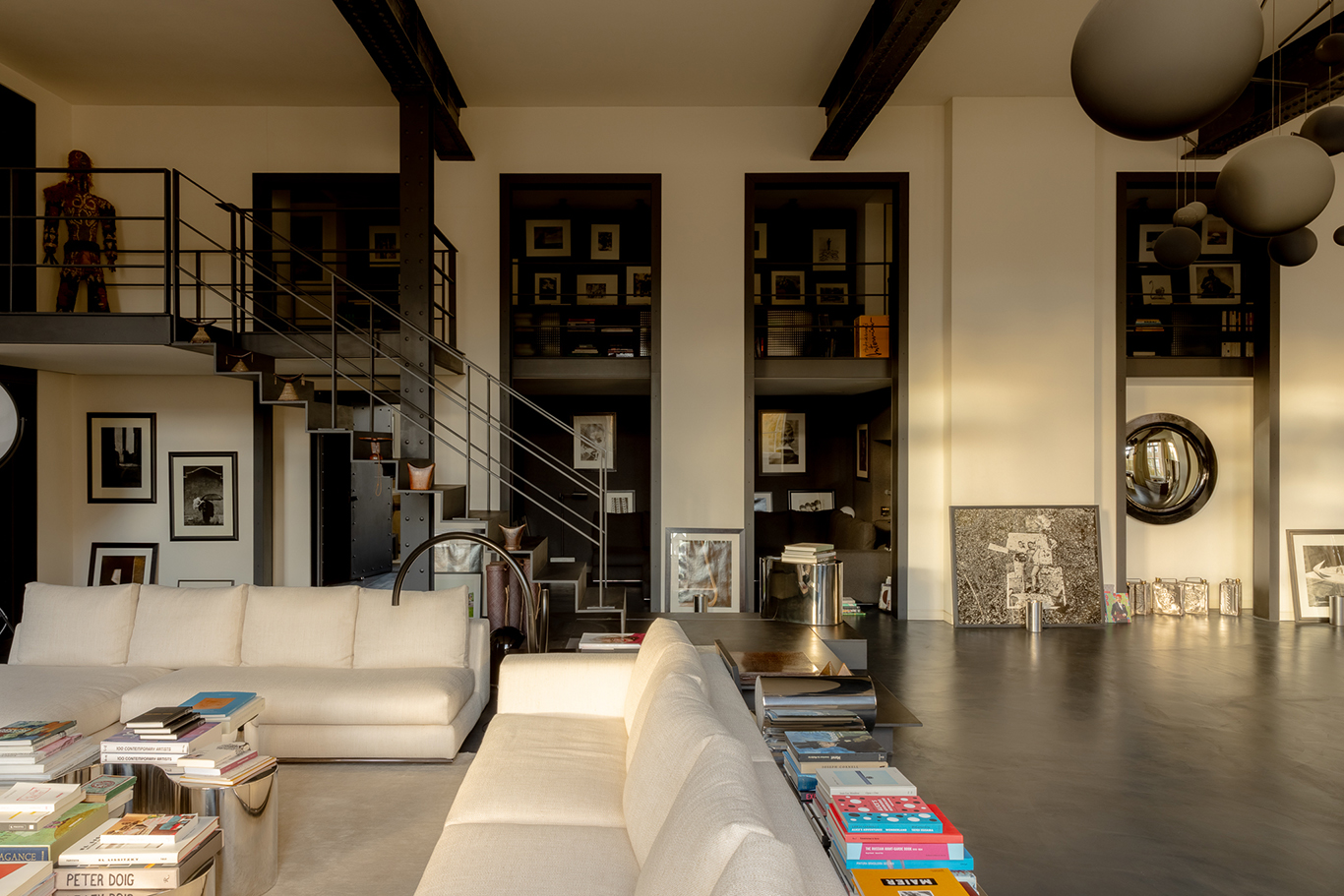
Out with the old and in with the new. 2025 is knocking on the door, bringing with it change, opportunity and a sense of adventure. If you’re looking to extend this experimental sensibility to your home, here are all the major colours looking to shine on the domestic stage this year.
Though this cache of colours looks disparate at first glance, there’s an earthy sensibility and groundedness that connects them, as well as a penchant for saturation and warmth, expressed in many different ways. Take a peek.
Mocha Mousse by Pantone

Pantone’s 2025 colour of the year is so warm and inviting you’ll want to drink it. PANTONE 17-1230 Mocha Mousse is a rich brown tone that ‘nurtures with its suggestion of the delectable quality of cacao, chocolate and coffee, appealing to our desire for comfort,’ says the company. If 2024 was the year of ‘demure mindfulness’, Mocha Mousse follows gently in those footsteps with a subtle but thoughtfully indulgent tone that encourages relaxation, cosiness and harmony.
‘For Pantone Color of the Year 2025, we look to a colour that reaches into our desire for comfort and wellness and the indulgence of simple pleasures that we can gift and share with others,’ says Laurie Pressman, vice president of the Pantone Color Institute.
Rumors by Behr

Rumors (MQ1-15) simultaneously evokes a tongue-in-cheek lipstick shade and one of the greatest albums of all time. Not a bad combination for the ruby red paint hue, whose tagline urges ‘Now is the time to make a statement’. The unapologetically bold but deep colour is a declaration of confidence that works well in kitchens, dining rooms and home studios or dens, especially for cabinets and baseboards.
Behr’s research lab claims that three-quarters of Americans would consider painting a room or wall a shade of red, but for many, red’s got a bad rep, connoting anger or unrestrained energy. Rumors is the antidote to those misgivings, taking things down a notch in the best possible way. The moody, warm shade has a heritage vibe while still feeling daring.
‘We’re seeing people embrace color like never before,’ says Erika Woelfel, Vice President of Color and Creative Services at Behr Paint Company. ‘Rumors is a modern take on the timeless red that creates an energetic appeal to make a lasting statement in a stunning way.’
Quietude by HGTV Sherwin-Williams

There’s power in tranquillity – and HGTV Sherwin-William’s 2025 Color of the Year, Quietude (SW 6212), leans into its strength. Described as a ‘soft sage with a whisper of blue influence’, Quietide brings a soothing coolness to interiors and works particularly well in spaces of transition, such as hallways or rest, such as bedrooms.
The soothing tone can be used for colour drenching, for doors, or for two-tone walls. Its sibling complementary shades, Snowbound and Convivial Yellow, have a similarly natural and optimistic vibe.
Sherwin-Williams’ first Color Capsule of the Year

Rather than announce a single colour, Sherwin-Williams has released nine shades for its first-ever Color Capsule of the Year.
As you’ll gather from the names—Grounded (SW 6089), Sunbleached (SW 9585), Chartreuse (SW 0073), Rain Cloud (SW 9639), Clove (SW 9605), Malabar (SW 9110), Bosc Pear (SW 6390), White Snow (SW 9541), and Mauve Finery (SW 6282)—the palette is grounded in nature, with each shade working in collaboration).
‘Together—as a complete palette or in expertly picked pairings—the capsule’s alchemy creates something to be treasured in any style or setting,’ said Sue Wadden, director of colour marketing at Sherwin-Williams.
While Sherwin-Williams highlighted nine, we gravitated towards Rain Cloud as our pick. This capricious grey with blue undertones looks fantastic in bedrooms—like being wrapped in a summer storm.
Encore by Valspar

Valspar isn’t afraid to go against the crowd, and while other brands have leaned into neutrals and gentle, nature-inspired themes, it’s taken a different route with its colour of the year. Encore (8002-45G) steps confidently into the future, an atmospheric ultramarine shade designed to stir the senses and excite.
‘Says the company: ‘Blue is enjoying its comeback — its encore if you will. Valspar® Encore is an anchoring shade that embodies constancy and confidence to let you create a joyful respite from the ebbs and flows of life.’
‘Joyful’ Encore most certainly is, and it’s more adaptable than it appears at first glance. It’s described as a ‘bridge’ between digital and physical realms, saturated with a violet undertone that can be amplified or softened with low lighting.
Alphalpha by Nippon Paint

Japanese paint company Nippon Paint’s 2025 theme is ‘Heart Island’ with the colour Alphalpha (GN5080-2) emerging as the leading shade, ‘a green with medium-high brightness and medium-low luster, giving off a gentle elegance and a sense of transparency.’
Inspired by the natural world and the pursuit of inner peace, the shade conjures a sense of tranquillity and is a harmonious addition to the home that works well in a multitude of spaces. It’s particularly powerful in bedrooms and cosy, ‘soothing’ spaces, promoting a sense of calmness and relaxation in dens, home studies, and dining rooms.
Cinnamon Slate by Benjamin Moore

You might want just a pop of Cinnamon Slate (2113-40), or you might want to drench the entire space in this warm, rich plum that meets a smooth chocolate brown shade for an immersive colour experience. The brand calls Cinnamon Slate ‘adaptable, yet distinct’, and it’s a striking colour that makes an impression without dominating or overwhelming a room.
Cinnamon Slate works equally well in living rooms, dining rooms, and bedrooms and is a ‘backdrop’ to living rather than a showy colour that dominates and dictates the mood. It’s part of a new 10-colour palette, which features five warm and five cool shades that can be used in any combination to further heighten the atmosphere of the space.
Elderton by Graham & Brown

Deep, warm and inviting, Elderton by Graham & Brown is a nature-inspired brown shade that manages to make a statement while also being very gentle.
Graham-Brown took inspiration from the Elder tree for the colour, particularly its deep brown leaves, to create a shade that embodies an earthy, organic and timeless vibe well suited for an accent wall, dining rooms or cosy living room spaces. Browns typically aren’t chosen as the colour of the year (or should we say dark browns?), but this shade checks the box for versatility and depth. And though it’s not subtle, it has a quiet honesty that nurtures rather than dominates.
Purple Basil by Dulux

Regal and rich Purple Basil (DLX1046-7) is one of the bolder colours appearing on this list, but it still has its feet planted firmly in the ‘warm’ category. This dusty violet shade has mauve undertones and, according to the company, ‘reflects the movement away from lighter, airier hues in favor of deeper, richer colours, a trend evident in everything from fashion to interior design.’
If that sounds serious, Purple Basil has a playful side to it too, conjuring up celestial deep space vibes, or earth side, a restorative and peaceful confidence.
‘Positioned between a mid and dark tone, Purple Basil is deeply shaded, yet muted. Multidimensional with depth and layers, Purple Basil has a touch of warmth from the red pigments in its composition. The result is a perfectly balanced color—not too bold or too bright—that imparts a sense of serenity, comfort and elegance.’
Caramelized by Dunn-Edwards

Dunn-Edwards is also leaning into earthy, gentle tones with its shade Caramelized (DET687). It is described as a ‘warm terractorra brown with soft earth tones that evoke the sunbaked hues of natural clay’. In effect, it’s a ‘new neutral’, warm and adaptable, that pairs well with other more confident tones and is envisaged as a timeless colour that will remain popular for years to come.
‘In the current fast-paced, high-tech age, we find ourselves drawn to more saturated and timeless colors to create personal spaces that feel welcoming, stylish, and grounded,’ said Lauren Hoferkamp, lead colour expert at Dunn-Edwards.


