‘Our intention was to merge old and new so seamlessly that you don’t always recognize what was there before and what wasn’t,’ said architect Rem Koolhaas at the opening of the new Fondazione Prada in the south of Milan last Saturday.
His practice, OMA, have designed a sprawling new art and cultural centre for the Italian fashion powerhouse on the 19,000 sqm site of a former distillery from the early 20th century.
Just steps from a series of barely used, lush green railway tracks that used to bring the raw ingredients in and the finished spirits out of the factory’s ornate metalwork gates, the Fondazione Prada complex is an alluring combination of seven existing and three contemporary buildings that each has an individual identity and name.
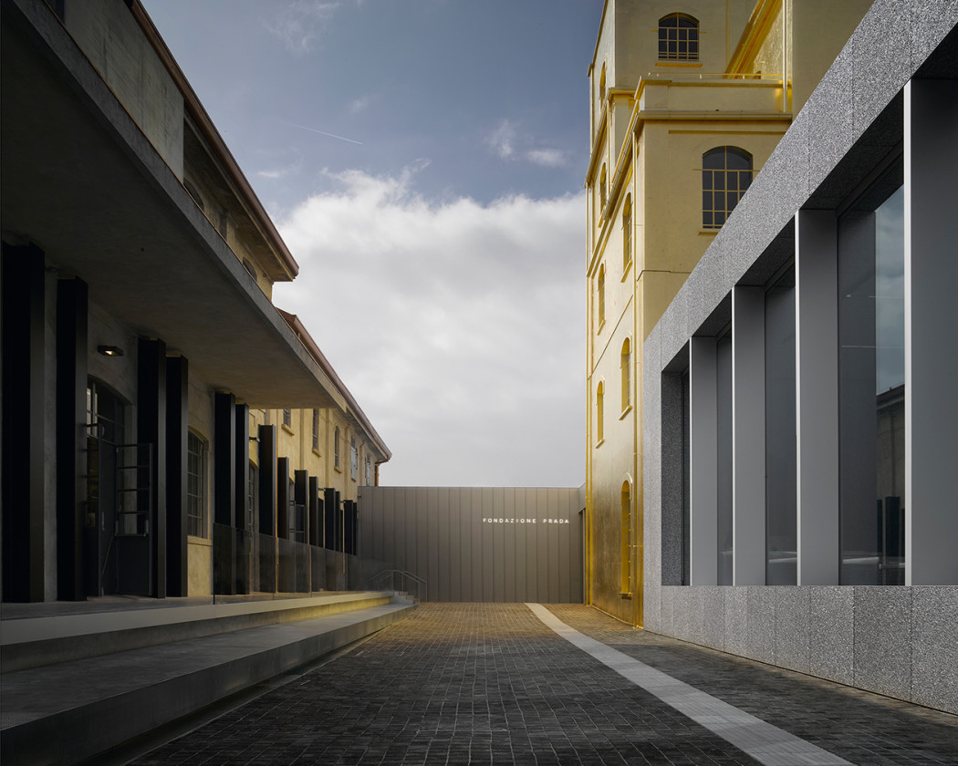
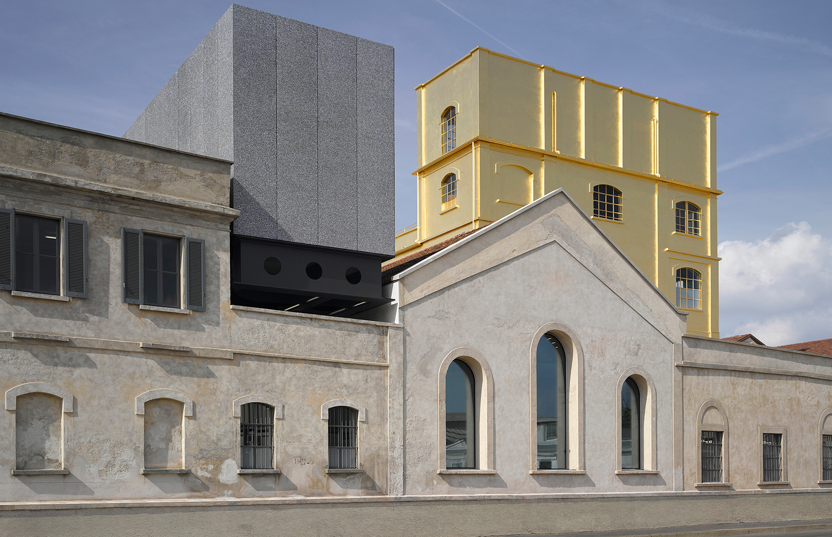
The Fondazione Prada offers a happy collision of architectural styles. Photography: Bas Princen, courtesy of OMA
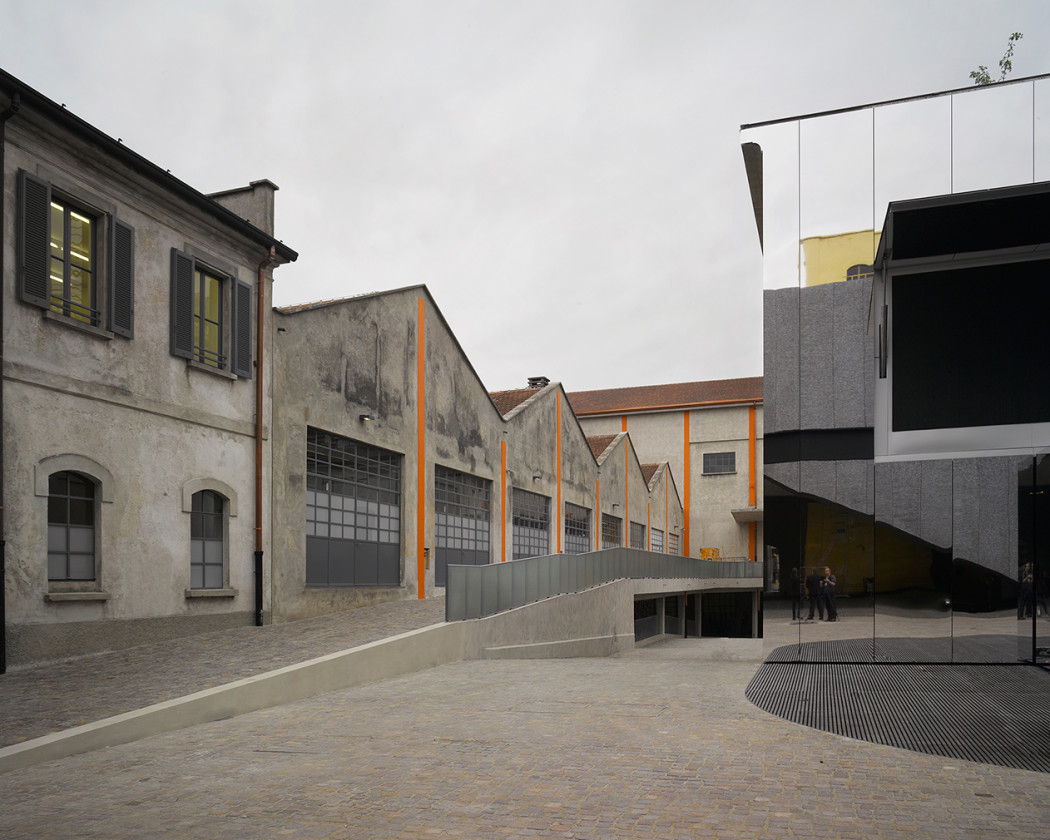
OMA have created intriguing and unexpected juxtapositions. Photography: Bas Princen, courtesy of OMA
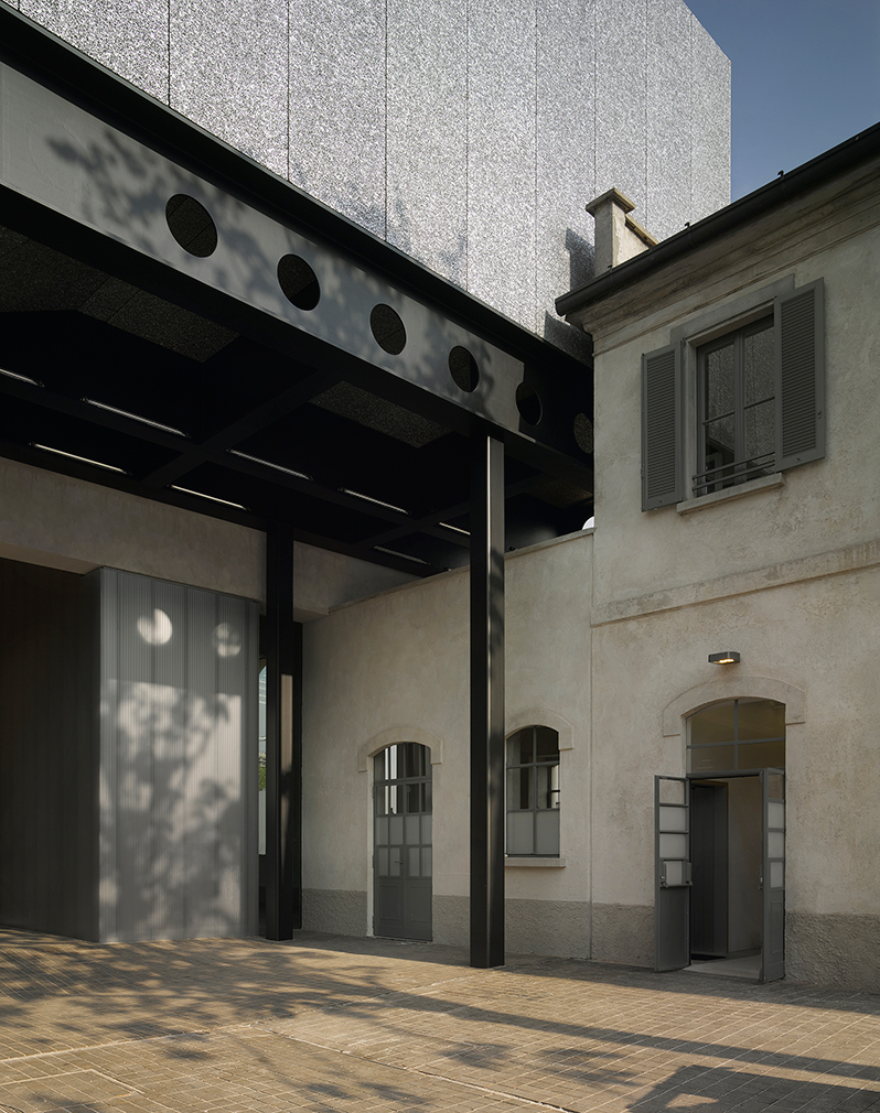
High and low materials, finishes and colours come together in an irreverent but harmonious fashion. Photography: Bas Princen, courtesy of OMA
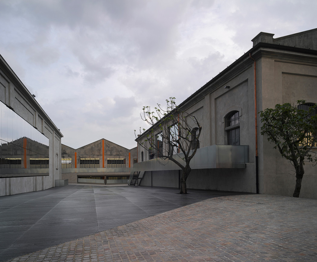
It’s a remarkable series of found and created spaces for art that celebrates the site’s industrial heritage without being deferential to it. Photography: Bas Princen, courtesy of OMA
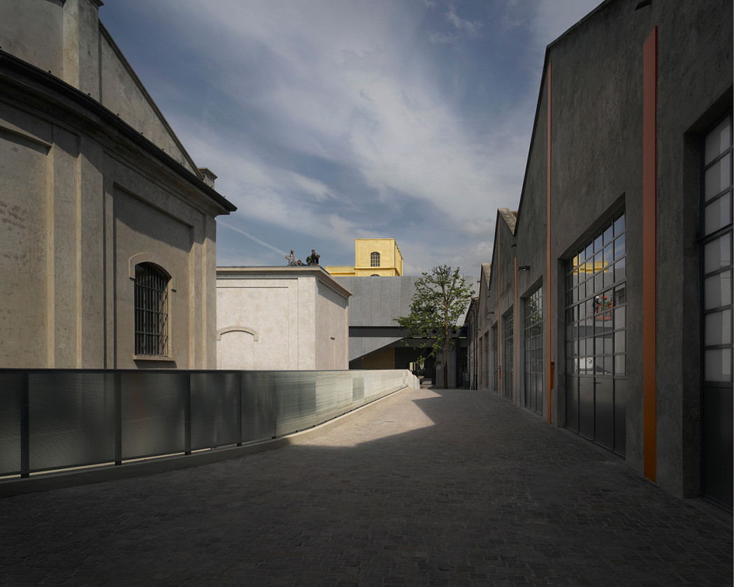
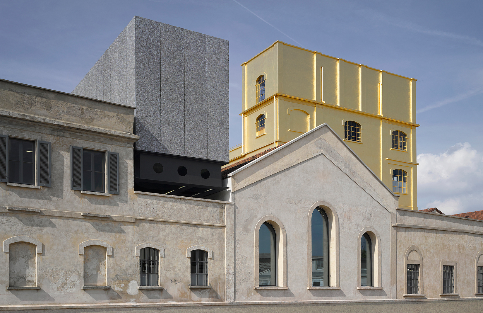
Every inch of an unremarkable four-storey building, known as the Haunted House, is clad in 24 carat gold leaf. Photography: Bas Princen, courtesy of OMA
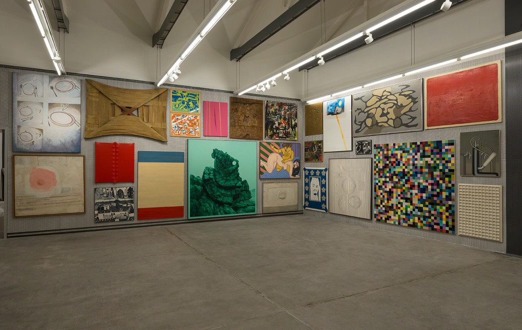
Installation view of ‘An Introduction’. Photography: Attilio Maranzano, courtesy of Fondazione Prada
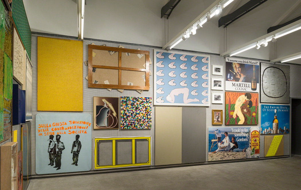
Installation view of ‘An Introduction’. Photography: Attilio Maranzano, courtesy of Fondazione Prada
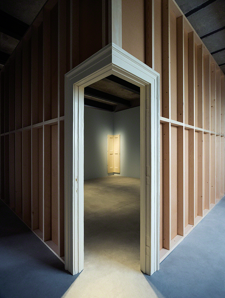
‘Corner Door and Doorframe, 2014-2015’, by Robert Gober. Photography: Attilio Maranzano, courtesy of Fondazione Prada
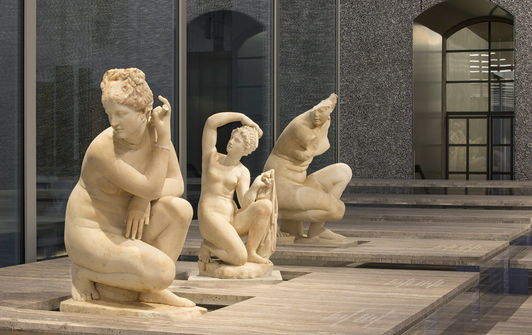
Installation view of ‘Serial Classic’, co-curated by Salvatore Settis and Anna Anguissola. Photography: Attilio Maranzano, courtesy of Fondazione Prada
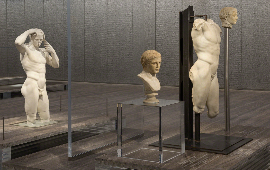
Installation view of ‘Serial Classic’, co-curated by Salvatore Settis and Anna Anguissola. Photography: Attilio Maranzano, courtesy of Fondazione Prada
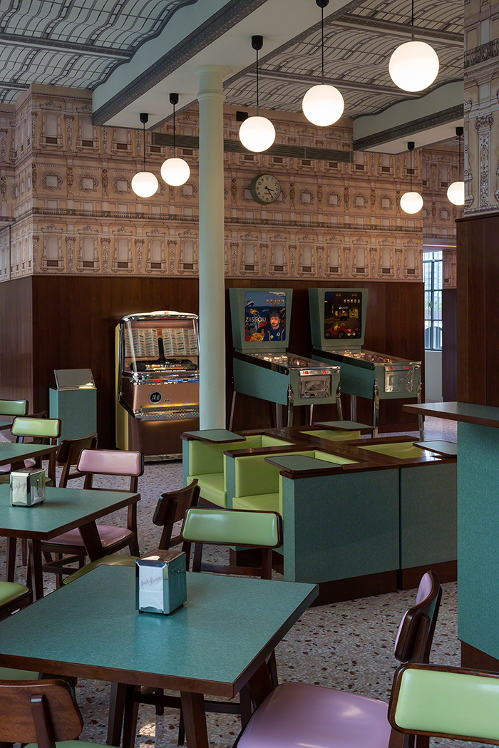
Bar Luce, designed by Wes Anderson. Photography: Attilio Maranzano, courtesy of Fondazione Prada
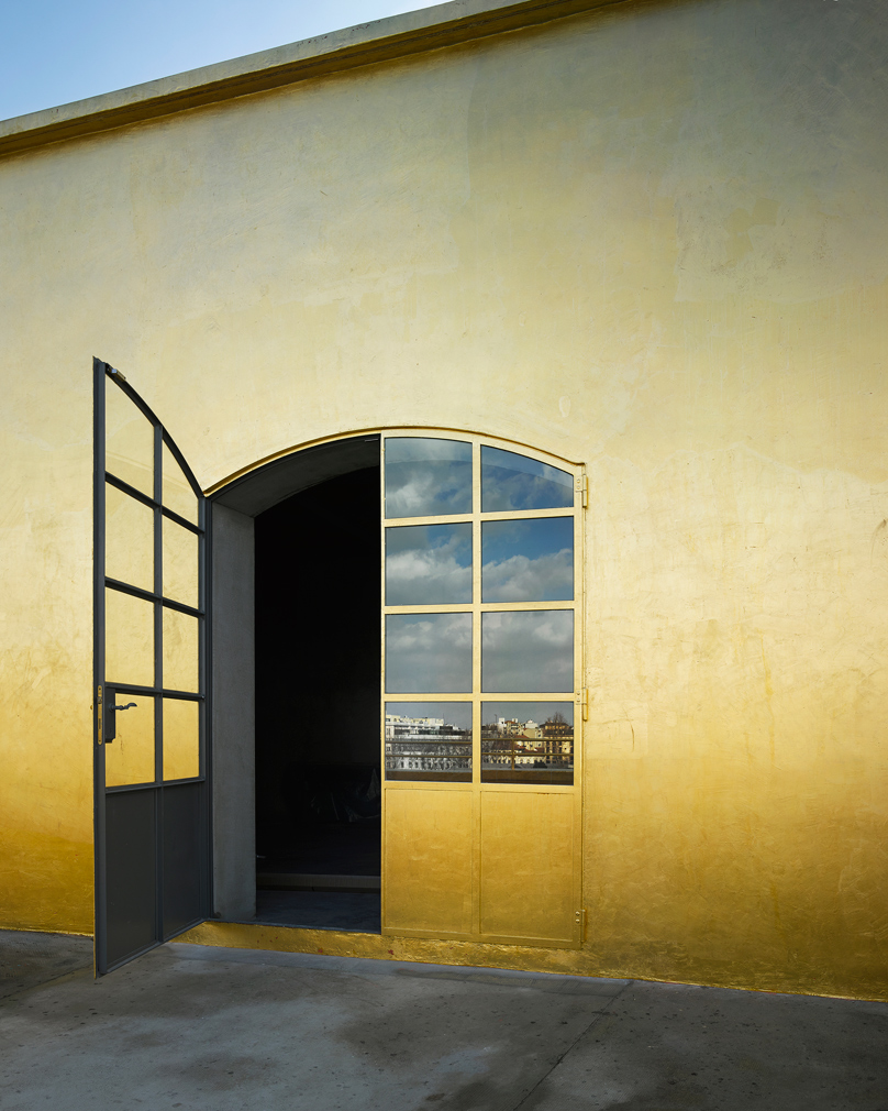
The gold leaf clad Haunted House. Photography: Bas Princen, courtesy of OMA

A rooftop terrace offers view of the city to the north. Photography: Bas Princen, courtesy of OMA
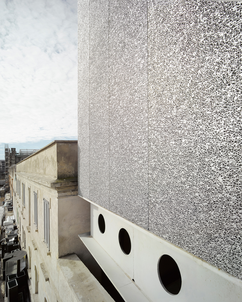
New and old structures work together. Photography: Bas Princen, courtesy of OMA
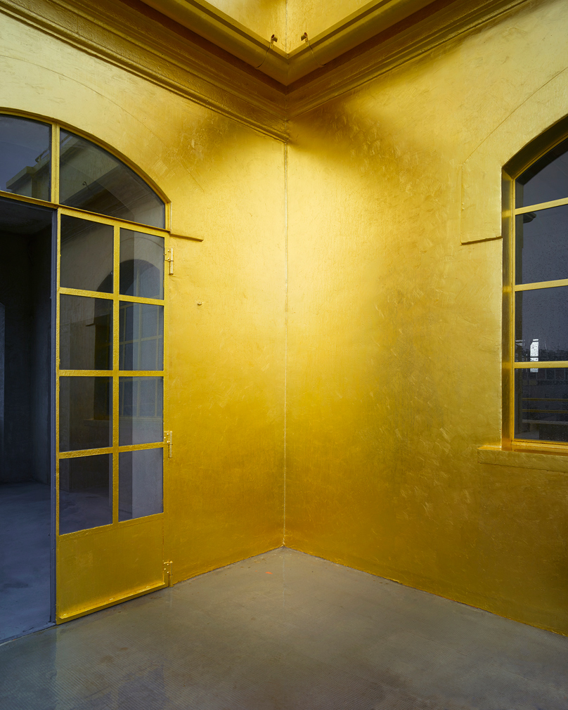
Outside the gold leaf clad Haunted House. Photography: Bas Princen, courtesy of OMA
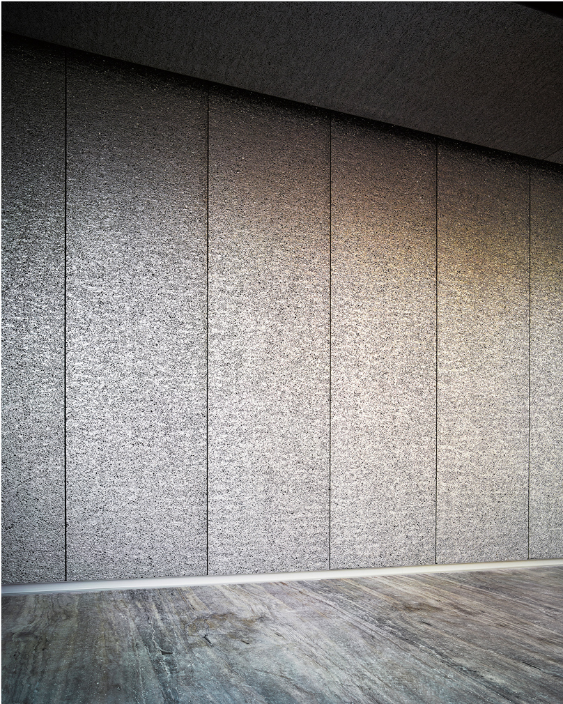
Textured materials work together paying homage to the site’s industrial roots. Photography: Bas Princen, courtesy of OMA
It’s a remarkable series of found and created spaces for art that celebrates the site’s industrial heritage without being deferential to it and creates endless intriguing and unexpected juxtapositions.
The new so-called Podium building’s arched windows echo those of the building it replaced, while its dark steel crossbeams come crashing into the rooftop terrace of one of the existing structures, and an impressive cantilever juts out from its other side coming perilously close to its 1900s neighbours without ever quite touching them.
High and low materials, finishes and colours come together in an irreverent but harmonious fashion. Walls of polycarbonate panelling vie for space with acres of foamed aluminium, while beautifully detailed yet understated grey travertine from Iran lines the walls and flooring of the main glazed central exhibition space of the Podium.
Every inch of an unremarkable four-storey building, known as the Haunted House, is clad in 24 carat gold leaf (including the drainpipes and roof railing). The new low-slung ‘cinema’ building, meanwhile, comes coated in reflective polished aluminium. ‘If I had to sum up the project with one word I would call it “ambiguity”’, says project architect Federico Pompiglioni. ‘This was never about a white box or sacred attitude to art.’
One of the three new buildings – a 60m tall white concrete and glass tower – is not yet completed. ‘It was important to have a vertical element in the environment,’ says Koolhaas. Pompignoli refers to it as a sort of beacon that will give the site a presence on the southern Milan cityscape. ‘It is oriented north towards the city and people will be able to see it for miles in the dark,’ he says. In a nice further wayfaring touch, the architects designed embossed maps of the site replete with a bright orange ‘you are here’ spots, which are scattered around the grounds.
No arts complex would be complete without a café. Designed by filmmaker Wes Anderson the whimsical Bar Luce references Milan’s grand 19th century shopping arcade – Galleria Vittorio Emanuele – in its faux glazed vaulted ceiling as well as Italian cinema of the 1950s and 60s in its colourful formica furniture. It’s another unexpectedly rewarding collision of styles and finishes.
