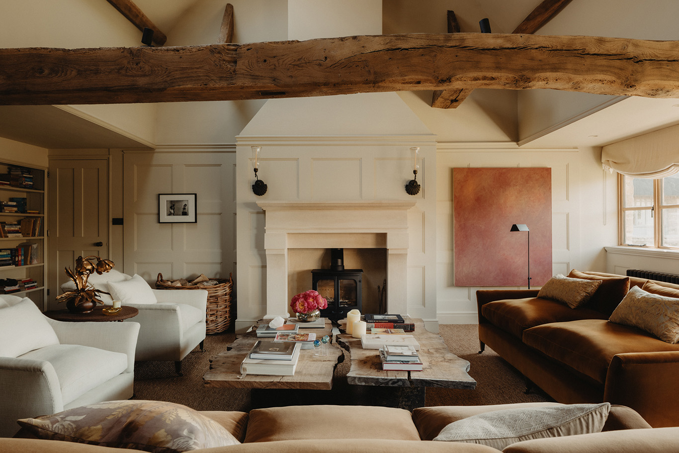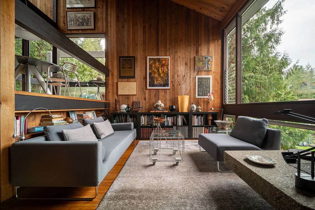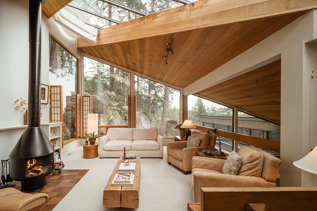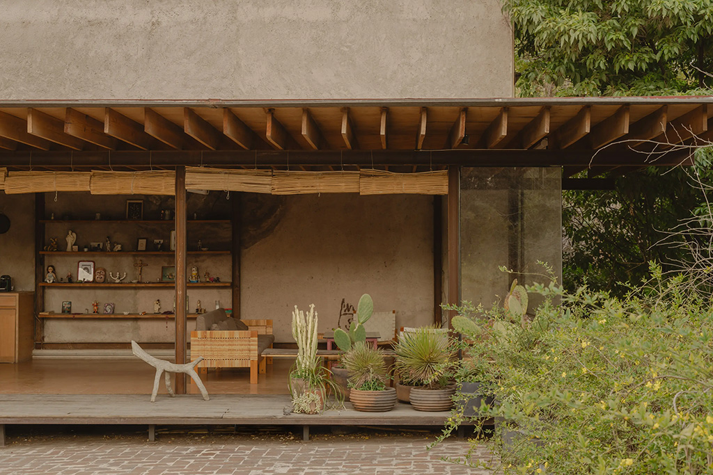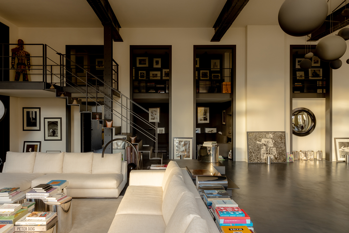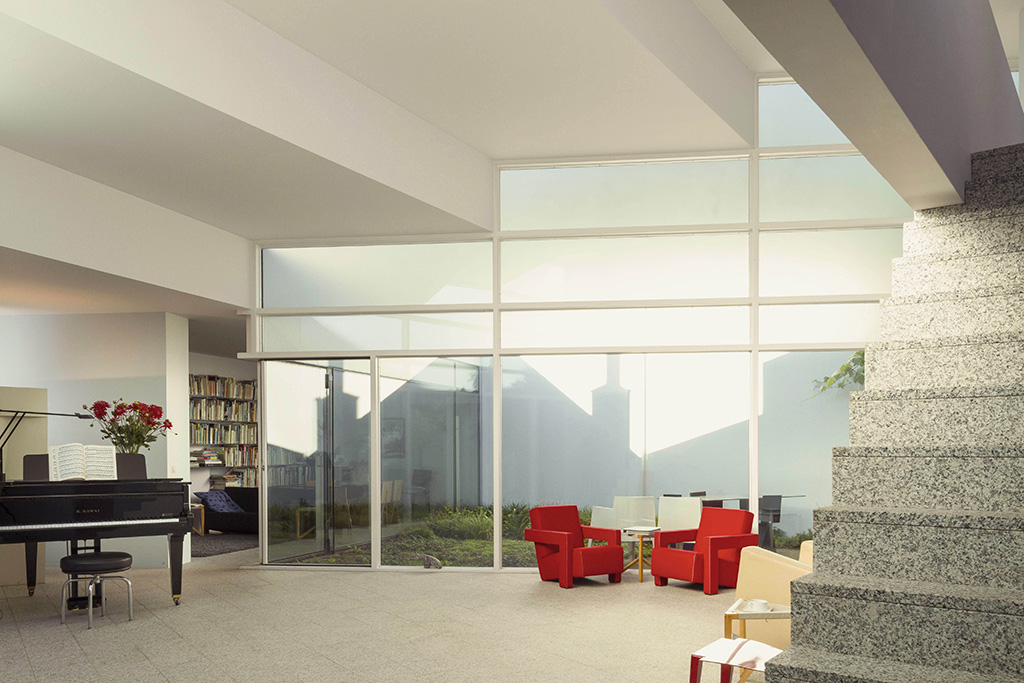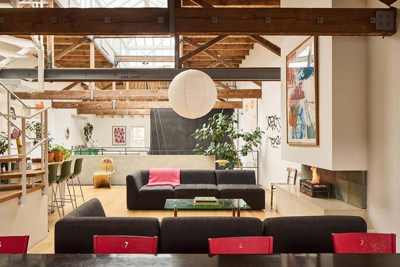
Understated ‘quiet’ design in muted tones has held sway for years now, but that all seems set to change, as colour, pattern and excess take centre stage.
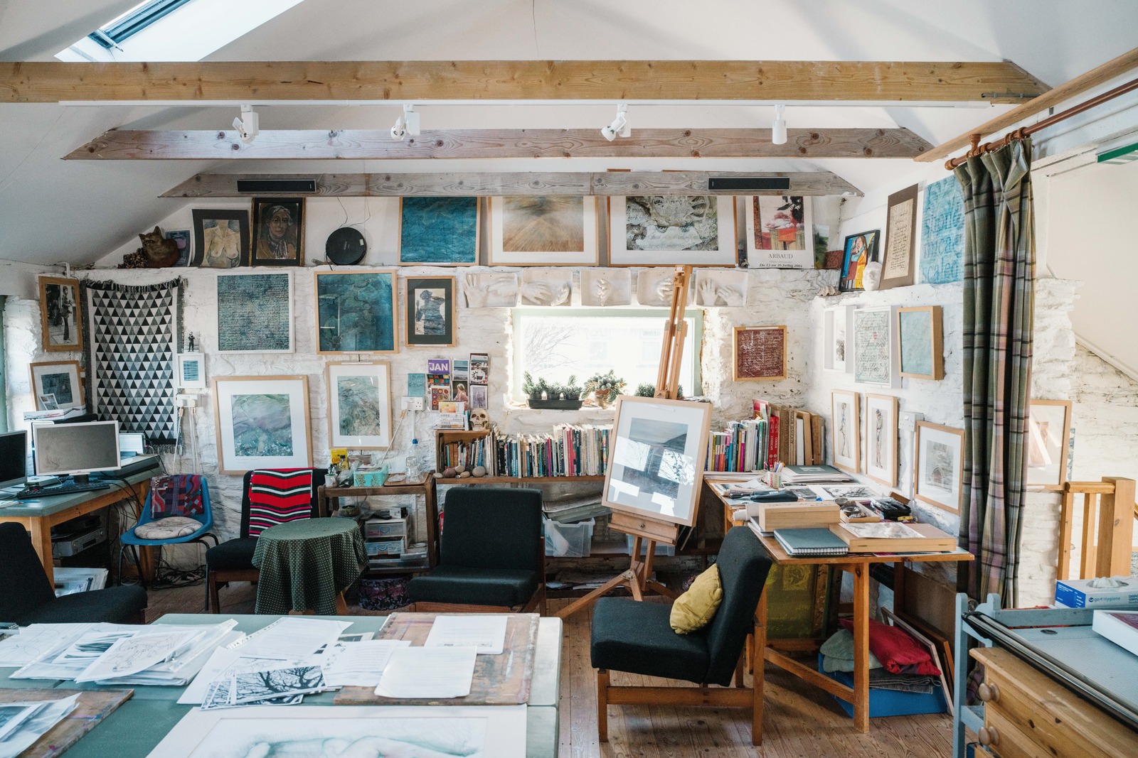
A stroll around Milan Design Week in April revealed a ‘multicultural and emotional journey into the world of maximalism’ by Corian, while Dimore Studio’s latest collection was showcased against a mash-up of historical styles and colours. Artist and designer Luke Edward Hall thinks this is a backlash against digitised perfection: ‘We are spending so much time looking at screens that we want our homes to be more ‘real’ – more layered, more textured, full of objects we’ve collected and loved.’
We spoke to five creatives who all agree that, when it comes to interior design, more really is more…
Luke Edward Hall

One of David Gill Gallery’s Bright Young Things in 2016, London-based Luke Edward Hall designs interiors, fabrics and ceramics. ‘The world can be quite a grim place sometimes and maximalist interiors provide an escape – a fantasy in which to lose yourself,’ he says. ‘I just see it as wanting to be surrounded by lovely things.’

He cites an eclectic range of inspirations from ancient Greek myths and folklore to the English countryside and Italian food, so it is no surprise that his work is so rich and colourful.
Malin Glemme

One of Stockholm’ most exciting design stores, Layered, came about because designer Malin Glemme couldn’t find a rug for her living room. She designed one herself, found a manufacturer in India and it appeared in photographs of her home. Glemme had so many enquiries that she put it into production and today Layered is redefining Scandinavian design. ‘I have always been drawn to looks with a strong personality, expressed through bold patterns, colors and shapes,’ says Glemme.
‘Scandinavian design has been well-known as Minimalistic, but that’s not all of the truth,’ she adds. ‘The last few years, there’s been a slow return of a more colourful, vibrant design inspired by Swedish Josef Frank and the “Swedish Grace” movement.’
Martina Mondadori Sartogo
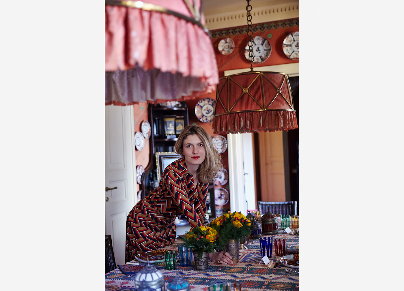
Milan-born designer Martina Mondadori Sartogo is the founder of Cabana – a biannual magazine bound in a different fabric or textile for every issue – but she credits her parents and in-laws for the Maximalist style that infuses her home.

‘Our parents all had a passion for things, for patina and quality and for the pleasures of collecting,’ she told Architectural Digest. She often travelled with her father to exhibitions and galleries and his influence can be felt to this day.
Roman and Williams

Roman and Williams Buildings and Interiors is a New York-based design studio established by Robin Standefer and Stephen Alesch in 2002. Describing their style as ‘primitive Modernism’, they eschew the Minimalist style prevalent in contemporary office design. ‘There’s a whole movement in architecture that says the office should be a white box—you don’t want the space to distract all your creativity,’ says Standefer. ‘And of course Stephen and I feel the exact opposite. Make it Maximalist instead of Minimalist.’

Dimore Studio
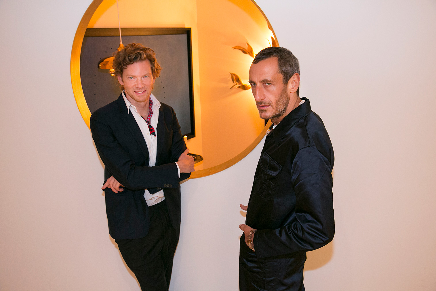
Founders Emiliano Salci and Britt Moran describe Dimore Studio as moving between design and art, architecture and fashion, so it is no wonder they were leading the trend for pluralism at Milan Design Week.

‘We create interiors that mix styles, periods, materials, colours, lightness and darkness, old and new,’ they say. ‘Nothing inspires us more than the patina of time, reinterpreted in sophisticated, contemporary decors, to create a specific mood. The result is an aesthetic that is not only hauntingly beautiful, but also unique.’
Read next: As an antidote to Maximalism, see how Minimalism is changing its shape
