Universal Design Studio helped redefine the notion of an ‘office’ when it designed London’s Ace Hotel, where Shoreditch residents congregate en masse to eat, work and play. It has also created HQs for the likes of Mulberry and Virgin, so it seemed natural to pay the team a visit at their own Shoreditch space to see where their ideas are dreamt up.
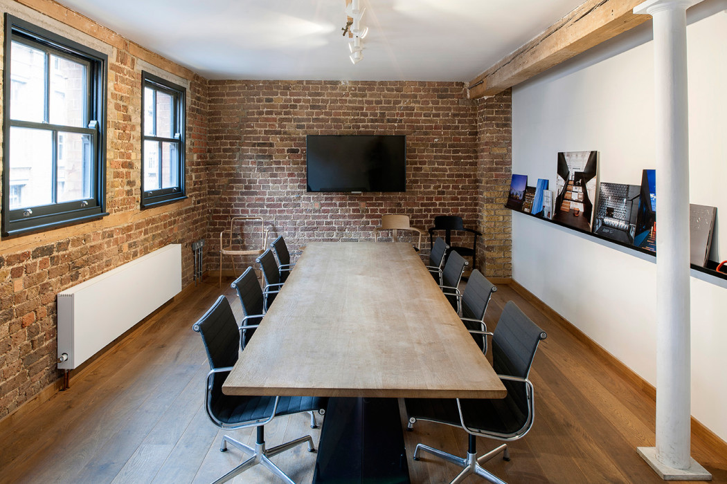
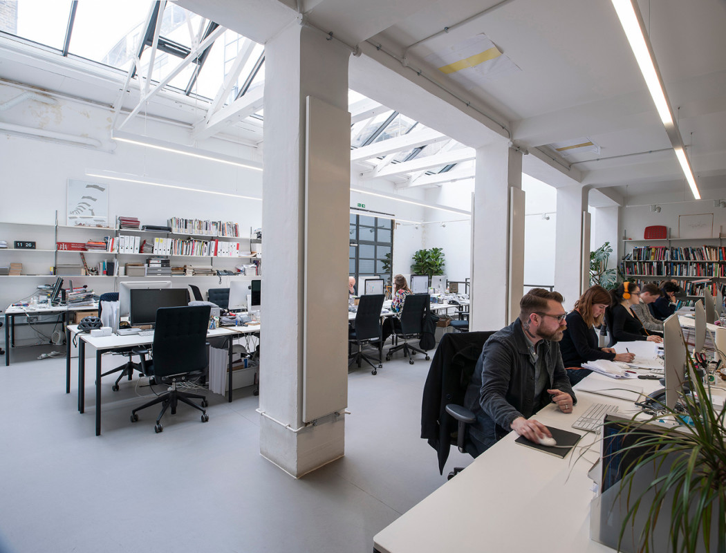
The 35-strong team of architects and designers are based in one of the area’s many red brick former industrial warehouses. ‘There was a commitment to a certain type of quality in these buildings even though they were designed for industrial purposes,’ says Jason Holley, pictured below with co-director Hannah Carter Owers. ‘That quality and heritage is something we keep returning to as a practice.’
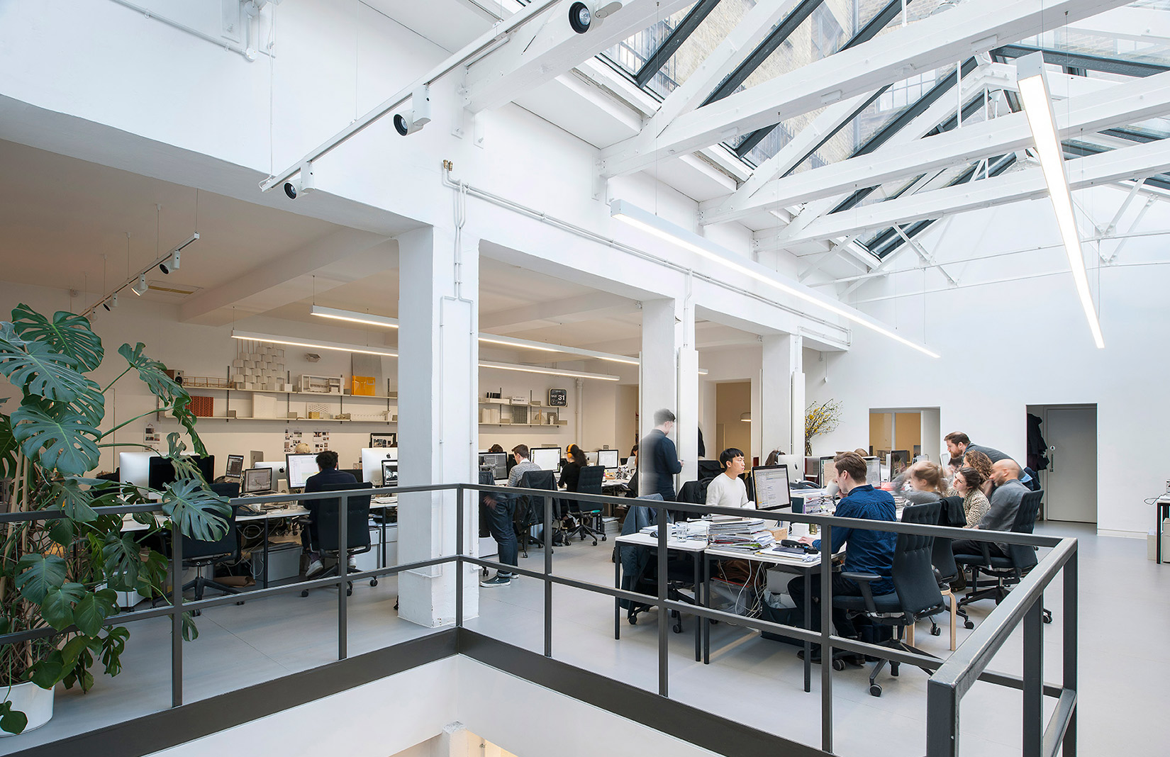
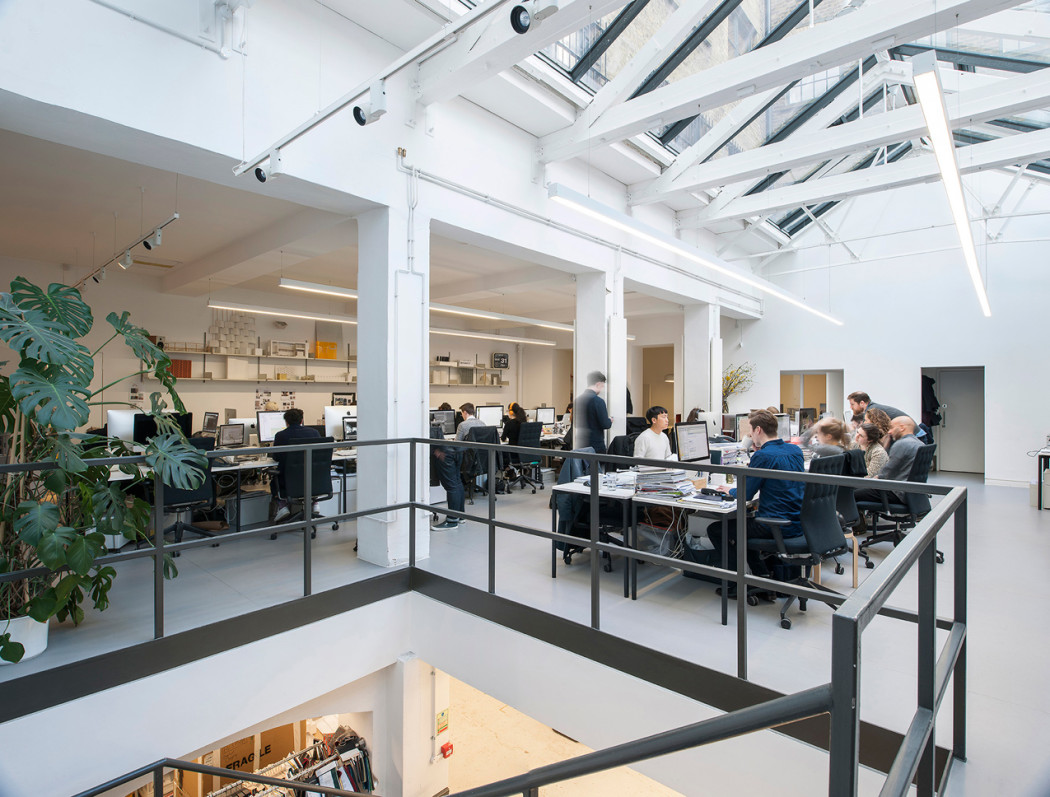
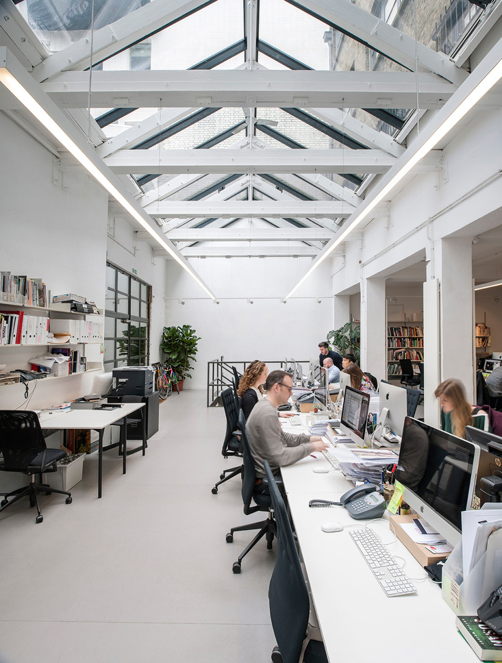
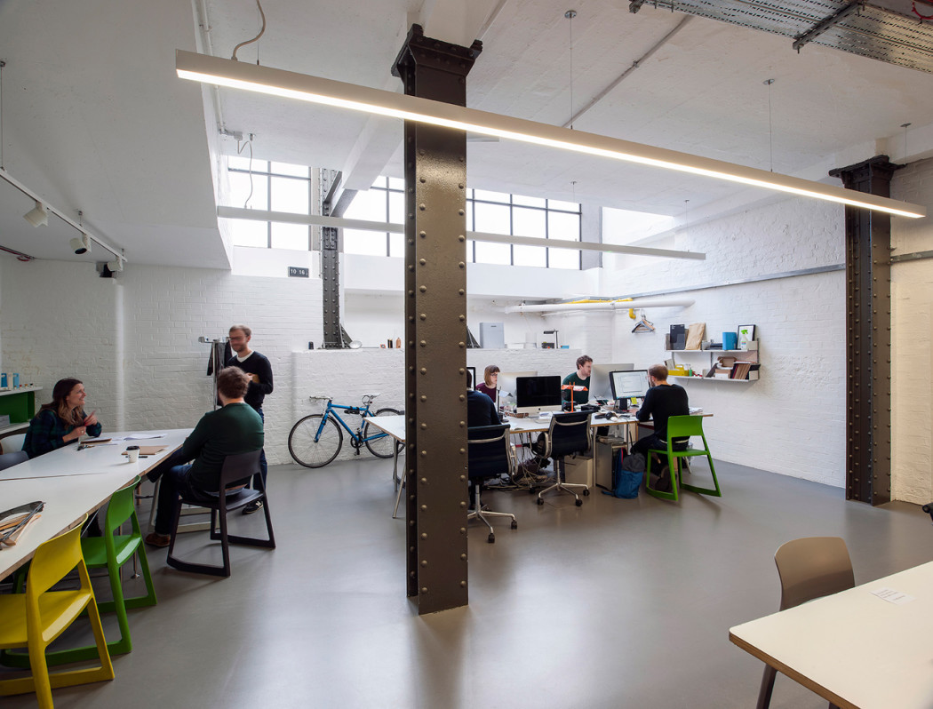
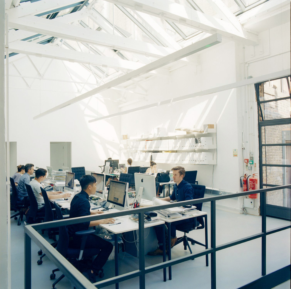
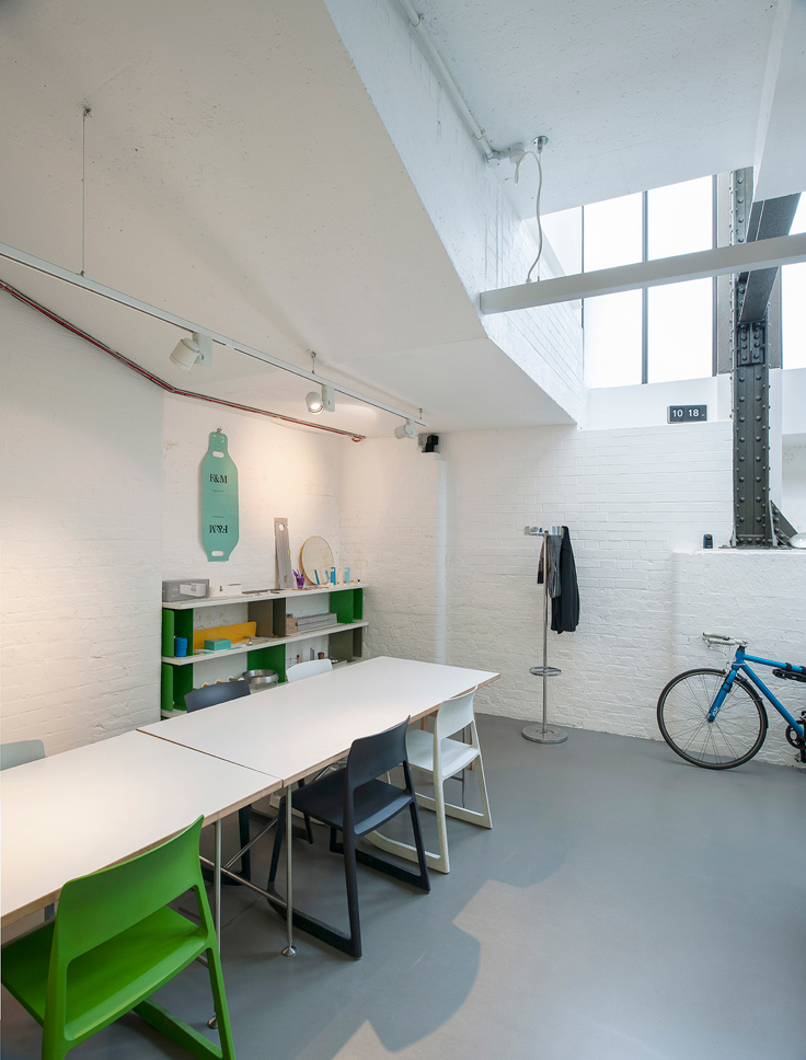
Universal Design Studio moved into the space on Charlotte Road about eight years ago with their sister company Barber & Osgerby, taking over the building’s ground floor and basement. They stripped back the space, opening it up to create an office that is flooded with light. A double-height ceiling helps breed big ideas.
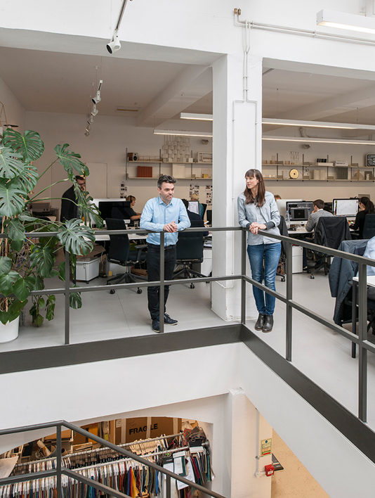
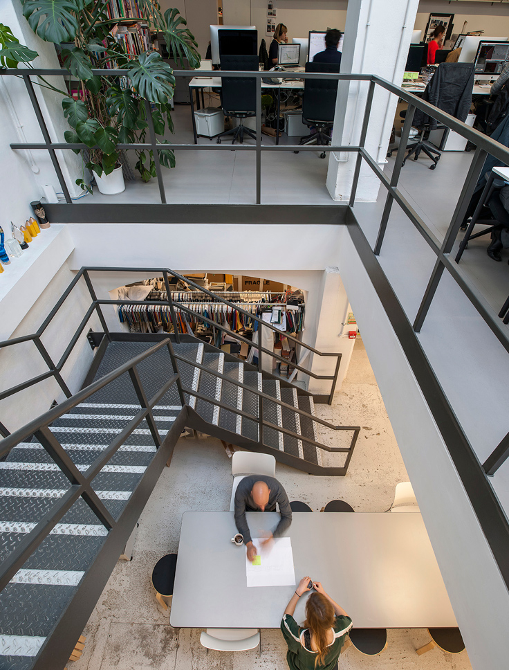
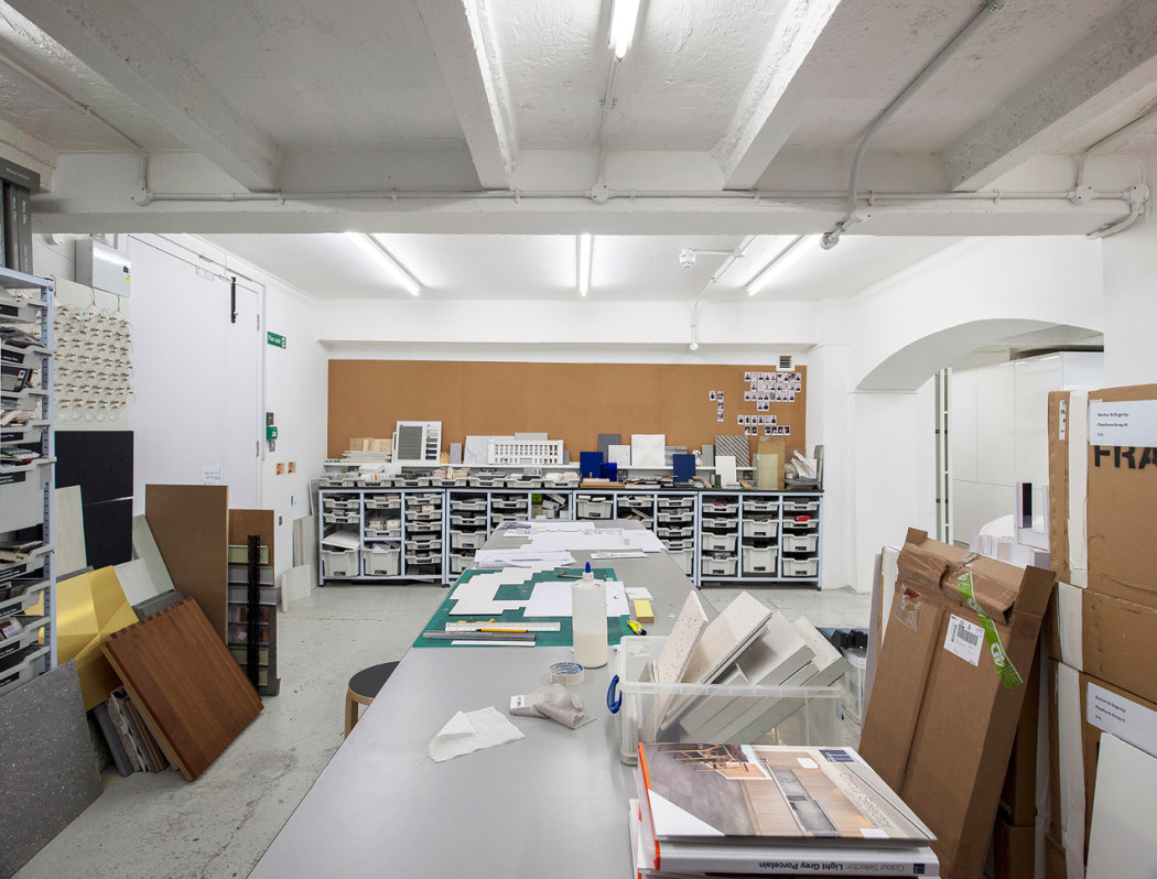
With the birth of another sibling – creative consultancy MAP Project Office – they quickly outgrew the space, which saw the group expand into a collection of rooms in the underbelly of the building, its first floor and in the building next door.
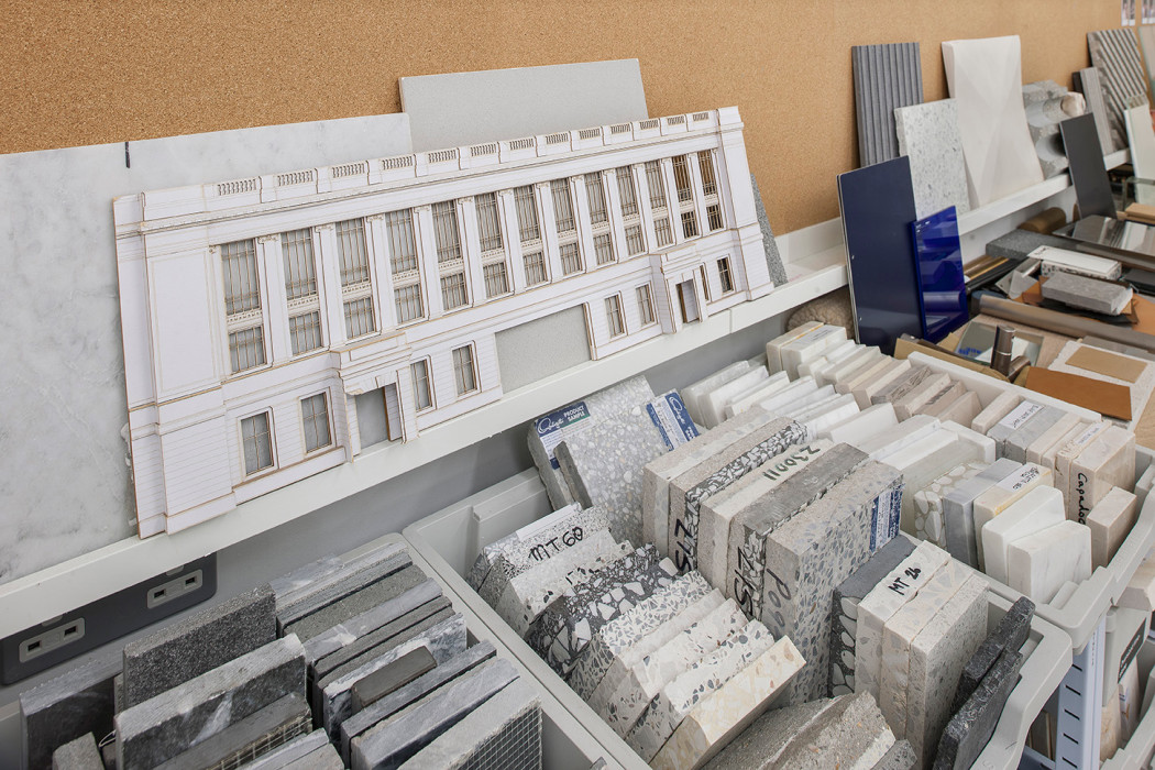
This maze of rooms is the antithesis of the Facebook doctrine of one, vast open-plan space. But it works. Here, Barber & Osgerby have conjured up designs for everything from the Olympic torch to furniture for Vitra and Knoll, while Universal Design Studio’s client list continues to expand across the globe.
Ahead of the latter’s open studio event today – part of the London Festival of Architecture programme – we spoke to Holley about how their HQ incubates their ideas and how the way that people inhabit space is changing.
Why Shoreditch and what drew you to this building?
A lot of our collaborators were based here so it was a natural place for us to be. We thought about moving two years ago when we needed more space. Many creative businesses are moving out because of rent hikes, which is a worrying trend. But when we managed to negotiate additional space, we looked at what could be beneficial about this labyrinth of rooms.
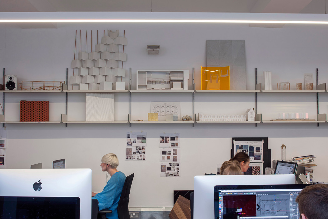
Creativity is a difficult thing to work with. It’s hard to define what it is about a space that’s conducive to it but for us, it’s clear that we benefit from having rooms with different qualities – some that are open and lively; others that are quieter. There are plenty of nooks and crannies where you can sit and contemplate.
What do you take away from your own experiences of working here, when you are designing other people’s work spaces?
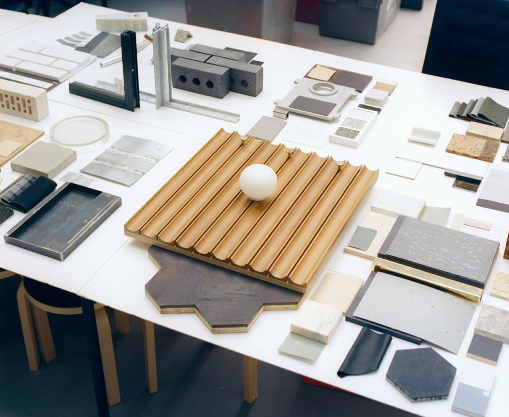
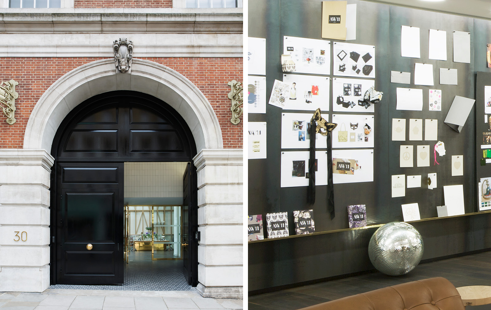
Every company works differently – there’s no one size fits all. We try to intuitively pick up on things that aid what people do. We observe how they work and try to get under their skin. At Mulberry, we realised reference imagery was the most important tool for the team’s working process, so we created a big steel wall that was magnetised and stretched across the space. It acts as a communication device for the company.
How do you go about expressing the culture of an organisation in the workspaces you design?
We often focus heavily on entrance spaces. Alvar Aalto once said that door handles are like the handshake of the building. For us, the entrance is one of the key moments when your relationship is cemented with a building and a brand.
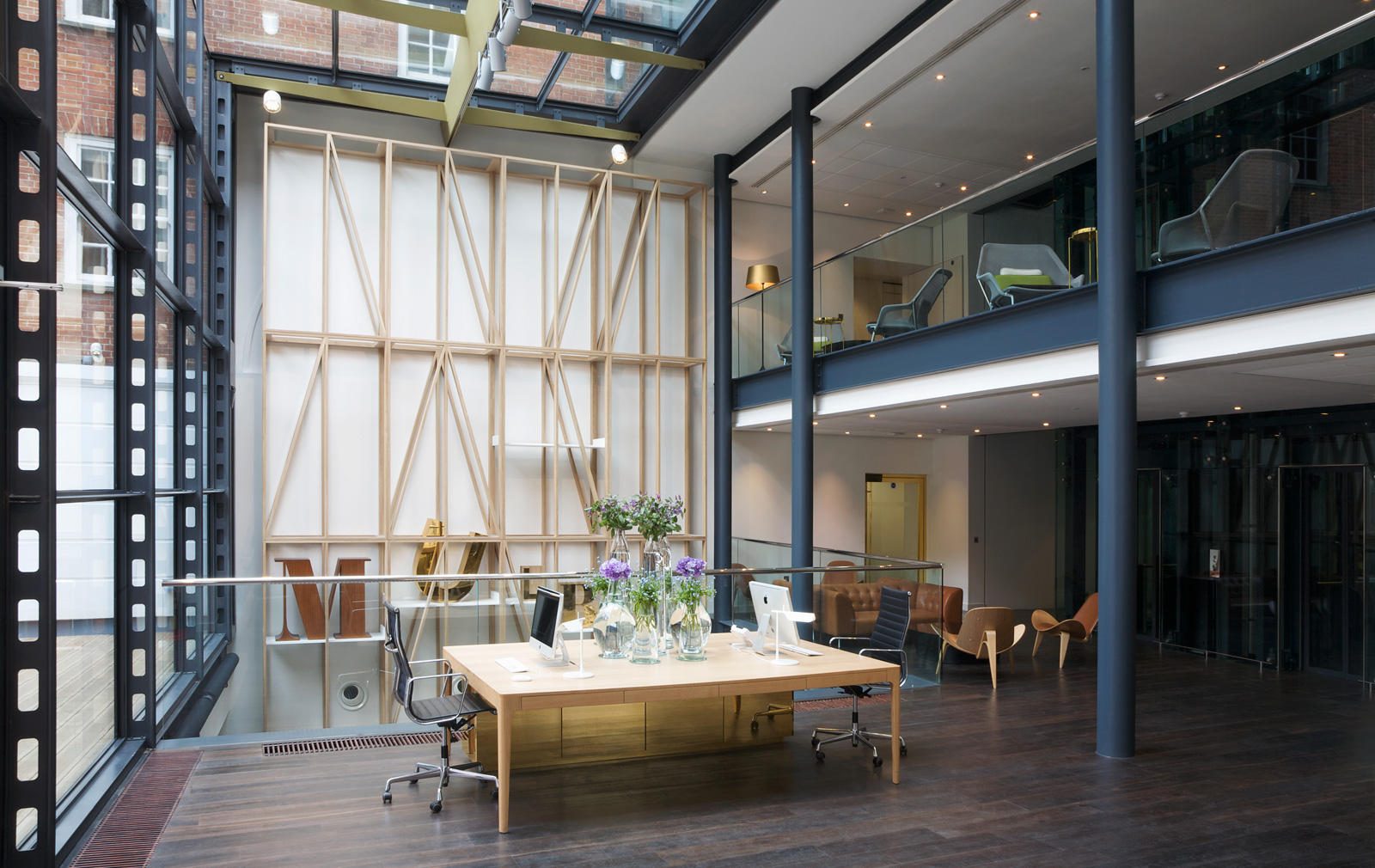
In the case of Mulberry, this was really important. When we started working with them seven or eight years ago (we’ve since delivered over 100 stores for them across the world) they were known as a heritage brand but they also wanted to foreground their younger, more innovative side. The entrance was a good way to communicate this. We decided to stick with the big, heavy, black door to convey that sense of heritage, but this is propped open and leads to a second door that reflects the ‘new’ Mulberry in its materiality – polished brass, glass and oak. That contrast was really important.
The way people are living and working is shifting dramatically at the moment, largely because of technology. How is this affecting the types of projects you take on?
Many of our projects are overlapping. We don’t just design a hotel, a store, a workplace or a residential project in isolation any more. They are all blurring into each other.
These days retail spaces have to be much more than just stores to succeed. We’re currently working with Australian developer QIC to reboot Eastland Shopping Centre in Melbourne. They’re trying to introduce all sorts of different spaces like libraries and galleries, and we’re also rethinking how you organise retail.
In Sweden, we’re working on a big project that will re-examine what a ‘business’ hotel is today – not a corporate space but an informal place to congregate to work.
Have we moved away the play-pen style offices that typified Google and Coca Cola HQs in the noughties?
If you go into a disco-themed meeting room, the only idea you’ll come out with is a disco room. A space’s character shouldn’t be so strong that it’s overwhelming.
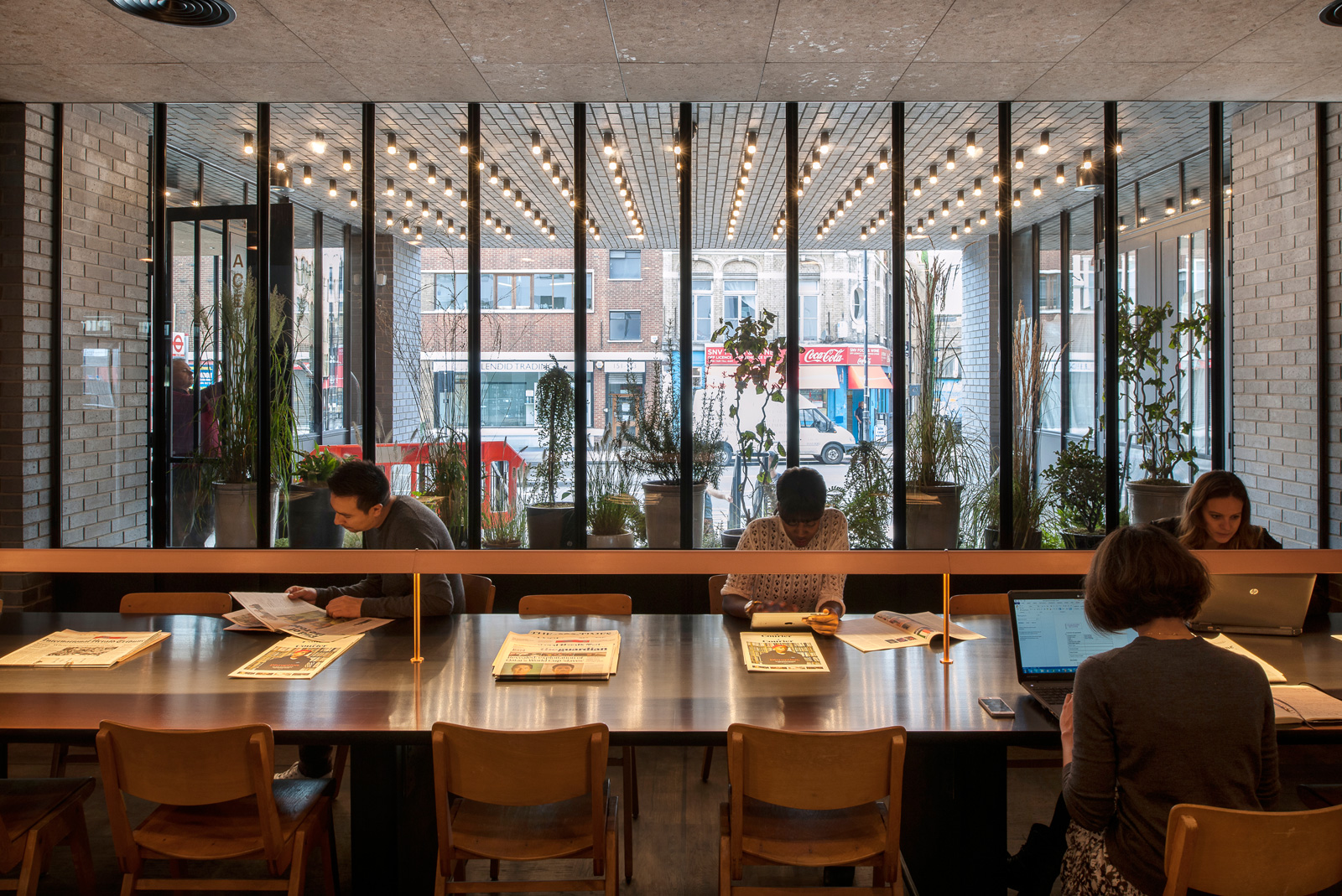
How do you think the way we work is impacting the spaces we call home?
New models for living are beginning to emerge. We’re currently working with a developer on a new concept that’s a response to the pressures on housing within the city, in terms of space and cost. We’re looking at ways to combine communal spaces – including workspaces – with private areas. We realise there are parts of your home that you want to keep private but there are other parts that work quite well to share with others. If you do that, your personal space can be smaller.
The developer comes from a hotel background, and the idea stems from the notion of making a hotel more residential. It’s sort of like Ace, but where you can actually live. More will be revealed soon…
