Terence Conran managed a brief sentence at yesterday morning’s Design Museum opening press conference before his voice cracked with emotion: ‘It’s a happy day for us and I hope for you too’. The audience warmed to this raw response from the museum’s founder and benefactor, and there was a genuine sense of excitement as people filled the building for the first time.
A major new museum aspiring to be the best in the world and shift our perceptions of design is indeed a momentous ambition. Director Deyan Sudjic followed Conran, saying that he hoped the museum would ‘unite the design tribes but also speak to a wide audience, and make design a mainstream part of the conversation’.
Their target is 650,000 visitors a year and if the people do come, they will find plenty to see. The new Design Museum has two vast exhibition halls, a permanent display of 800 objects from the collection, a well-equipped education centre, members room, restaurant, shop and more.
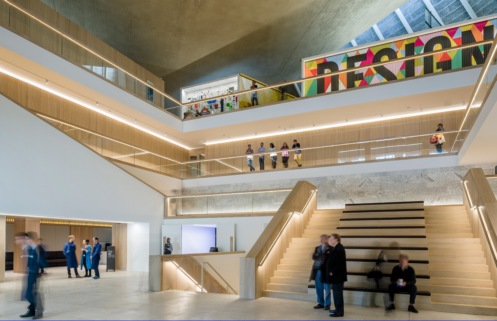
This is very much a new model for a museum, with just 25% of the gallery space given to the permanent collection. Chief curator Justin McGuirk describes it as a ‘kunsthalle’ for temporary exhibitions rather than a conventional museum. And the feeling of a meeting place, where ideas and people are the attractions rather than objects, is reflected in the design of its interior.
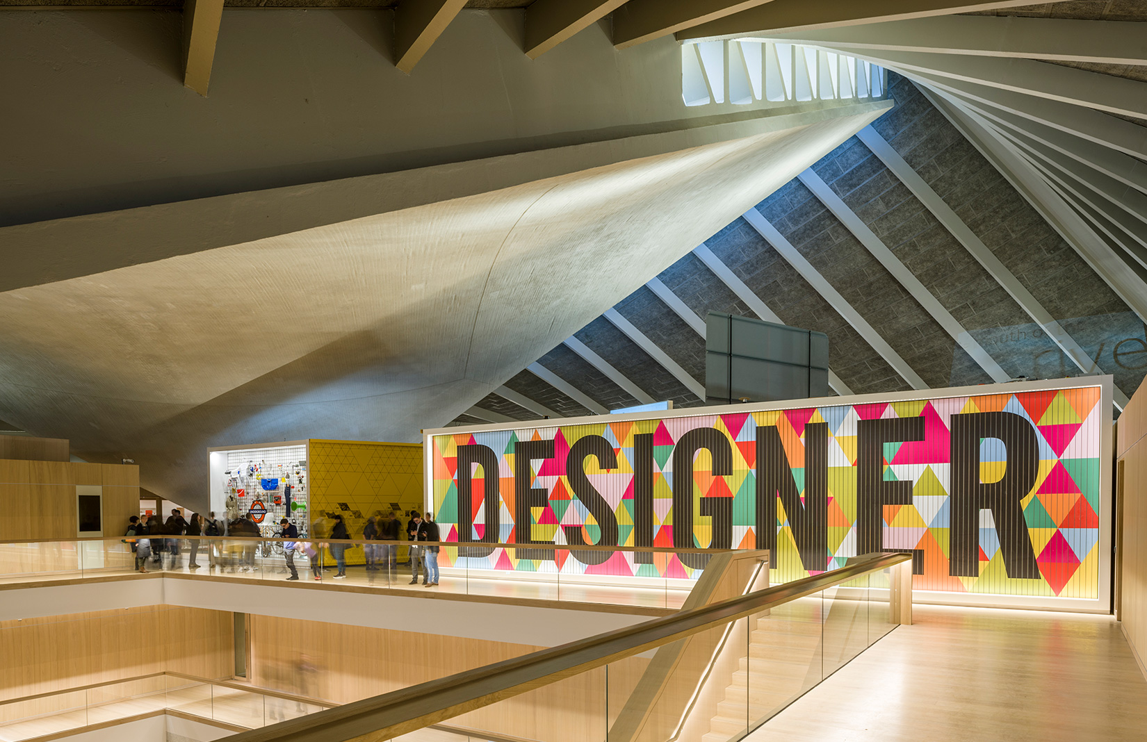
John Pawson has focused on the central space, which is a place to sit, shop, promenade, and of course to look up and worship the Grade II*-listed former Commonwealth Institute’s spectacular paraboloid roof.
When Pawson won the competition to redesign the interior of the 1963 building – designed by RMJM – some key decisions had already been made by OMA, the firm who master-planned the site and made the shell ready for the Design Museum to take it over. For practical reasons it removed ancillary buildings that originally contained the institute’s administrative offices, and the original curved floors and staircases, which lacked the load-bearing capacity needed for a museum.
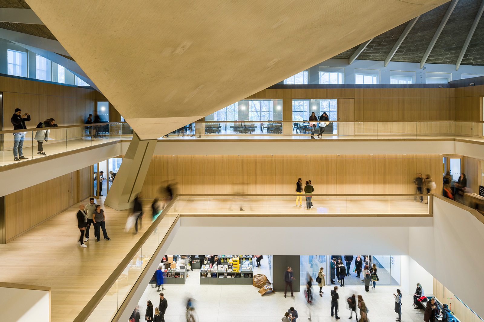
So Pawson started with what was effectively a box with an exotic roof structure. His approach was to maintain an open central volume, with the accommodation arranged on galleries wrapping around the edge, like ‘an opencast mine’ as he put it.
Evidently he has tried to tame the Commonwealth Institute’s eccentric architecture with logic and straight lines. All that can be glimpsed of its original playful curves and disorienting geometry is the concrete roof slab, which hangs above the atrium like a giant manta ray.
Much of the success of the museum as a meeting place will be proven in how the curators bring this circulation space to life. Pale oak and white paint very much dominate the experience right now, but if they are given permission to treat these surfaces as a tough framework for events and installations it could become a busy, intense environment. With acres of pristine white walls, the danger is that it will remain more like the polite restrained box you’d associate with a place of worship or retail.
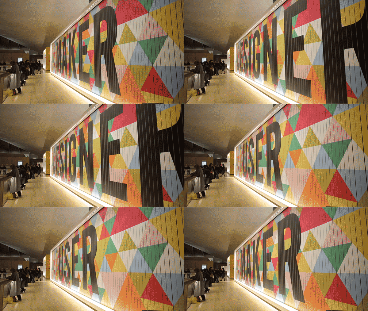
Exhibition and graphic designer Morag Myerscough certainly breaks the silence, calling visitors up to the top floor with the use of a ‘triple sign’ billboard that rotates the title of the permanent collection, Designer Maker User. The display, which wasn’t quite finished when I visited, is a complex sequence of spaces that attempts to engage visitors on different levels. Some areas are clearly aimed at school parties, with large simplified text explaining the basics of design; while other displays allow the objects to speak for themselves.
A wall of 200 crowd-sourced objects reinforces the message that the ‘canon’ of design is out, in favour of a more fluid exploration of context and meaning. This is most vividly illustrated by the juxtaposition of an Eames leg splint alongside an AK47. ‘Killing and healing’ are presented as two aspects of the use of design. The significance of the leg splint as part of the Eames’ experimentation with bent plywood, which led to chairs and other products, is sadly irrelevant in this context.
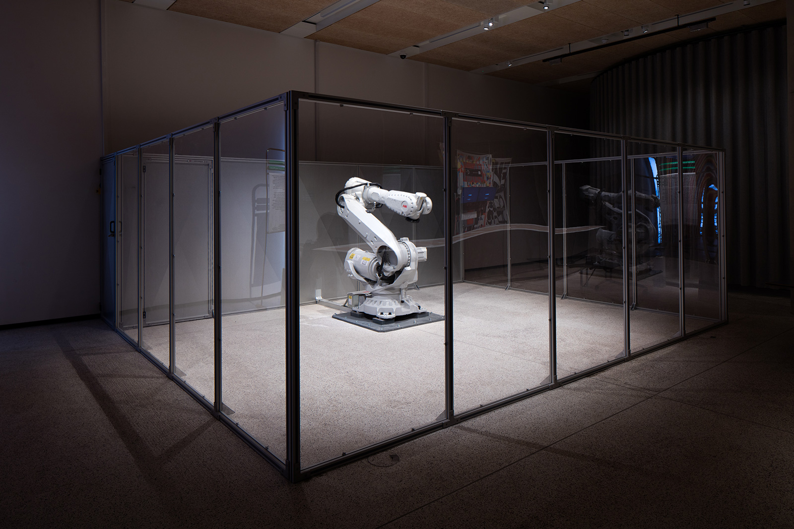
as part of Fear and Love. Photography: Luke Hayes
The argument is that visitors can always search online or in a library if they want to find out more, but still, the curatorial approach leaves me feeling uncomfortable in the way it leads the visitor to certain conclusions.
McGuirk points out that the new Design Museum is ‘not just an architectural shift, it is a content shift’. With the opening exhibition, Fear and Love – Reactions to a Complex World, the chief curator says he is trying to ‘challenge, to provoke and to set the tone for the museum’s new programme’.
Reportedly, he threw out Sudjic’s original idea of opening with a show on design manifestoes, in favour of Fear and Love, 11 installations by invited designers who responded to the state of the world. ‘This was the riskiest thing we could have done,’ says McGuirk, who began developing the show just a year ago.
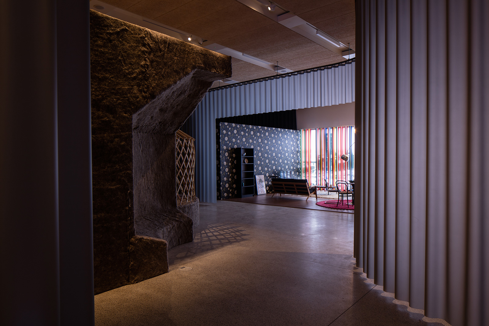
Photography: Luke Hayes
The risk has paid off though, and the show is an intriguing romp through contemporary world issues by international names including OMA, Kenya Hara, Neri Oxman and Hussain Chalayan. Exhibition design by Sam Jacob and graphic designer OK-RM shows off the generosity of the main ground floor exhibition hall, avoiding fixed partitions in favour of a meandering 190m-long curtain of projection fabric.
But back to the opening speeches. After regaining his composure Conran went on to quietly but decisively declare that he feels the Design Museum’s moment has arrived: ‘Optimism. That’s what this place is about. Clean, fresh, full of surprise. We’ve grown up but not grown old.’
Conran’s ideas about design seem strangely at odds with the museum’s fashionable new focus on issues and meaning. Nonetheless, these tensions are part of the appeal of the museum, reflecting the multiple outlooks of the design world itself.
Read next: 11 culture hubs opening this autumn
