How we live: developer-designer duo Jonathan Ellis and Sophie Smith take us inside their testbed London home Hide
By: Ellen Himelfarb
How we live: developer-designer duo Jonathan Ellis and Sophie Smith take us inside their testbed London home Hide

The Art Form and Scenesmith founders practice what they preach in Hackney
Words Ellen Himelfarb
Photography Kane Hulse
Film by Kato Productions
Music by Mr Goldfinch
He’s a London developer. She’s an interior designer who helps developers realise the potential of their properties. On paper they’d suit any number of cookie-cutter residential towers across the city. In reality, Jonathan Ellis and Sophie Smith are working together to redefine multi-unit living in London today. With Ellis’ retirement from the “if it ain’t broke, don’t fix it” development game and Smith’s fascination with unconventional materials, they are hoisting the bar for what passes as aspirational contemporary residential property.
“I felt like I couldn’t do this for the rest of my career. I wanted to be challenged,” says Ellis, who after 13 years working within a cookie-cutter framework launched his own firm Art Form. “Also, in the areas of East London I was working in, the buyer wanted something a bit different.” He credits the success of his design-led approach to Smith, with her background in architecture and talent for channeling that “something different”.
Their most recent collaboration, a 160-square-metre North London block designed by Dowen Farmer Architects called XO, was marketed in its entirety by The Modern House after construction wrapped late last year. Working within the raw concrete envelope, Smith finessed each flat with ecru walls, plum built-ins and herringbone wood and staged them with Danish antiques picked from local sellers – most of which were snapped up by the buyers.
“Other developers don’t usually go for weird, wonderful details like chamfered pre-cut columns,” says Smith, founder of the interior design studio Scenesmith, “or windows that are timber where they meet the concrete and aluminium where they meet the brickwork.” The strategy brings a vintage-Brutalist feel to the interiors that feels authentic in a heritage neighbourhood favoured by creative professionals.
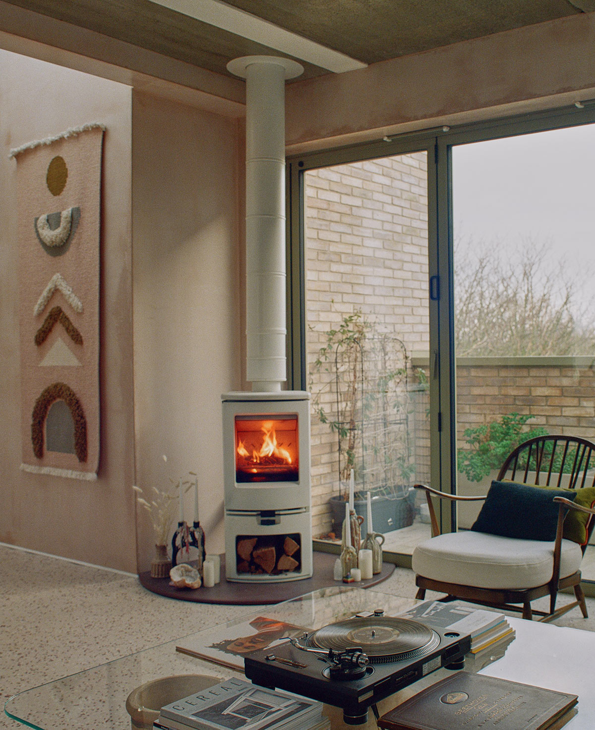
As for their own home – well, unsurprisingly, Ellis and Smith chose a flat in Hide, a collaboration in East London completed a few months into the Covid-19 pandemic. Hide’s two infill buildings were four months into construction when the couple earmarked a top-floor unit, souping up the raw space with an open-plan master suite and a private lift that opens right into a lounge with a wood-burning stove. Their cabinetmaker, master-builder of every cupboard and credenza they commission, took another unit in the development.
“We’ve been trolled on Instagram for being exclusive,” says Smith, “but our buyers are local people, ordinary makers around Hackney Road.” Hide’s only other neighbours are St Augustine’s Church and the adjacent Hackney City Farm.
“Most people are thinking about how to delineate work from home right now. We’re going the other way. We like to blur those boundaries”
- Sophie Smith, Scenesmith
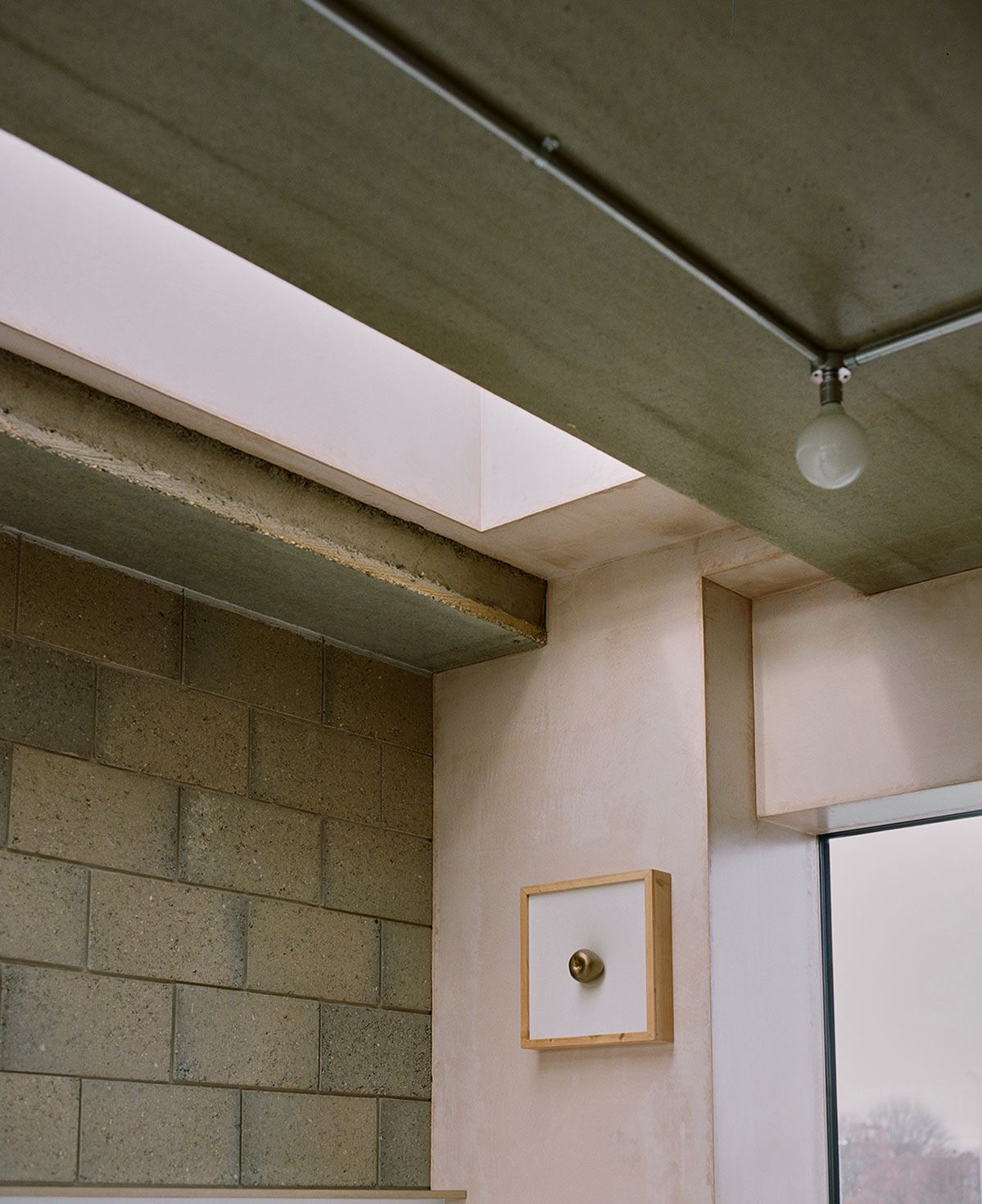
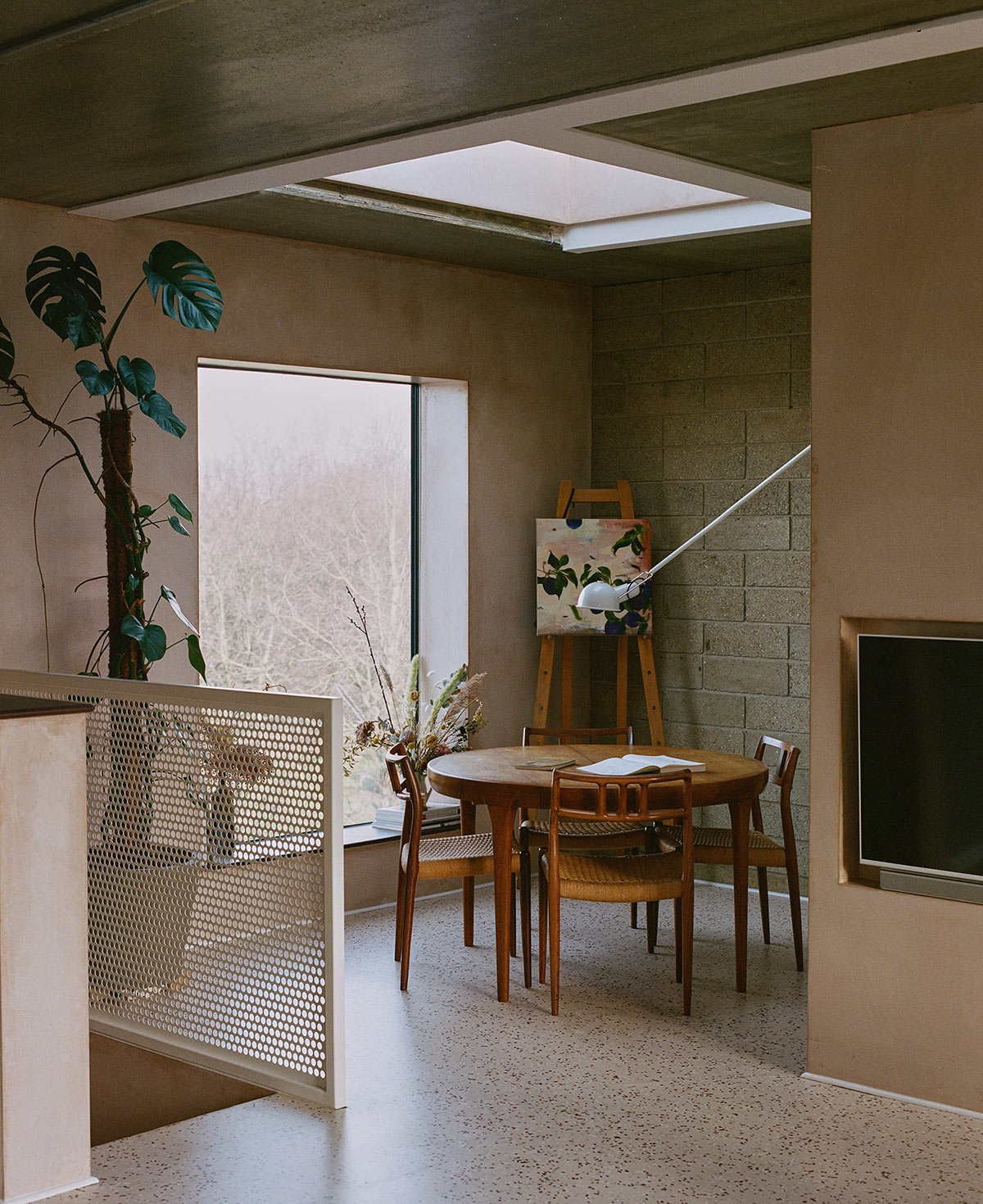
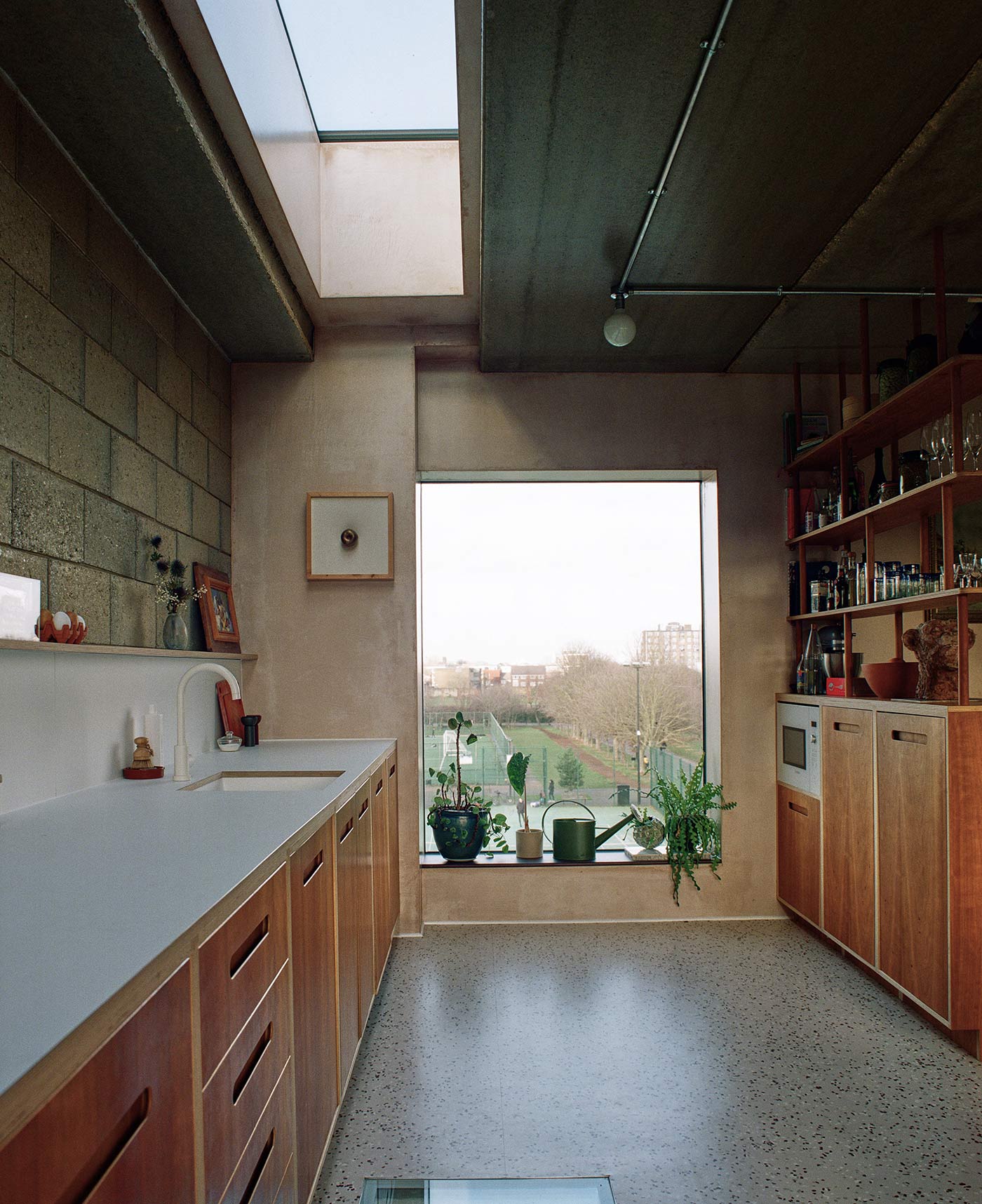
You notice the development’s free-spiritedness early on. The entrance, through an iron gate, is hidden, per its name, by a wood-panelled corridor. The hardware is clearly custom, from the matt steel door pulls to the balcony balustrades, cast in a sinuous coated metallic to echo the Gothic windows at St Augustine’s. Inside the units, Smith started with a fail-safe stripped-back loft aesthetic – exposed concrete, steelwork and raw plaster – then cleverly divided up the spaces so buyers could work at home, parent, escape.
Yet in their own unit, Smith played with that approach. “Most people are thinking about how to delineate work from home right now,” she says. “We’re going the other way. We like to blur those boundaries.”
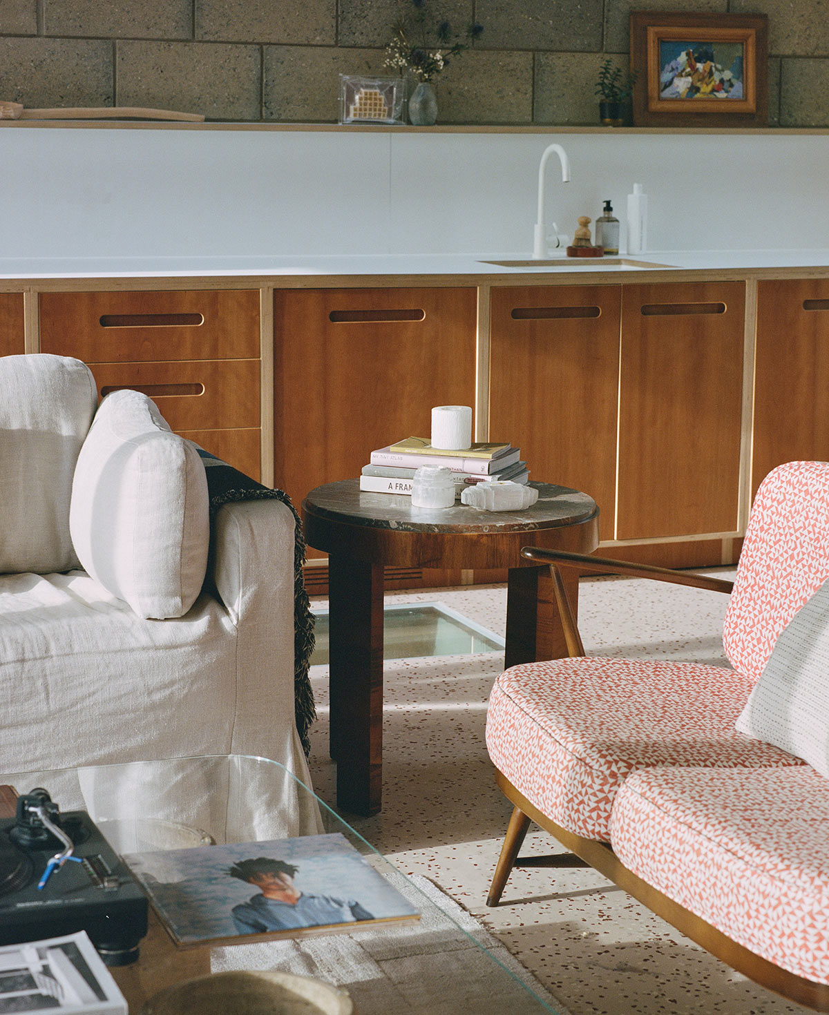
Set into the utilitarian rubber “terrazzo” kitchen floor is a wide glass light well peering down into the master bedroom.
“Initially it was to allow the natural light in, but Jonathan and I can actually have conversations through it. A lot gets shouted through that window.” When I ask about privacy when Ellis’ two sons come to stay on weekends, she shows me the concealed window shade she can pull across from below.
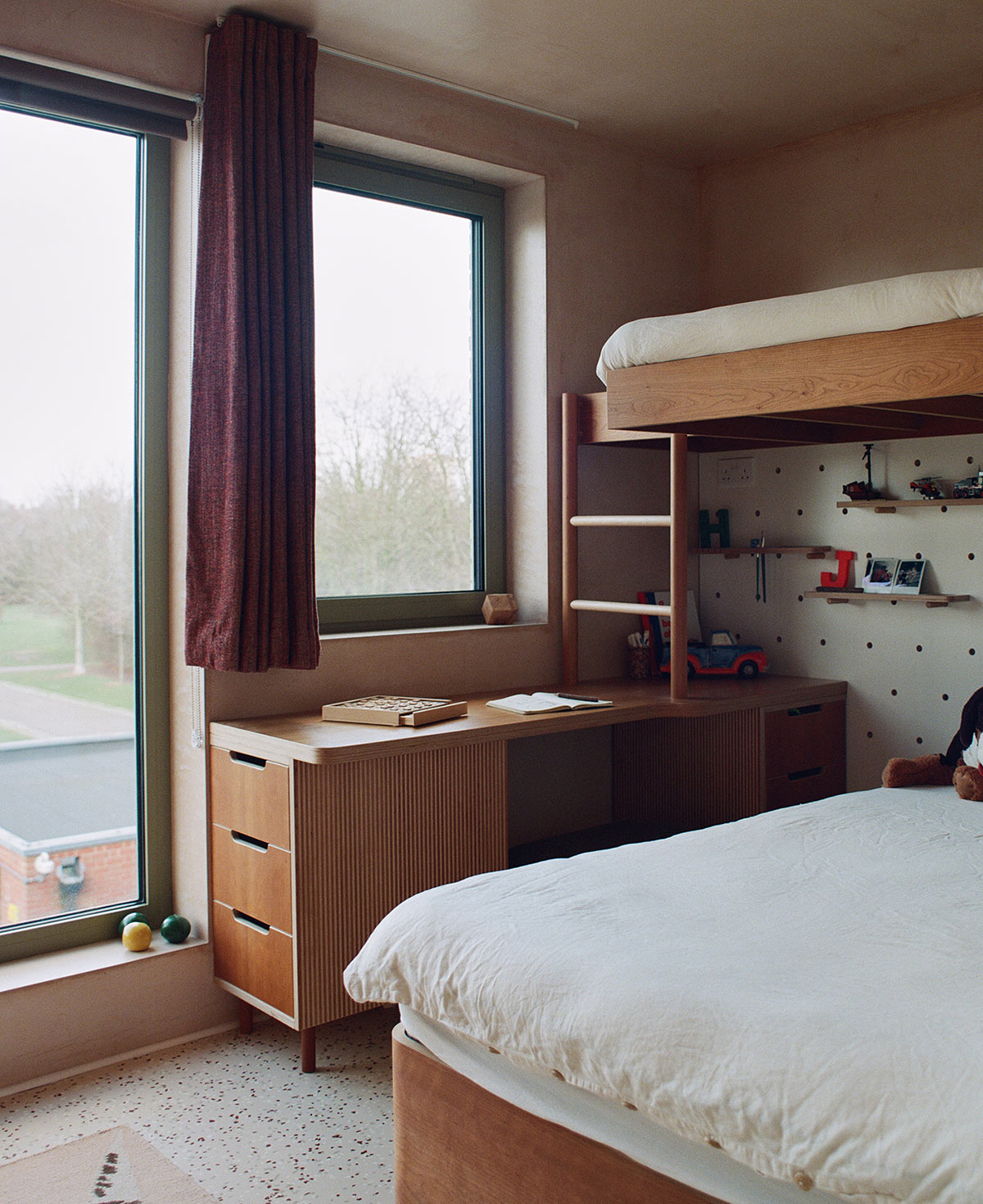
Then she shows me the L-shaped bunk beds her cabinetmaker designed for Ellis’ young boys, with a built-in dresser, desk and pegboard where they can rearrange their toys. The bedrooms are small, cozy – amazingly, there are three tucked into the under-level – yet, Smith, points out, the built-in wardrobes run deep. The couple customised the master bedroom by eliminating dividing walls between the bed and en suite, rounding the edges of the wardrobes, so the space feels like a hotel suite.
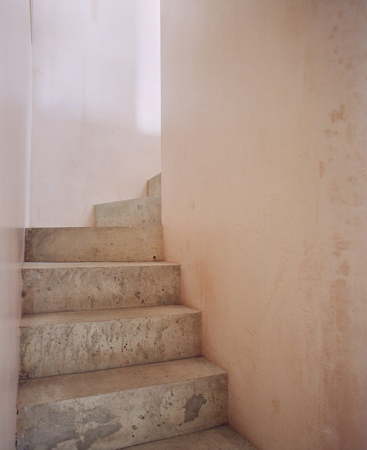
If you’ve seen images of the XO properties, you’ll recognise Smith’s hand everywhere at Hide. The speckled flooring, for instance, is the same rubber terrazzo she used in the XO bathrooms. And you can feel her passion for plaster-pinks, natural woods, textural fabrics and steel accents like the powder-coated perforated strips complementing the concrete stairwell.
To drive it home, Smith says she follows the work of the innovative London designer Faye Toogood, with her “animalistic rudimentary forms. I love simplifying those things,” she says.
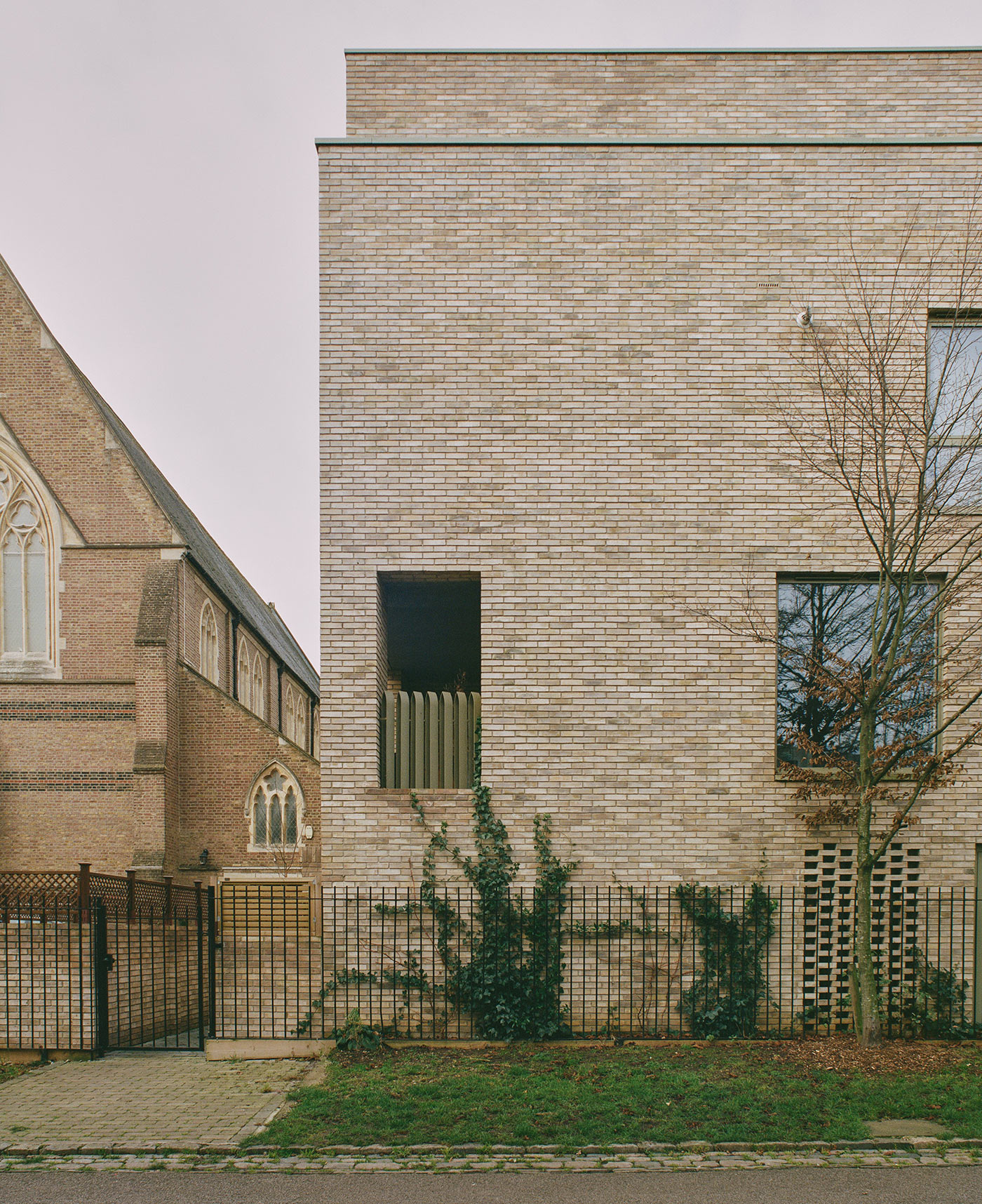
One of the couple’s initial design discussions was deciding how to meld the rural scene at the farm with the pristine quality of a new-build. The answer was all those natural, utilitarian materials, juxtaposed with a rich, softening palette. “When things get busy and layered, it’s like deconstructing the truth,” she says. “You walk past donkeys before you walk into the flat. You don’t want to feel jarred. But now everything feels like it’s meant to be here.”
